

Out now: Mæna #5

The annual magazine produced by students and academics from the design department of the Icelandic Academy of the Arts suggests that Iceland has a very promising graphic design future ahead of them. This year’s theme is technology – an exploration of design’s dependence on new tools and technological advancements. As an experiment, the team removed glue and traditional binding techniques from the magazine making mix, relying on methods like lazer cutting and hand-folding instead. The product is a strange and delightful mixture of the hand-made and the digital: it looks like what would happen if a computer could write a diary and then self-bind the pages with elasticated string.


From the outset, the design invites you to play and interact: a loose, pale yellow contents strip (which could later be used as a bookmark) drops onto your lap when you open the first page (above). Small, pixellated icons from retro mac design dots the loose paper, setting up the imagery that becomes the magazine’s binding visual theme as the small icons are placed below each of the article’s titles (also above). A loose poster of a man holding up some kind of ceramic cupcake with word art hovering above his head is also a pleasant surprise (below) – a surreal reinterpretation of conventional mag freebies and posters.

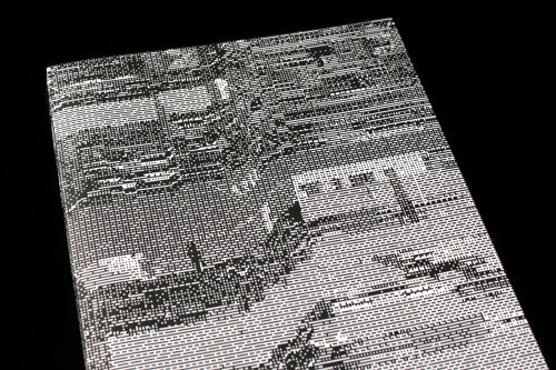
A playful, meta-moment occurs a few pages in, visualising the publication’s juxtaposition between its printed form and digital theme (below). Two hands hold a publication made from a digital barcode pattern, a self-referential nod to how you’re holding a publication concerned with new technology in your own hands. The inky blue, snowy grey and pixels are a welcomed reminder of the aesthetic of HOLO, a magazine which would be the wise uncle to Mæna if we were mapping out its design family tree.


The emphasis on hands highlights the tactile nature of the publication. As well as the A5 pages hidden within the A4, which encourages engagement with the paper, we’re invited to tilt and turn the magazine in our own hands through side-ways positioning of text and titles (above). This playful engagement reaches a crescendo at the halfway point of the magazine, where a foldout depicting a graphic designer’s staple tools stretches way beyond the confines of the A4 page (above)

The magazine doesn’t just celebrate graphics and the printed format: a piece entitled ‘Internet of Things’ is accompanied by a scruffy drawing by Sunna Ben (above), reflecting how the internet isn’t just an aesthetic of pixels and clean colours, but also a boundless space of amazing lo-fi, sketchy illustrations.
There are so many design elements at work that it is impossible to mention them all, and even though there’s a lot going on, the publication is in no ways overbearing or a mess. The design and production details overcome the obvious language issue (who reads Icelandic?), positioning Mæna as a homage to graphic design and magazine-making, and playfully inviting you to engage with the magaziney-ness of the object like a pop-up book does for kids.
Review by Madeleine Morley
behance.net/gallery/22246287/Maena-5