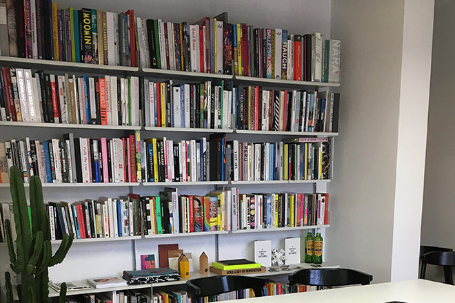
Owen Pritchard, editor, It’s Nice That
Today magCulture is attending Here London, and so to coincide with It’s Nice That’s annual design symposium, we’re checking out the team’s studio magazine collection.
We asked Editor and Here host Owen Pritchard to select three magazines for us: a new issue, an old issue, and a detail that from an issue that he finds particularly nice.
A new issue: The New York Times Magazine, The New York Issue
Every time I manage to get my hands on a copy it is a delight to read. The editorial and the design are tightly aligned in a way which occurs all too infrequently in weekly publications. Gail Bichler, Matt Willey and the design team continually challenge the format and embrace the theme of the issue in inventive ways. The New York issue turned up in our office (as well as on the magCulture Journal) this week, with a vertigo-inducing gatefold cover shot by Jimmy Chin, and a number of great articles about high rise by the likes of architecture critic Michael Kimmelman and Jon Ronson.
Throughout, the content has been rotated 90 degrees to give a sense of verticality and to make all the content as tall as possible. At a time when newspapers are in turmoil and weekend supplements are becoming less defined in their purpose, becoming an amalgamation of sections that are being stripped back or discontinued, the NYT magazine stands apart.
An old issue: Blueprint, 1983-1993
I started my career at Blueprint Magazine, the title was launched the month I was born. I became aware of it while at university when researching essays and precedents for projects. It was only when I was scouring the archive when working at the magazine that I became truly aware of its early years. It was large format, saddle stitched on crappy paper stock – but the energy in the writing and design is palpable.
The founding editor was Deyan Sudjic, now director of the Design Museum, and the publisher was Wordsearch. This book, ‘From Matt Black to Memphis and Back Again’, is a compendium of the first ten years and contains articles by Rowan Moore, Rick Poynor, Steven Bayley, Martin Pawley and many more covering design in the broadest sense. The layouts remind me of the Sunday Times Magazine with blocky page furniture and typefaces providing anchor points in the dense mixture of words and images. There is an irreverence and independent spirit that runs through the publication – it’s like the NME in its heyday for design – and it’s fascinating to see the response to so many ideas that are now considered icons in the design world.
And another thing: Playboy, Jan/Feb 2014.
The 60th anniversary of Playboy saw Kate Moss shot by Mert Alas and Marcus Piggott on the cover. By this time the title, its founder and the brand had become jaded and it felt like a last hurrah for a moribund print title – it relaunched this year with a new direction, design and purpose.
There’s a double page spread in the anniversary, designed to look like a page from Schott’s Miscellany, that is an astonishing reminder of the power that the magazine once had – it made me think about Playboy as an institution. The feature shows both sides of the publication: with a list of Playmates defined by their hair colour alongside the list of people who were interviewed or wrote for the publication each year. It’s an incredible list that includes Dali, Muhammad Ali, Jean Paul Sartre, Margaret Atwood, Roald Dahl, Helmut Newton, Truman Capote, Yasir Arafat, Alice Denham, Joyce Carol Oates, Vladimir Nabokov and Malcolm X to name but a few. Maybe people did ‘only buy it for the articles’.


