

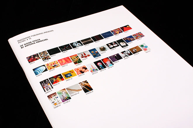
Picnic #15
Every issue of Trademark Publishing’s Picnic magazine showcases a new project by a different artist: the title should be thought of as a printed and portable exhibition (a ‘picnic’ exhibition that you can pick up and take with you on the go?) Issue 15, titled ‘Of Good Stock’, features 36 stock photographs chosen and arranged by Frankfurt-based photographer Antonia Henschel.
As we’ve noted here recently, there’s been a general shift away from the spacious, minimalist small indie in favour of a scrappier, satirical design that manipulates the conceits of popular, commercial magazines.
It’s often the case that designers react to luxury with anti-design and parody, and we’ve mentioned how publications are now making that move away from print that luxuriates towards print that satirises. I’m thinking in particular of Sofa, Mushpit, BBY, and the latest issue of Buffalo Zine. Stock photography is a key part of the visual language of these titles, which use them to explore the advent of digital ads and widespread use of artificial and tenuous imagery. Mushpit issue sevens’s cut-and-paste ad for ‘Another Stunningly Depressing Development’ is one recent, memorable example. The latest issue of Picnic goes a step further in its interrogation of stock photos.


Henschel’s collection of everyday stock images seeks to uncover something about where we are today: the loosely connected images reveal a faith in medicine and technology in the digital age, and a world of artificial colours and plastic textures. The links between the images on each page are impressionistic - pictures of see-through containers filled with liquid (above) progress to images of chemical test tubes illuminated by a single ray of light (also above). The blue of the liquid in a test tube is then drawn on to make the next link - a series of blue circles, which is followed by a cluster of bubbles (below). The connections are based on substance - colour, framing, lighting, texture, shape.

The written introduction correctly likens the publication to a stamp collection for the digital age - one where the artist has looked through stock CDs instead of traditional stock books. The minimal layout also presents the images as if they were art; neatly squared off on a white background (the treatment of a minimalist indie not a satirical one, but a layout that’s ironic nevertheless). It’s our Magazine of the Week because of its focused and direct examination of a design vernacular that currently very present in the media landscape.