

Picnic #8
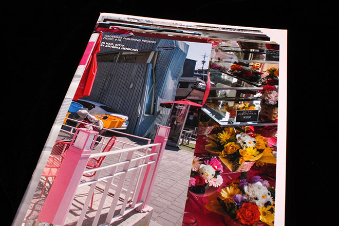
Sometimes we get magazines sent to us and it takes a good few re-reads and a Google search or two to get our heads around what on earth’s going on. For me, this was the case with issue eight of Picnic, which at a first (and second) glance is simply a series of Hello Kitty themed photographs and double-paged spreads of glaring, hot pink typography (below). The cover gave me few clues – an angular collage of cakes, flowers, whiskers and the renowned Kitty’s trademark pink bow. Only a 12pt title hints at the content.

 On closer inspection, I realised that the issue is actually a celebration of Hello Kitty as a design and illustration icon. Picnic is produced by Frankfurt-based Trademark Publishing, and each issue showcases the work of a different graphic designer, photographer or illustrator. The Hello Kitty issue features the work of Antonia Henschel, who spent years documenting the feline megastar across Asia and beyond. Snippets and facts about the history of the cartoon are woven into the magazine (above), but mostly, the pictures document the incredible volume of Hello Kitty iconography and merchandise that can be found.

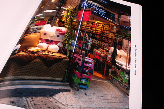
 A Hello Kitty mansion in China (above), a Hello Kitty sweet shop in Taiwan (above) and Hello Kitty plush toys in New York (below) are just a few examples of the silent kitten’s worldwide presence.
Previous issues of Picnic are miles apart in content and presentation. Hello Kitty is all shiny white and glossy, while issue five records working printing machines, printed in seperated CMYK inks on matt stock.
The upcoming issue nine brings together the still lifes and angular photographic work of artist Takashi Suzuki. Most of his work consists of colourful sponge sculptures set against black, and the other half of the magazine is dedicated to his silvery architecture photography.
Picnic is a testament to the eclectic nature of magazines, and a reminder it’s a medium that suits all sorts of ideas and projects. It has the singularity of thought of mono.kultur, adapting its visual presentation to each different subject/theme. And like that magazine, there’s no way of knowing quite what you’re getting.
trademarkpublishing.de/de/category/index/4