

Print isn't Dead #3
We’re quite spoilt for graphic design magazines in the UK. Although we’ve seen the demise of Design Week and Grafik as printed magazines, each solving their respective problems by going web-only, longstanding monthly Creative Review continues to adapt and change, taking advantage of its position as the remaining mainstream/B2B title and currently focusing on themed issues (and shortly undergoing a redesign). The quarterly Eye continues its purer appreciation of graphics, fiercely traditional in its outlook in most respects but always willing to throw a few surprises. The Monotype Recorder has a more craft-orientated approach to graphics, reflecting its position as a calling card for the type company of the same name.
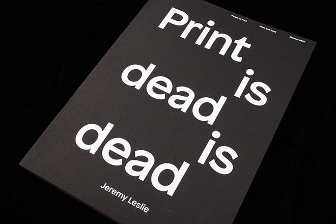
And then there’s Print Isn’t Dead, a project of the People of Print collective. Their third issue is just out, and it’s their best one yet. Unlike the first two, this one hasn’t been funded via Kickstarter. Instead the marketing has revolved around the option to create you own bespoke cover design. Phrases up to 250 characters long are digitally printed in white onto deep black Fedrigoni stock to create bold typographic covers that also look great on Instagram and Twitter (that’s my one in the picture above).

Launched to make the case for print, Print Isn’t Dead has cleverly done so with its paper stocks and special inks each issue. The new cover concept continues this, and makes for some great-looking designs, but it would mean nothing if the magazine itself didn’t live up to the concept. Luckily it does: the content is now beginning to match the level of presentation.
There’s plenty for the magCulture reader in the issue; a piece about design studio Kin and their work for the Wallpaper* DIY covers (above and below) echoes the magazine’s own cover project; an interview with the duo behind the tiny Dog Ear bookmark magazine (below) gives the project some rare love.


Another rare editorial story is an interview with Amy Hood, art director of new erotic magazine Bang! (below).

All these pages give a visual flavour of the new Print Isn’t Dead; lots of dark pages and overlapping special inks make it a celebration of print and paper, perfectly reflecting the rally cry of its title.

Perhaps the least succesful design is the opening essay about print, where a more self-conscious monochrome approach it applied to the layout (above).

I prefer the more flambouyant pages; they work because there’s a conflict between the limited typographic palette (just the one typeface, Patron) and the the freeform expressionism of the images and colours. Page designs need parameters to work against, and there’s just enough limitations applied here for the visual noise to feel deliberate rather than random. These are the pages that make the case for print.
Editor: Marcroy Smith
Art director: James Lunn