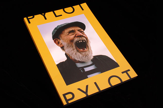
Pylot #2
Pylot is a fashion and photography magazine taking a definitive stand against re-touching: they’re setting out to prove that a shoot doesn’t need to be plastic and glossy to be aesthetically valuable and striking. The spreads celebrate wrinkles, freckles, blemishes and natural beauty in all its facets, and all of the photographs are analogue, creating a magazine that is joyfully organic and wholesome.
Last year’s first issue was received with a flutter of excitement after its initial Kickstarter launch, most likely because the concept is both uncommon and relevant: to browse through a print magazine that covers fashion and not see a single airbrushed image is a delight on the eyes. There is a purity that radiates from each spread, and the simple, tongue-and-cheek pictures remind me in parts of the brilliant London-based Hot & Cool, which also relishes analogue and fashion inspired by the everyday. Pylot’s wholesome-ness extends to its choice of theme, which for this second issue is ‘Family’. Throughout, they’ve used young and old models, from grandpas to young’uns, which is strikingly apparent from the offset because of the yawning elderly man on that sunny yellow cover.
 As Pylot’s new theme is ‘Family’, the shoots focus on ideas of home or age. ‘Made in Colchester’ (above) is make-up-less and evokes high school and living with parents, and the graininess of the analogue is beautifully well suited to the homemade feeling of the photographs. Another spread featuring an old man called Pete is hazy and organic (below) - at odds with the glamour often associated with traditional fashion glossies.

 Another stand out shoot is the warm and laid-back ‘Throw Forward’ (above), photographed by Vicki King and styled by Laëtitia Mannessier.
 Analogue also suits the slightly nostalgic quality of the theme – it works particularly well for a humorous shoot of bespectacled models against densely patterned wallpaper (above). A piece written by the daughter of music photographer Peter Anderson is also permeated with the idea of memory and the past (below): Esme Anderson conjures the smell of fix and developer that she grew up with, and she considers the physicality of analogue that defined her father’s work.
 The natural and honest emphasis of the magazine extends to the written content as well: interviews with models bring the living mannequins to life. These features are not about fashion-as-escapism or something unattainable, but rather fashion as something that we can all relate to.
 A glimpse into the Elegant Papered archive, a collection of iconic fashion magazines, is also a must-read for magCulture readers (above).

Although it’s a very photography heavy magazine, for text-based section, Pylot is playful in terms of design. Whilst the photography is laid out simply (keeping the spreads clean and tidy, emphasising the lack of Photoshop fussiness), the light, outline typography and the baby lilac backgrounds of articles reflect the softness of analogue (above). Words in the titles are also connected to each other with lines, gently mirroring a family tree. These more obviously designed sections vibrantly change the magazine’s pace, contributing to its eclectic ebb and flow.
Pylot is to fashion what Dirty Furniture is to interior design: a wholehearted rejection of industry norms, and an unashamed celebration of the realistic. The shoots embrace stray hairs, bags under eyes, wrinkly necks and crow’s feet, and tear through the more obsessive and controlling aspects of the fashion world. For me, the magazine is not so much about creating unattainable fantasies, but rather it’s a celebration of how photography can be used for honest and personable storytelling.


