Rapha Mondial #1
Lifestyle bicycle brand Rapha have launched their first print magazine, Mondial, a biannual publication containing long form writing, photography and in-depth reportage all connected to cycling. The company is known for their refined and classic aesthetic, and as soon as you catch a glimpse of the soft pink and text-heavy cover, it’s immediately apparent that they’ve smoothly extended their sophisticated style to the magazine’s design.
The first issue is out on 17 July and it’ll be sold through the Rapha shop. We take an exclusive flick through the pages with art director Jack Saunders and find out more about the brand’s reasons for starting their own publication.
Why did Rapha decide to start a print magazine?
The vast majority of the content we create as a brand is published exclusively online. Our website contains a wealth of videos, photo essays, features and articles that can be accessed, searched and shared ad infinitum by our customers, it’s crucial to the way we distribute content. Mondial is a new addition to our content strategy. In time we believe it will become the benchmark for all our commissioned content.
 What other magazines inspired the design of Mondial?
There are many magazines that influenced the design of Mondial. Titles of note such as Twen, and more recently, those designed by Matt Willey, are great examples of editorial design that have had varying degrees of influence over magazines in general and thus Mondial.

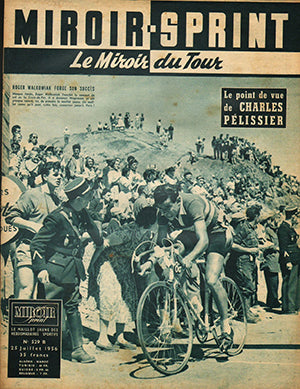
It is much easier to see the design cues of a 1970’s Gazzetta Dello Sport or Miroir-Sprint — two titles synonymous with the sport of Road cycling - in the Mondial, as these publications have also been an influence on the aesthetic of our brand.
 Why did you decide on a primarily text-based cover?
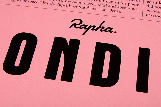
Black text on pink paper is a direct homage to the front cover of the Gazzetta Della Sport, the Italian newspaper that was responsible for the creation of the Giro d'Italia in 1909. Famed for its pink paper, the Gazzetta, with its strong connection to the sport of road racing, has always been an influence on the overall design of our brand.
 Also, as a members’ magazine that is sold online and shipped directly to our customers, we would not appear in newsstands. This gave us the opportunity to break away from conventional considerations, which was namely to omit imagery and place the masthead — a custom font (by Colophon) which again has heavy influence from typefaces found in the Gazzetta circa 1970’s — in the centre of the page as a means of giving the Mondial a distinctive identity.


How have you translated Rapha’s aesthetic into a magazine format?
The Mondial provides a chance for us to solidify the aesthetic of our brand in the minds of our customers rather than reinvent it. Inside, the typographic treatments are tweaked in-house styles, which have been refined for the specific editorial requirements of the magazine.


 The written word and photography are really a true reflection of what our brand is all about - editor Mark McKenzie and the magazine's most heavily featured photographer Ben Ingham have been helping to define the brand for many years (his photo essay, above).
-----
Jeremy Leslie adds: One of the toughest extensions for any brand to manage is the development of editorial representations of its character and aesthetic. That Mondial succeeds so well shouldn’t be a surprise; the Rapha brand has barely set a foot wrong since its launch eleven years ago.
 It is a hugely impressive first issue, effortlessly mixing general cycling stories with Rapha-centric articles. The latest in a number of digital businesses to expand into print, the result is an impressive 162 pages of mixed paper stocks, excellent production values, good writing and strong visuals. A small insert mini-mag from the Rapha Cycling Club (above) gives members a voice too.


