

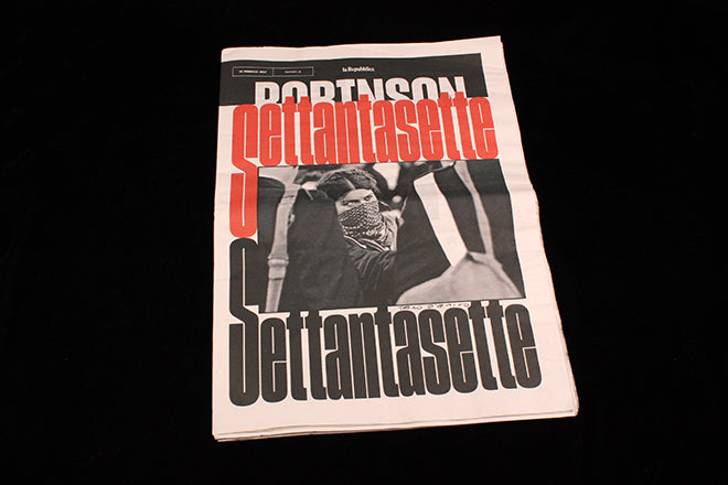
Robinson
A few months back we noted Francesco Franchi’s move from IL Magazine to La Repubblica with a few sample pages from the new weekly supplement Robinson he’s created for the newspaper. With a few more issues under his belt, we’re excited to share some further details of the new project.
The first thing to make clear is the scale of the publication – what we would know as Berliner tabloid, a page sieze about double that of IL. As Francesco explains, ‘I remember when I started working at IL, since my previous job was in a newspaper, I designed the front of the magazine section like a newspaper and it worked well. Now at Robinson I’ve designed a newspaper like a magazine...’ This is the perfect summation of how Robinson works.
IL was known for its intense, busy pages packed with typographic detail – and little open space. Here the pages have space, sometimes quite dramatically so, with strong type elements floating freely (above) and long features using single wide columns familiar from longform online content (below).


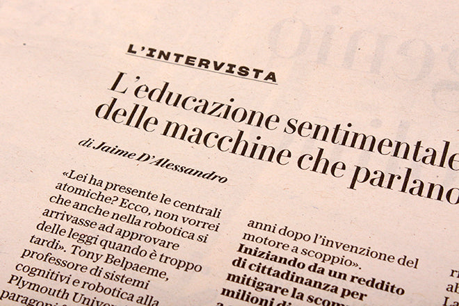
Turn to the reviews section and the structure of the pages are laid out more clearly with rules (above). Here, the combination of typefaces are more typically Franchi, with a broad palette of impeccably selected display fonts that are utterly contemporary but completely legible and readable.

The bolder typographic statements come with the feature headlines, where new sans Sharp Gothic is used in all its many versions, from super-condesned (above) to extra fat (below).

It’s fascinating to see Franchi and team stretch out across this bigger canvas. His thoughts about applying magazine a sensibility to a newspaper are backed up by the cover designs (top of page) which are already demonstrating great flexibility while maintaining a very strong visual identity, using illustration, reportage, cartoon and parody.The latter extends inside, making visual references to other formats – such as the gossip news mag applied to a story about fake news (below).

With his title at Robinson edior-in-chief rather than art director, Francesco is also extending his ideas of how newsrooms need strong collaboration between designers and journalists. ‘What I like mostly working in a newsroom of a daily newspaper is the opportunity to work with such a wide range of incredibly intelligent and knowledgeable editors,’ he says, ‘I’m learning from everybody and everywhere.’
Robinson is our Magazine of the Week because it shows how a newspaper can intelligently use the language of magazines to make itself more visually arresting and engaging. While other design-led newspapers remain slightly tentative about making bolder jumps, it’s refreshing to see a traditional daily such as La Repubblica show how it’s done.