

Sabat #1
Sabat is a wizard of a magazine and it’s such an unexpectedly fantastic concoction. It brings together two interests of mine that I never thought would or could combine; witchy themes found in 90s TV shows like ‘Buffy’ and ‘Charmed’ on the one hand, and crisp design and typography on the other. You wouldn’t expect this combination to work, but it does.


Sabat is what Sabrina the teenage witch or Willow from ‘Buffy’ would read if they were young today—they’d take photos of the magazine sat next to potion bottles and upload the images onto their Instagram accounts. Many of the articles focus on image-makers that are drawn to occultism but who also have huge Tumblr followings. Inside the magazine, there are articles on “tech age hexing” (above), essays on the witches of Instagram (also above), interviews with artists that self-identify as Witch (below), and features on photographers who document and explore esoteric history (also below).


When I first heard the concept of Sabat, I thought that a witchcraft themed magazine from a design point of view would be doomed to look dusty and musty, covered in cobwebs. But like the TV witches I’ve mentioned, the publication doesn’t look conventionally “witch-like.” It’s in disguise, hiding its powers.
A magazine about modern day occultism needs modern day design. That’s why the fashion shoots in Sabat aren’t of women bent double and shrouded in black scarves; they’re more stylish, and the witch theme is subtly evoked through moody atmosphere and dark lighting (below).
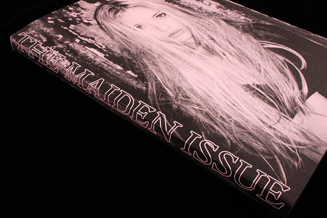
The powder pink inserts make the monochrome palette feel alive, fresh, and young, and the minimal layout means that nothing feels too archaic. As the theme of this first issue is ‘Maiden’, the feeling of youth conveyed by the design is vital and makes a lot of sense.


Typography is particularly well chosen. The magazine uses Radim Pesko’s Larish Alte (above) throughout, mixing in Berhold Wolpe’s calligraphic Albertus (below) and Jonathan Barnbrook’s Virus VujaDe (also below) at points through the issue.

Sabat is hex meets hip. When it comes to curatorial approach and design, it’s a magazine that’s completely out of this world. We’re spellbound.
Editor: Elisabeth Krohn
Art director: Cleber Rafael de Campos