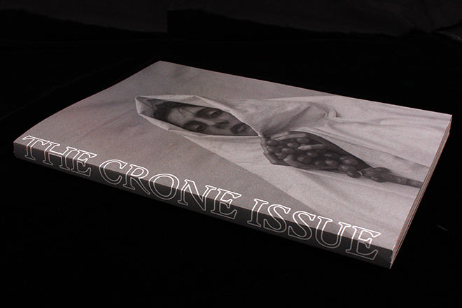
Sabat #3, The Crone Issue
Last week we heard from Sabat founder and editor Elisabeth Krohn as she prepared to launch the third issue of her witchcraft magazine. Yesterday the issue arrived in the post, so today we can share a little of the magic within.
We’ve praised the magazine before for its unique take on womanhood, but today I want to highlight its design. In her At Work With interview, Elisabeth talked of her admiration for A Magazine, Colors and Vestoj. Like them, Sabat has a truly distinct aesthetic, one that has developed issue by issue, and his third issue is the most accomplished yet.
As before, the name only appears in a shiny varnish on the cover, with the Crone theme highlighted boldly down the spine. The outside edge of the pages are again used for a message, this time a verbal one: ‘In Darkness, Light’, changing to the Greek ‘En Erebos Phos’ when the pages are pulled the other direction.
Inside, the complex monochrome design and mix of illustrations and photography are familiar from the earlier issues but are joined by a series of die-cut moon phase symbols on title pages, bright red inserts, occasional gloss pages and a generally more complete unity across the pages. Although the typography is largely the same as before it feels more confident (an aside – Radim Pesko’s Larish Alte font, a key part of the Sabat identity, bears a passing resemblance to MacGuffin’s favoured Churchward) and the rich, off-white Munken paper carries the soft focus imagery well.
Sabat is a truly convincing mood piece that uses all the visual tools available to the designer to create a unique environment. It is that rare magazine, a uniquely designed and art directed object that ignores much received wisdom of editorial design and revels in the possibilities of print to make a really special publication. And vitally, it perfectly reflects its subject matter. It’s a shame that, according to Elisabeth, there’s not to be a further edition.
Editor: Elisabeth Krohn
Art director: Cleber Rafael de Campos


