

Studio Patten, design studio
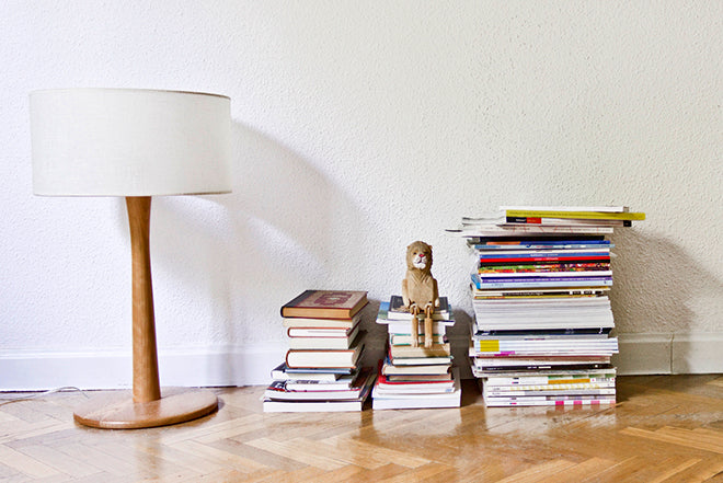
Today we’re in Barcelona checking out the magazine shelf of design agency Studio Patten. Magazine lovers will know its particular blend of editorial design and illustration because the studio is behind the design of Australia’s popular New Philosopher and Womankind.


We asked founders Aida Novoa and Carlos Egan to pick three magazine for us: an old issue, a new issue, and a detail that they thing is great.
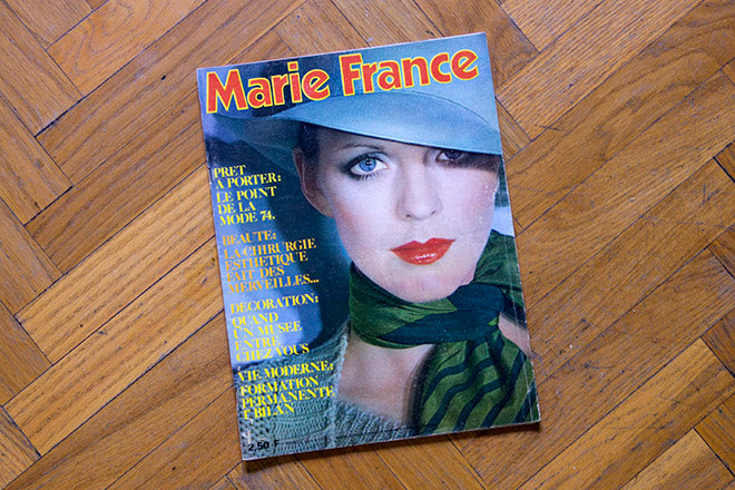
An old issue: Marie France
The picture on the cover has a charm and sophistication that’s unmistakably retro 70s style, especially the logo, the thickness of the yellow stroke, and the classic sketched image. The magazine is still being published today.


We like everything about it: the typography, the bright colours and the composition of the photos. There’s a good use of typographic hierarchy and creative freedom without loosing a sense of order an an accurate use of the grid. Every double page attracts our attention because of the amazing details Long live the ’70s!
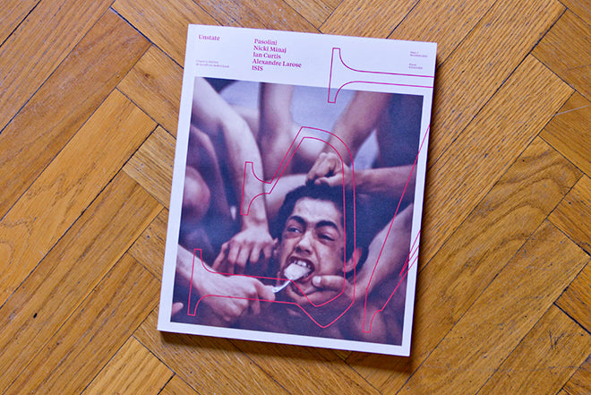
A new issue: Unstate
This is the last magazine we brought, and it’s its first issue. We really like it because it’s focused on audio-visual culture and does so in a creative and brave way, with lots of different perspectives. Inside you have articles on Pasolini, Nicki Minaj, Ian Curtis, Alexandre Larose and ISIS (irresistible). What caught our attention was the design in particular, the format and the quality of the paper. It smells so new!

We like that the picture on the cover continues on the back cover. For a break, there is a superimposed part of the logo over the photo on the cover page, deforming the letters U and N of Unstate, and yet not getting the picture dirty and all. It fits in the composition and the suits the language of the photo.

The design is very literary, and it mixes with the content in an interesting way.They break their grid and play with the width of the columns without making the reading difficult. The prominent colour is red, and that contributes to the simple and beautiful visual language.

It’s an elaborate product, and the team obviously cares for the text and pictures a lot. We strongly recommend it!

And another thing… covers by Manolo Prieto
As a detail we have chosen some covers from novels that were published for the first time in Spain in the ’40s… We know it’s not a magazine, but the way the publications have been produced is so similar. They were made using two or three inks and then stapled together. The fascinating covers were made by a great and clever illustrator called Manolo Prieto (1912-1991). We think that he’s a gem in modern Spanish illustration and a key figure in a great era of Spanish design. We suggest that you research his rich history straight away!