

The Modern Magazine - Boat, Colors, Anorak and Commercial Type

Report by Sarah Snaith
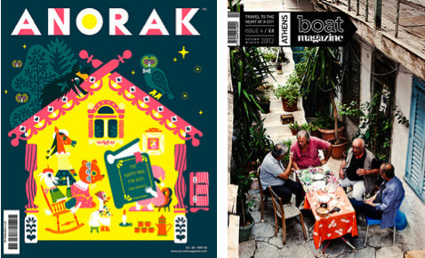
Currently in the process of making issue 6, Davey Spens of the nomadic biannual magazine Boat, makes it clear that running a mobile studio is anything but a holiday. 50% of the stories come from local contributors and the other 50% from writers who come with them on their adventures, so far to Sarajevo, Detroit, London …
‘We don’t sugar-coat cities’, said Spens, but Boat is undoubtedly a celebration of place. ‘The people who decided to stay in Detroit had the most fire of anyone we’d ever encountered’. The Sarajevo issue embodied the horrors of war, and the London issue offered an alternative look at Spen’s city at the time of the Royal wedding from the top of double-decker buses, rooftops and through the eyes of Olympians.
Each city is left unresolved like the end of an indie film and is treated like a new launch. ‘We were never going to be able to retire at 35 … Boat began and remains a passion project’.
Colors magazine has a long and glorious 22 year history, and the current editor-in-chief Patrick Waterhouse maintains the original vision that ‘diversity is good’; globalisation=diversity=good. Initially, the magazine took on large topics like religion, wealth, touch and multiculturalism. Twenty years after it’s 1991 launch (by photographer Oliviero Toscani and art director Tibor Kalman), Patrick took the magazine in a new editorial direction, in concept and design ‘creating Colors The Survival Guide and a series with an interlinking narrative structure’. The survival guide encompassed the interconnectedness and complexity of the world today, tackling issues of transport and peak oil, apocalypse and human waste. After these first four issues, the structure shifted and became more causal, covering marketing, the network of trade and art. One feature in the process of interrogating art including going to the Louvre ‘to capture the phenomena of people going not to see the work, but to say they have seen it.’
Colors places great importance on the communication of imagery and now uses comics, and detailed infographics (and animated shorts) alongside photography. The equation for Colors has evolved under Waterhouse – Visualise. Objectify. Thingness. Deconstruct. Show how things work. Process. Celebrating human ingenuity. Build around it – but it appears to be working. Discovery, open-mindedness and keen observation are paramount to Waterhouse, who’s passion and clear vision for the publication’s future is undeniably concerned with humankind, ethical debates and other complexities of life.
Cathy Olmedillas launched Anorak in 2006 after having children and realising that kids were very poorly served by the industry. ‘It was a happy accident’ and it’s success led to the launch of The Anorak Press.‘The happy mag for kids’ is filled with stories, writing and games under themes such as friendship, fear and dreams. Olmedillas’ love for illustration comes from 70s and 80s publications and Anorak draws upon this visual language as long as the 200 little editors who take part in every issue of the magazine, who review books, do drawings and tell jokes.
Due to launch in the spring, Olmedillas is set to launch a new magazine Teepee for teens aged 14+, uniquely made for teens by teens. In the same manner she was told Anorak would never work, Teepee is being met with the same responses. ‘The same process I took with Anorak is being taken now. It was amazing the number of people who said it would never work.’
Paul Barnes of Commercial Type began by reiterating how much they love making type for different people with examples of client work for Puma, The Guardian, and many others, ‘But we really, really love making typefaces for magazines’, a feature which tied this talk to the day’s events.
‘It’s great to reinvent the wheel over and over again’ said Barnes, who flashed type samples and magazine spreads from Frieze, Harper’s Bazaar, Vanity Fair, The Oprah Magazine (a study of English vernacular typefaces in graveyards), and T magazine across the theatre screen, asking questions such as: how did the national typographic identity of America end up being a French typeface?, why are so many women’s magazines using Didot? and, where do luxury letters come from?
By Sarah Snaith