

The Modernist #16
I’ve always had time for The Modernist; I enjoyed its positive outlook on modernism, and in particular brutalist, architecture. But I never quite warmed to the design, which is perhaps why, despite regular mentions here over the years, we’ve never taken a longer look at an issue.
Until now, that is. I may have missed a few recent issues, but the arrival of the latest one was a pleasant surprise and makes a very welcome Magazine of the Week.
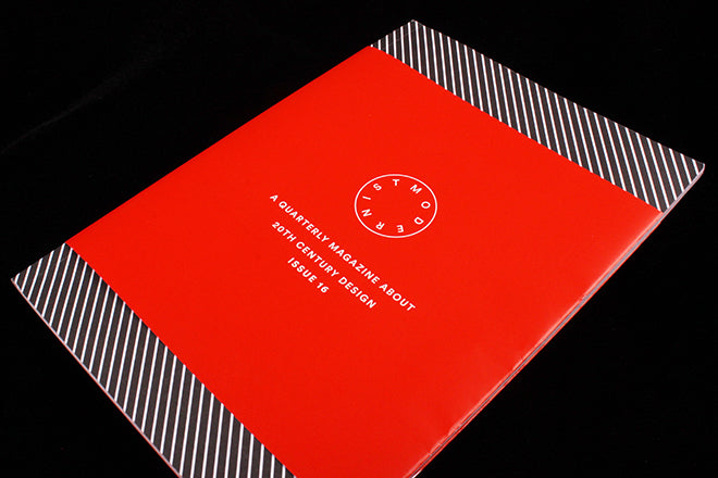
The first impression is strong and simple, making the most of the basics: a striped black and white matt cover is in complete contrast to a glossy warm red wraparound.
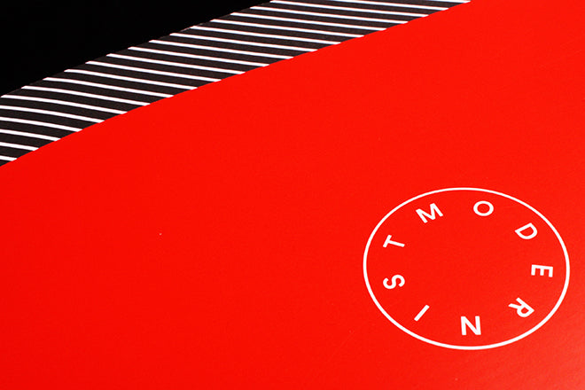
 Peel back the red title piece and this circular pattern (above) echoes the magazines logo. Such visual/tactile effects can sometimes be overworked, but this a powerfully elemental use of basic colour and pattern that is not only relevant and appealing, but also a contemporary take on modernism. Less pastiche, more appropriation.
 The entire issue works with just these two colours, the first story (above) setting the visual template: the two typefaces offer a mix of contemporary and mid-century modernism. The first, black phrase uses the relatively recent and hugely popular Circular (we use it here on our site) and the second part of each headline uses a different font. These range from the above grotesk to the decidedly sixties Antique Olive (below) via a spindly serif worthy of the Letraset catalogue.
 Although mainly concerned with architecture, The Modernist is good at providing a broader cultural context. This Bowie piece is a great example, examining his position in 20th century culture; you turn the page to story about Berthold Lubetkin’s London work.
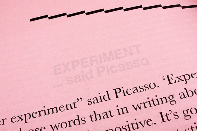 The theme of the issue is ‘Experiment’, and as you’ll have spotted, each page is stamped with that word and a reference to Picasso (detail, above) in pale tint. This is a rare departure from an otherwise clean and clear modernist layout (below, a piece about skyscrapers), and refers to a key essay by Peter Wyeth about experimentation and Picasso’s disdain for the term.

The Modernist is a beautiful, small magazine – it just about fills its perfect binding to create a spine – that does a lot with few elements and little fuss. It’s managed to keep going long enough to really develop into something special, and it’s a credit to those listed as sponsors – Imoso, Steven Passant – and patrons Johnny Marr and Jonathan Meades as well as the magazine team themselves.
Editors: Jack Hale, Eddy Rhead and Emily Gee
Design: Thomas Ulrik Madsen