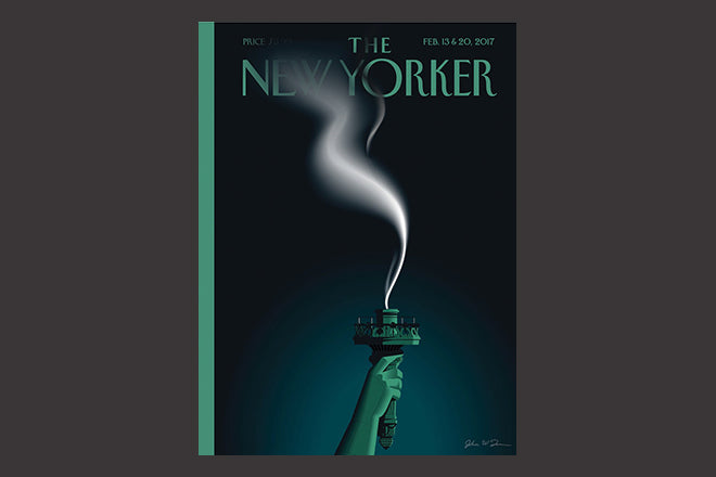
The New Yorker, February 13-20, 2017
Over the past 18 months as Donald Trump swung from outsider candidate to occupant of the White House, The New Yorker has regularly noted his ups and downs. Resolutely liberal in outlook, it has published a stream of covers that reflect the fear and anger about the new president. We’ve selected it as our Magazine of the Week because of its latest front cover, ‘Liberty’s Flameout’ by John W. Tomac.
The magazine has always used its illustrated covers cleverly, switching weekly between lighthearted seasonal visuals and harder hitting political observation. Both types of cover appear without comment or headline, a rare example of pure visual storytelling that offers great opportunity to the artists. The covers never link to a story inside the issue — they are quite standalone, stories in themselves.
The New Yorker is not alone in focusing on Trump for its covers; there’s a kind of arms race going on among publishers testing how far they can go on the subject (more of which later).
Tomac’s cover is as simple as it is powerful, a single thought made concrete. His challenge is that the focal point of the Statue of Liberty’s torch has always been the gold flame, the very part whose absence here is the point. Instead the iconic oxidised green of the Statue of Liberty is the identifying element, the one colour on the cover. That The New Yorker logo appears in that colour too is nice piece of symbolism too.
It’s a dark, bleak cover – the flame of liberty has been extinguished, and the light it is supposed to bring, darkened.
What I love about the cover is that despite this desperate symbolism, the wisp of smoke that winds across the cover, the main feature of the design, remains bright and alive. It feels like a couple of breaths could reignite the flame. Who knows who, how or when, but there’s some hope here. The cover takes you from despair to hope.
Another cover that has been buzzing around online over the past week is this one, from illustrator Edel Rodriguez for German weekly Der Spiegel. It offers a very different persepective on the same story.
Rodriguez has been notable for anti-Trump images since his powerful Time cover portraying a melting Trump. Here he takes things up a notch or two.
There are many differences of context between the two front covers above — not least the outright condemnation of Trump from German politicians including chancellor Merkel. And Der Speigel editor Klaus Brinkbäumer is very clear in his editorial in the issue, stating ‘It is literally painful to write this sentence, but the President of the United States is a pathological liar. The President of the US is a racist (it also hurts to write this). He is attempting a coup from the top; he wants to establish an illiberal democracy, or worse; he wants to undermine the balance of power...’
None of which I disagree with, yet while his magazine’s cover reflects those views it feels gratuitous in a way The New Yorker’s doesn’t.
There has been so much coverage online the use of wit and humour to puncture Trump and his policies – check the round-ups of the Women’s March banners and signs of which this is just one — that this cover feels overwrought. I understand its expression of anger, and was shocked to laughter at first sight of it, but worry that it coarsens the dialogue, resembling online trolling rather than developing a coherent argument. It also feels like it has overstepped the mark – Liberty is quite dead in this image. Are we there yet? There’s also the uncomfortable visual reference to ISIS beheadings to consider.
Which brings me to the arms race of covers. Both these cover designs arrived in my inbox rather than as actual printed items. As has been observed by many people in the industry, the front cover now has a purpose beyond selling on the newsstand; it must pop out on twitter, in emails and on websites like this. This easy sharing of ideas is largely a good thing, but if it gets too competitive in a desire to shock it perhaps becomes a bad thing.
Art editor, The New Yorker: Francoise Mouly


