

Trust
Recently at Indiecon, Hamburg’s excellent independent magazine event, I met Dolf Hermannstädter, long-time editor of local music ’zine Trust (he’s worked at the title for 30 years). He offered to post me some copies of his Trust, and I’m happy to share some pages here.

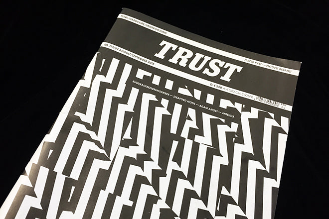
The design of Trust is a great example of making something out of very little, which is not supposed to be patronising. Limited to black and white, designer André Nossek has a restriction to push against, something that’s always important. The worst design brief is the wide-open-do-what-you-want brief: where do you start? We need parameters, and if budget or brief don’t provide them the designer can impose their own.
As discussed here previously, I can’t judge the German-language content, but I can sense the enjoyment of making the most of crisp black ink on bright white paper. Freed from selecting and combining colour, he’s been able to go big, bold and simple, a style that enhances the ’zine feel of the mag.

Bold black borders around the edge of pages; solid black backgrounds; typographic games like spelling out the name of a band a letter per page; no greys apart from the image halftones. And plenty of contemporary, quirky fonts. It’s a really strong, emphatic piece of editorial design from an unexpected source.
