

Detailed
Typography (1) – Bon

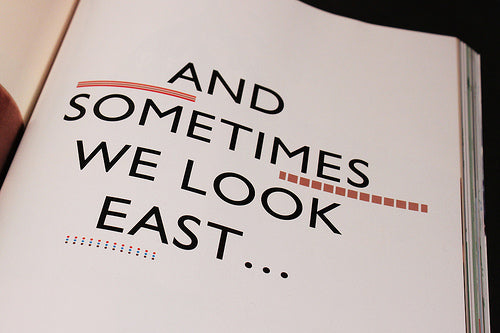
Three examples of interesting editorial typography today, starting with Swedish fashion title Bon. The magazine has never quite caught my imagination in the past but their current Spring/Summer 2011 issue has these great headline treatments.

The simple monochrome Gill Sans type is decorated with pattern and colour in a manner quite unlike other magazines out there at present. It’s very eighties, and seems to anticipate the V&A’s upcoming show about that decade, and the Memphis in particular (design Johan Avedal, Erik Hartin).
