

U Symposium 2016, Singapore
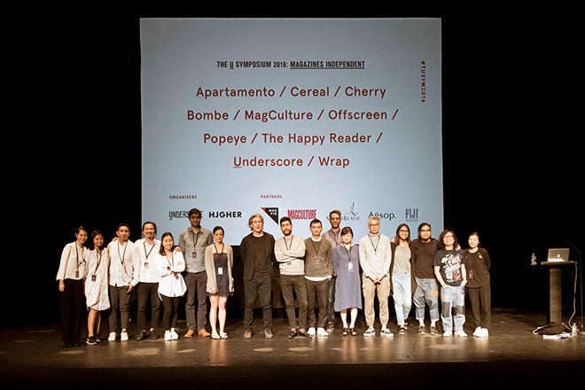
A couple of weeks ago the second U Symposium took place in Singapore, and it was a pleasure to take part in organising and presenting the two days of talks by some of independent publishing’s finest practitioners.

Held at the Lasalles School of Art, the start of the first day was delayed slightly by the queue of attendees registering; the debut event in 2015 attracted 250 people, this time there were over 400 in the audience. Most were local but the line-up also attracted people from Australia, Malaysia, Hong Kong and Indonesia.

What they saw and heard was a well-rounded overview of the independent magazine publishing scene. Here are the highlights.

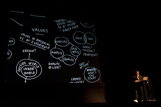
Co-organiser Justin Long (of Underscore magazine) welcomed the audience, before I opened the day with a synopsis of recent magCulture projects and moving on to my thoughts on the relevance and importance of independent mags.

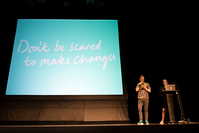
Across its two outings to date, U Symposium has presented a really strong set of magazine makers, a point I highlighted (above) ahead of an overview of five current indie trends and their leading examples.

The magazines I focused on were Mushpit, Works That Work, Huck, Puss Puss, Drift, The White Review, Peeps, Little Atoms, Mondial, MacGuffin and Buffalo Zine, with honourable mentions for The Outpost, Ladybeard, Tom Tom, Four & Sons, The Happy Reader, Pitchfork Review, Guestbook, Rubbish Famzine, Editorial Magazine and Unstate.

Next up was Rosa Park, co-founder of Cereal. The magazine is known for its strong visual identity and whenever I see Rosa or her partner Rich Stapleton talk about their magazine it’s always immediately evident how that identity is achieved. The pair share a super-clear vision of what they are doing and are steadily building a magazine brand that extends into products and other collaborative projects.

Rosa presents confidently and with a self-awareness and sense of humour that is sometimes missing from the magazine itself. Famous for not showing people in its images, she noted the front cover of the new issue featured a two pairs of feet (above).
Cereal is one of the big beasts of independent publishing; From carrying no advertising at launch just over three years ago, issue 12 carries a Hermes ad on the back cover. Rosa and Rich are hugely ambitious and it’s fascinating watching their project develop. It was very well received here, even as Rosa focused on the hard work and business elements of publishing rather than just sharing a best-of porfolio of images.

She also described in detail the structural changes they’ve made to the new issue, an ongoing process that confounds those that regard the Cereal concept as strictly set in stone. And despite the striking growth in sales and ad income Rosa explained they were concerned not to grow too fast.

After lunch Kai Brach offered a very different view of ‘indie’. The self-taught Offscreen publisher/editor/designer discussed how working for digital agencies has influenced his open-source approach to magazine-making. Anyone planning their own magazine will find his Publisher Field Notes blog a vital source of information and opinion, as was his talk. Rather than brand-building, his form of indie is a journey of self-discovery. He was adamant that an independent magazine does not need to try and compete with The New Yorker or Vogue; it just needs to be.

With a typically open approach he hinted at future changes to Offscreen, something confirmed in a recent email newsletter to subscribers and supporters. His belief in ’indie’ as almost a philosophy of life was communicated strongly, with iterate and change his mantra. Although Kai is rightly proud of the physical end-product of his labours, I always feel his real love is the process of making and indie publishers everywhere should be grateful for the sharing that engenders.

In my opening talk I highlighted brand magazines as a key part of today's independent spectrum, and The Happy Reader is probably my favourite example of this growing genre. A collaboration between Penguin Books and the Fantastic Man team, it is as elegantly simple in editorial direction as it is in design. Editor Seb Emina personifies his magazine perfectly, almost too quietly calm and collected. But pay attention and you soon realise there's a lot of effort going on below the waterline.

Achieving the state of calm serenity insinuated by The Happy Reader is hard work, however it appears. Seb talked engagingly through the ups and downs, using a series of FAQs to structure his presentation. He is a writer/curator who has rather stumbled into magazine editing but is clearly enjoying the role, something that shines from every page of his magazine.

The last speaker of day one was Cherry Bombe’s Claudia Wu. After rejecting ’traditional’ graphic design at university, she found herself interning at fashion titles Visionaire and V before working the freelance rounds of New York publishing. She fell in love with magazines working at the now defunct Index, and launched Me, a lovely conceptual idea of a magazine that centred on one person each issue. This person, sometimes a soon-to-be celebrity, sometimes a relative nobody, was portrayed via the views of their friends and the contents page was a family tree-like map of links. It was a favourite of mine at the time (I recall describing it as an upscale NY version of another favourite, Karen) and it was good to be reminded of it.

Claudia explained how she was approached by an ex-colleague to help with a possible magazine linked to a friends’ restaurant, and when that didn’t happen the idea develped into Cherry Bombe.
She sees her magazine as a female riposte to the male-dominated world of chefs and foodies, and joked about its name (taken from a Runaways song) being a female version of Lucky Peach. When Time magazine ran a cover story about the top 100 chefs, and didn’t include one woman on the list, Cherry Bombe launched their annual Jubilee event, a conference in NY celebrating women and food. They also do regular podcasts via Cherry Bombe Radio. Such diversification was a theme of U Symposium; my only regret about Claudia’s talk was that she didn’t talk enough about the magazine itself.
In contrast with last year, the audience responded with detailed questions at the end of every presentation, which was satisfying for all the speakers. We ended the day with all speakers back on stage for a panel discussion but as I was chairing this final session I was unable to make notes or (now) recall the conversation.
U Symposium is unique among magazine conferences in bringing a majority of speakers in from outside the host country. This offers speakers the added benefit of hanging out together after hours and sharing the discovery of a new city. Our hosts from Underscore facilitated this generously; hearing each others talks and having the chance to talk in detail afterward made the event as valuable to the speakers as it was (I believe) to the audience.

The next day turned the spotlight onto local publishers. First up, host Jerry Goh introduced his magazine Underscore. Anyone who doubts that magazines are a reflection of the people that make them needed to hear this talk.

Jerry does not lack self-belief nor confidence, but neither is he a cocky, shouty speaker. His presentation was a subtle, engaging, systematic explanation of a magazine conceived by him as art director and editor Justin Long as a mood piece. He referred to his favourite influences (Re-, 032c and Purple) and explained how he and Justin had wanted the magazine to be known as ‘_’, ie the underscore keyboard character. They were denied the right to do this by the Singapore authorities, which was probably just as well since such a name would have been an abstraction too far. The magazine is subtle enough in every other sense without having an unreadable/prounceable name.
Underscore is quiet, irregularly published but worth a closer look. Typical of the attention to detail the team pay to the project is to prepare a soundtrack for each issue, published online. Samples from the soundtrack played behind Jerry’s talk, setting a unique tone to his presentation.
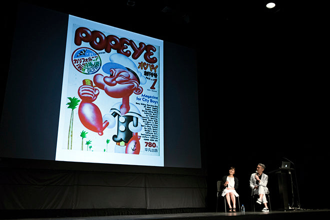
Next up was my personal highlight of the weekend. I was intrigued to find out what Popeye editor Takahiro Kinoshita would offer, especially in a rare public presentation in Japanese translated live on stage. It turned out to be a brilliant overview of a magazine that is celebrating its fortieth year in 2016. As soon as we were shown the cover of the launch issue (above), and told that the name came from the launch editors’ sons’ favourite cartoon character (‘It could easily have been called Mickey Mouse’) we knew this was going to be a winning talk.

In comparison to the other magazines represented at the symposium, Popeye is huge in sales and resource (even if sales have dropped from an 800k high to 130k). Was it an independent? Nakahiro believes so, describing independent as a state of mind, an attitude relating to how you treat your readers, ‘Making magazines to express yourself, it doesn’t matter if you’re indie or a big company.’
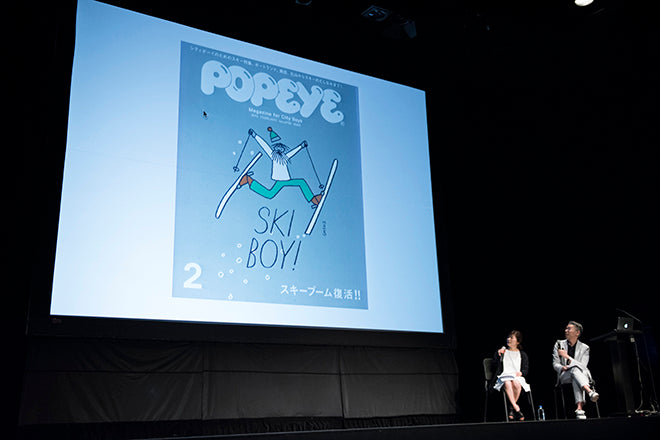
Looking at the beautiful covers and spreads he showed us, it was hard to argue. Nakahiro took over the editorship four years ago with the aim of ‘bringing back the magazine I remember from 30 years ago.’

Japanese magazines bring a unique language problem for western readers; it’s not just a matter of alphabet, but the whole structure and visual language of magazines is different. So much so that it’s easy (for designers especially) to fawn over the rare combinations of alphabets (Japanese and Latin), illustration, photography and space with little regard for the actual content and meaning. What made Nakahiro’s presentation all the more compelling, was the wya he brought to life the pages and explained how they used monthly themes (anything from city guides to walking) to flesh out its self-defined City Boy audience.

The City Boy idea is key to the project, but this proved a hard idea to identify through several layers of translation. Naka talked through his relaunch issue of the mag, an ABC of the City Boy, and what I gleaned was a curious obsession with obscure western visual trends including 60s Ivy League life and long lost western literary references (above), a curious reversal of our obsession with things oriental. What makes it compelling is its joy in detail; the very first edition featured a hand drawn map of the clothing styles worn at UCLA (below).

Such a story would have provided rare insight for the Japanese reader in 1976; today, perhaps, the drop in readership might be explained by globalisation and the internet opening up such information. Naka was having none of that; ‘Magazines are not influential enough today,’ he explained, ‘but it’s not the internet’s fault. The reason is that so many magazines aren’t interesting to read.’

After a break for lunch at the local food court there was a brief panel discussion with local publishers who spoke at U Symposium 2015; Pann Lim (Rubbish Famzine) and Theseus Chan (Works) joining Justin from Underscore. Again, as moderator I was unable to take notes but I hope to be able to add some notes here soon.

I’d only ever seen Wrap presented in briefer presentations so it was good to hear founders Polly Glass and Chris Harrison tell their full story. The two spoke together and explained their background in product and jewellery design, and how Wrap was initially an experimental project. They had never planned to publish a magazine – Polly explained how seeing the Newspaper Club concept displayed at the Design Museum piqued tehir interest in print.
The first issue of Wrap was a collection of illustrated wrapping papers bound together. Since then, their publication has made an issue-by-issue journey towards a more regular magazine format, gradually taking on board the need for turnable pages, increased written content and finally a front cover designed as a cover. They now produce an issue roughly twice a year, each issue always offering a strong overview of work by new and established illustrators, with five highlighted artists represented bylarge, fold-out pieces of their work.
Like several other magazines on the bill, Polly and Chris also have an associated business, stationary and greetings cards, that provides their main income. This has grown from the magazine, and they described Wrap as key to their fortunes, giving them a voice and route into the shops that now sell their other products.

The final speaker at U Symposium was Omar Sosa, co-founder and art director of Apartamento. One of the key currencies of conversation over the weekend (on stage and off) was ‘what’s your favourite magazine?’ and it was no surprise that most people’s answer was the biannual interiors mag Omar launched with Nacho Alegre and Marco Velardi in 2008.
Apartamento’s story is an inspirational one, made more so by Omar’s delivery. The magazine was dreamt up over drinks and could easily have slipped away with the next days hangover. We should be thankful it didn’t; Apartamanto is a key project in the independent world, having grown from a typically hopeful small launch to establish itself as a financially successfull internationally respected title.

Typical of Omar’s self-depracating humour was the story of an exhibition of the regular still life stories he works on with Nacho (above); they framed the images and hung them, and as a last-minute addition included some of the original sculptures. Visitors to the gallery proceded to ignore the photographs and want the sculptures.

The idea behind Apartamento seems simple now; a magazine that reflects the real homes and spaces people live in, rather than the over-styled examples so many interiors titles feature. It hit the zeitgeist, the content and design perfectly balancing the rough and ready with the aspirational.

Apartamento is one of a small group of magazines that are regularly referenced when talking about contemporary titles, and also one of those whose design has been lifted wholesale by less imaginitive designers and publishers. That the team continue to keep it inventive and exciting is a result of its origins: they made a magazine for themselves, certain they had a valid idea. The challenge since has been to maintain that stance and not become complacent, even as their content becomes more aspirational; a recent story about Picasso (below) fits perfectly into the magazine but would have been inconceivable at launch.

Hearing Omar talk through his slides clarified any doubt about complacency. The three partners all follow their own projects (Omar is moving his design studio to New York, Marco is Milan, Nacho in Barcelona) and reconvene virtually to make their magazine twice a year. Nothing is certain until it is printed, like any magazine, and while in Singapore, Omar was testing the potential next front cover image, an interestingly celebrity-led one. Will it end up as the final design? We’ll find out soon. But the process is never certain, they keep trying things; one surprise announced here was that after years of turning theri back on digital (their webiste exists only to seell the print title) theya re developing an app for launch later this year.
The best thing about Omar’s talk was his humour, warmth and obvious love and enjoyment of the magazine-making process. It was a fitting end to a great weekend; each speaker had prepared well for their talk and with 40 minutes each were able to deliver a rounded story about their project.
We saw a lot of editorial design on screen, but this was far more than just a portfolio sharing session. The hard work and graft needed to make a magazine was evident, as was the excitement and joy of successful execution. The magazines were varied in scope and ambition, but it was notable how many speakers came to magazine-making from outside the publishing industry – Cereal, Offscreen, Underscore, Wrap – and how just about everyone regarded their magazine as the core part of a larger set of projects.
Huge thanks to Justin and Jerry at Underscore for inviting me to help with U Symposium, and to all the speakers, restaurants and the South Beach Hotel for making the weekend such a success.
All photographs by Jovian Lim