

What’s up with The Economist front covers?

Earlier this week a series of tweets criticised the latest front cover of The Economist (above). Erik Spiekermann, who redesigned the magazine in 2001, joined the exchange with links to his cover proposals from that time. Here, Andrew Losowsky takes a closer look at the covers.
There’s a lot to admire about The Economist. Its journalism is rigorous and informed; its page design, to a template established by Erik Spiekermann in 2001, is clean, readable and efficient; its digital strategy is targeted and forward-thinking. Even its photo captions are witty.
So why are its covers so bad? (And I’m not alone in thinking this.)

Let’s take a look at their cover strategy. I’ve identified four basic types of Economist covers from the past few years:
• A news-related photo
• A stock photo of something analogous to the current situation
• A hand-drawn illustration
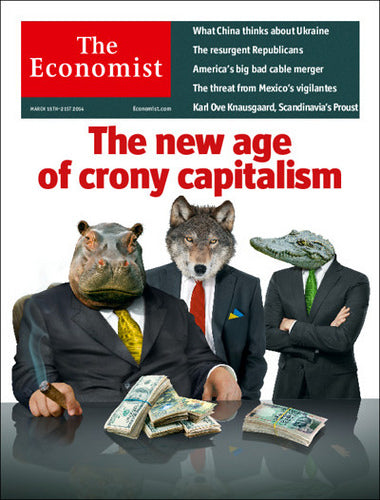
• A badly Photoshopped mash up.
The last one is by far the worst - and also the most prevalent. Here's a breakdown of their covers from the UK and USA since January 2012 (UK edition varies its cover from the US edition a few times a year):
The Economist covers
Hand-drawn illustration 21 (26)
Stock photo as analogy 6 (7)


The cover of a news magazine is supposed to give the reader a sense of urgency and authority. The Economist’s badly realized cut-and-paste jobs snigger at the world with a sneering sense of superiority. These are world events belittled by bad Photoshop and sarcasm. As a satirical cartoon segment, that might be passable, but as the shop window for the publication's world view, it reflects badly on them, and doesn’t match the tone of the rest of the magazine.


In fact, the magazine has created some powerful, single-image, smirk-free covers of late.

But as the stats above show, these are exceptions.
Wit and economic coverage are no strangers in good cover design - just look at recent efforts by Bloomberg Businessweek and Brand Eins. For a more British-flavoured inspiration, Spiekermann also suggested to us via email that Pearce Marchbank’s wonderful Time Out covers could be used as inspiration.
I still admire what’s inside The Economist. But its blunt, badly designed cover attacks feel snide, and I wish that they were better.
(Oh, and whatever they might say, it’s a magazine.)
Andrew Losowsky is a regular contributor to magCulture and currently a John S. Knight Journalism Fellow at Stanford University.