

Zweikommsieben #14
We’ve highlighted Swiss club culture mag Zweikommasieben a few times on the Journal now, continually struck by the way it applies a simple aesthetic idea over and over again with ruthless rigour. Like the music it champions, the editorial design is about repetition, rhythm and the gradual build-up.
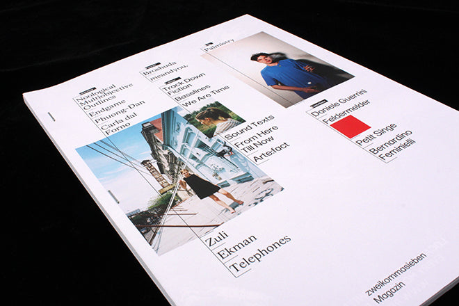
By its high standards, issue 13 was visually disappointing, but the new, staple-bound no.14 (the staples almost looks like pulsating beats on Protools) is back on form. It has a subtle web theme running throughout it. This is highlighted by the underlining of headlines, which look like a drop-down menu on a website, and the way that images break away from the constraints of the two page spread by bleeding across the gutter. The design seems to revolt against the paper that its bound to - the result is electrifying and impressive.
The layout of the cover also takes a lot from contemporary web design and the current trend of hovering over a word so that an image pops up on top of it. To contrast this contemporary flatness, at the magazine’s centre there’s a ghost from the past in the form of a vivid red flexidisc with an exclusive track by feldermelder and ous.
Editorial designers looking to embody the theme of a publication’s content should take note. Zweikommasieben continually denies and then reasserts the physicality of its own form - its graphic design that’s sure to put you in a trance.
Editors: Remo Bitzi, Guy Schwegler and Marc Schwegler
Design: Kaj Lehmann, Simon Rüegg and Raphael Schoen