At Work With Florian Bachleda, Fast Company

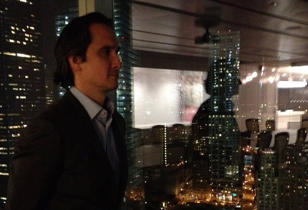
We start the new week with Florian Bachleda, Creative Director of Fast Company Media. Florian is one of the leading figures in US editorial design, having worked for titles including Vibe, Village Voice, Entertainment Weekly and Latina. He has been president of the Society of Publication Designers (SPD) and was on its board for five years. We look ahead at his week as he and his team complete design evolutions for the June issue of the magazine.
Where are you today?
In the Fast Company offices at 7 World Trade Center, in NYC.
What can you see from the window?
We’re on the 29th floor, so it's a nice view of downtown Manhattan.
Are you a morning or evening person?
I’ve definitely become a morning person. I like to work for an hour or two every day before I head to the office, which fortunately for me is only a ten-minute bike ride away.

What’s your favourite magazine this morning?
Right now it’s Eight by Eight, the new football (soccer) magazine from Priest+Grace.
Editorial designers in London and New York tend to look across the Atlantic at each others’ work rather enviously. How do you see the differences between design in the two cities?
I was unaware it was a two-way street. I really admire the confident minimalism of many English designers. The clarity and communication always stand out. I've been a fan of my fellow New Yorker Luke Hayman's work for as long as I can remember.
Fast Company has always had a reputation for strong design. What approach and changes have you brought to the magazine?
Fast Company is a different type of business magazine. It’s not about stock prices and profits, but rather innovation and creativity. So our graphic approach reflects that editorial mission, with a restrained palette of graphic devices and a non-traditional use of photography and illustration.
Our first big change was hiring Christian Schwartz to create two custom typefaces for us: FC Kaiser and FC Zizou (sans and serif). The faces have multiple weights which gives us both a functional variety and a strong consistency. Kaiser is used for most covers, and Zizou is the perfect refined compliment to its bolder sibling. For you soccer fans out there, you should know these faces are named after Franz Beckenbauer and Zinedine Zidane. (Kaiser is based on German fonts, and Zizou on French fonts) And of course, the ‘FC’ representing both ‘Fast Company’ and ‘football club’ was too good to pass up!

Jenna Lyons of J.Crew photographed by Yu Tsai.

Ben Silbermann of Pinterest photographed by Art Strieber.
By relying solely on these two families, we avoid any tendency toward ‘skeuomorphic’ typographic gimmicks, which might otherwise saddle a tech story with a computerized-looking font or an education story with a scrawled handwritten font. Our palette of graphic devices consist of gradients, slashes, long horizontal rules, divots, text underlines, and ‘stepped’ gradients (a combination of different vertical rule widths to suggest a gradient). They are all employed to suggest a sense of graphic motion, but also to activate different on-page elements and exist as connective tissue for a unified tone to the complete magazine.

Jason Kilar of Hulu, photographed by Joe Pugliese.
This discipline with our type allows us to sometimes present numbers and letterforms as art for franchise packages:

Most Innovative Companies (2014) numbers by Sawdust.

Most Creative People (2012) card-board numbers by Kiel Johnson. Illustrations by Peter Oumanski.
Our photography and illustration attempts to explode the notion that business is confined to drab conference rooms and impersonal corner offices. We try to never represent a person, a company, or a product as they are typically shown. Instead, we've done the following:

Dennis Crowley of Foursquare has been in business for 10 years with zero profits to show for it. So we had Gus Powell photograph him appearing lost in New York.

For a “How To Lead a Creative Life” package, we worked with Pop Chart Lab to spell it out.
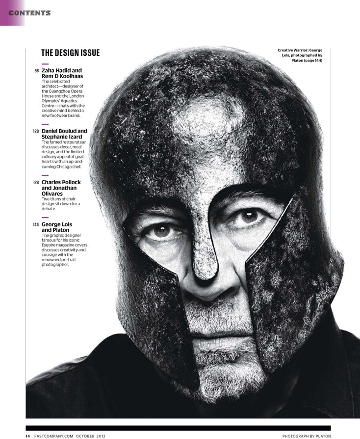
Sometimes it’s just about assigning great photographers to shoot great, non-traditional portraits:
How does the Fast Company iPad app fit into your work monthly schedule? Do you enjoy working on the app?
I don‘t have a monthly schedule so much as a daily schedule. We have an insanely talented and hard-working team of 4 designers, 3 photo editors, and an editorial art production manager, and (working with the edit team) we produce the monthly print magazine and the iPad app. (We’ll be sharing a website soon that will show lots of the iPad digital content - as well as print content - that we've produced in the last 3 years.) But I also work with designers and developers from our digital team on the our websites, and since my duties extend across the entire brand, I also work with our business side on everything from sales & marketing to circulation issues. Another big part of my schedule is working on our annual Innovation by Design franchise. It’s an eight-month long project, since it involves our design competition, the design print issue and iPad app, and the design conference and awards party in October.
What are you most looking forward to this week?
I often end up working long hours, so coming home and spending time with my cat Chairman Mao is always the best way to decompress.
What are you least looking forward to this week?
There’s really nothing I want to avoid. I have a great job, and I work with wonderful colleagues. I never forget how lucky I am, to be making a living doing something I love. It’s a luxury many people in this world don’t have, and it’s too easy to take that for granted, especially in New York.
What will you be doing after this chat?
We’re finishing up our June issue, which will introduce some editorial and design evolutions I’m pretty excited about. I’m not sure I want to call it a redesign, but it’s definitely a new front-to-back experience.


