

At Work With: Heath Killen, Desktop

As its names suggests, Australian monthly Desktop started out covering early desk top publishing. Recently it has developed a more challenging approach to its subject, each issue exploring broader themes around graphic design in the context of Australia. Here, we look ahead at the week with editor Heath Killen.
Where are you today?
Back at the office in South Melbourne.
What can you see from the window?
A timely question as just a few weeks ago I moved desks and now actually have a window to look out of! From where I sit I can see a car-park and a few neighbouring houses and offices. Beyond that I can see the city skyline through the grey winter haze. It might sound a bit bleak, but I find it very calming. South Melbourne is an interesting area - semi-industrial, a mixture of luxury real estate and council flats, and beautiful in the springtime when the cherry blossoms come out.
How many emails are waiting in your inbox?
Surprisingly few. I try and respond to emails as quickly as possible. Several desperate years of freelancing have made efficiency a survival tactic for me. I don’t like things stacking up either - physically or virtually.

What’s your favourite magazine this morning?
Colors - without question. The last few issues have been fascinating reads and so inventive with their design. I’m also an avid reader of Bloomberg Businessweek, Eye, Works That Work, Pie Paper, Meanjin, The New Republic, Domus, and Archis Volume.

Desktop sounds like something to do with DTP, while the subtitle ‘The Culture of Design’ doesn’t really do justice to its scope. Can you give some background to the magazine and describe your vision for it?
The word Desktop certainly does come with some baggage. The magazine was founded about 26 years ago, indeed as a response to DTP. For many years the content was largely focused on tutorials, software reviews, and discussions about emerging issues like the digitisation of typography. Occasionally I flip back through the archives and always get stuck on the letters to the editor. There was one particular issue made in the late ‘90s which was entirely black and white, and someone wrote into complain about the fact that the black wasn’t actually 100% black and contained a percentage of cyan. I like to think the industry has moved forward since then!
Desktop has gone through many different iterations over the years - some good, some not so good. It received a significant facelift in March 2011 under the guidance of previous editor Brendan McKnight, who helped pull things back from the brink of extinction. I took over the role of editor in July last year and my first issue was released in October. I’d been a contributor to the magazine previously, writing and illustrating a few articles. The opportunity to become editor just happened at the right time. I was feeling dissatisfied with my work and was looking for a new opportunity of some kind. I started with pretty much zero experience with magazines, and I’d certainly never been an editor before, but I tend to work best by being thrown in the deep end.
I use my role as an opportunity to explore a few big ideas that are on my mind through the context of Australian design. The trick is to find ways to relate those things together, and sometimes the links can be pretty tenuous. I’m extremely hands on too. Every theme and almost every bit of content is either developed or commissioned by me. Sometimes I work very closely with contributors and other times I just give them a challenging task and see what they come up with. It usually comes back nothing like what I expected, but I’m always delighted. I’ve been very lucky in that respect, and it seems like most of the contributors have really enjoyed doing something outside of their comfort zones.
I also use the magazine as an opportunity to explore the discipline of graphic design through its own visual language. It’s a perfect format for that type of investigation. I’m limited of course by time and money, as well as the actual structure and layout, but I can push it forward by commissioning things like psychogeographic maps, self portraits, future visions, do-overs and remixes. Those aren’t just frivolous exercises either. Each feature speaks to the theme of the issue, and each feature has a purpose.
Overall I just want to go as deep and wide with it as possible, and have some fun in the process. I must admit I do this for very selfish reasons too. I’m curious about the world. I’m interested in peoples stories and the ideas behind their work. I do this to learn, and my hope is that the readers learn along with me.

From London we see quite a few interesting publishing projects coming from Australia. Can you describe the state of the industry there, list some highlights?
There are indeed. Australia is finally starting to embrace its design heritage and find its own voice. There’s been a lack of education, a dearth of champions, and a broader perception that Australian design is something of a curiosity, when it's actually a powerful and vibrant force on international landscape. I can think of a few events that have been catalysts for that change. One is Dominic Hofstede's recently relaunched Re:collection project, which unearths and catalogues work from the 1960s - ‘80s. Another was the exhibition of Les Mason's work for Epicurian magazine (see Desktop feature) which happened a few years back at The Narrows gallery space. Geoff Hocking’s book about the World Record Club (a sort of Australian Folkways where many of our design greats got their start) and Alex Stitt’s monograph have also been significant. I think these projects really started change perceptions and get people engaged with the local industry at a deeper level.
People like Warren Taylor, Andrew Ashton, David Lancashire, Jenny Grigg, Mark Gowing, Jason Grant, Stephen Banham, Michael Bojkowski, Eamo Donnelly, Mimmo Cozzolino, Jeremy Wortsman, Bonnie Abbott, Stuart Geddes, Kevin Finn and others have made invaluable contributions to raising the profile of Australian graphic design internationally as well as the quality of discourse around it - both through advocacy and their own work.
There are some wildly talented young designers coming up too - people who are producing bold ideas with an antipodean flavour. Take Responsive Projects for example - which is a project made up of four talented individuals who are engaged with real issues and are actively trying to reshape the industry.
The Australian identity expressed through design is something I’m deeply fascinated by. Australia has such an unusual history and it’s still full of possibilities. Today it’s fairly conservative, at least politically, and in many ways tied to its colonial past, but there’s also a rich and diverse range of mix of cultures living together. There’s a strong Asian influence and increasingly a Middle Eastern one. And of course all this is on a foundation of Greek, Turkish, Yugoslavian and Italian post-war immigration. Somehow it all coalesces. Australia is a land of open spaces, extreme weather, and rare natural beauty. There’s an atmosphere and spirit that's hard to describe but easy to identify. In my opinion the best Australian design absorbs some of that and translates it in a unique way.
Coming from a design/illustration background, how have you found adapting to being an editor?
It’s difficult to explain but I actually approach it in a very similar way. I do miss designing, but I've had a strong hand in the art direction of the magazine, particularly in some of the latest and upcoming issues. I love reading and writing though and Desktop has definitely become much wordier since I started. I’ve thought a great deal about what the magazine can provide that isn’t freely available online - and one of the things is a more in-depth exploration of the work and issues through essays and interviews.
What was the last thing your designer, Hannah Lawless, said to you?
Goodbye! Hannah moved on recently, returning to the freelance life . She's an incredible talent - so dedicated to quality and detail. Extremely intelligent and very switched on. We worked closely on evolving the design if the magazine within a strict set of limitations. We couldn't touch the masthead or change the fonts, and we had to maintain a certain level of consistency from the old to the new. We've actually been breaking the template and piecing back together every month since my first day, so it's actually good that those limitations were in place, because otherwise the magazine would be a real mess.

The thing about my approach is that I want each issue to be special and unique. The content is almost always entirely bespoke (no mean feat on such a small budget) and it all speaks to a theme, so it’s always different. Because of this, each time we have to let the personality of the issue emerge and figure out how it all works. The content comes first, and the design is there to support it. If we need to tweak or completely redesign the look and layout of a regular feature we just do it. Each issue is a prototype, and we’re constantly looking for ways to improve and refine. We learn from our mistakes so we can make new ones to learn from. That process of experimentation and invention is probably my favourite part of the job. It’s a shame that it’s often the one that gets the least amount of time allotted to it - but then again, sometimes the best decisions are made impulsively and under pressure.
I'm now working with a designer called Davin Lim, who’s doing a great job, picking up where Hannah left off and pushing the pages in some new directions. We've been enabling each-other - indulging every left field idea, but always pulling the other person up when they've gone too far in the wrong direction.

What are you most looking forward to this week?
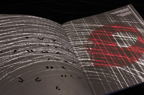
Content is rolling in for August which is exciting, and I’m currently plotting out September. I’m also very excited about the July issue which has just gone to print. It’s called Other Worlds and I really started to push the editorial design I this one. It contains lots of little touches that may go unnoticed, but will hopefully add to the reading experience. There are actually easter eggs and embedded ideas in all the issues if you look hard enough, for example all the articles in the March “Back to the 90s” issue are named after classic 90s albums. Rewards for keen eyes.
What are you least looking forward to this week?
The same thing as every week - waking up early. I’m terrible in the mornings and I struggle with a 9 to 5 routine. I work better in bursts and I need lots of time out.
What will you be doing after this chat?
Probably staring out my lovely new window momentarily, then back to it.