

Crepe City #2
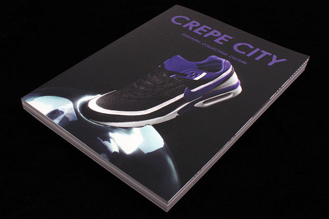
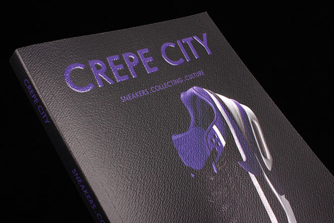
Issue two of trainer magazine Crepe City kicks off with two bespoke covers that intend to ‘sum up where sneaker culture is at in 2016.’ Like its debut issue, the images are printed on slightly rubbery paper-stock so that the magazine feels leathery and trainer-like when you hold it in your hands. The only thing missing is two laces that could enclose the pages in a bow or wrap like snakes up the spine – then Crepe City really would be a trainer-meets-mag.
Out of the two covers, the purple one featuring the Nike Air Max – shot by JODI’s creative team – is the best fit and feels especially striking. The shoe was chosen for the cover in order to reflect the current and pervasive interest in early 1990s running shoe silhouettes. This kind of intense commitment to contextualizing and considering trends is exactly what Crepe City is about, and which is why it’s divided up into three sections (‘Sneakers’, ‘Collecting’ and ‘Culture’). I like how each section’s title spread looks like a sole that you might find in an Adidas originals (below) – when you open the magazine, it’s like you’re looking inside a trainer.

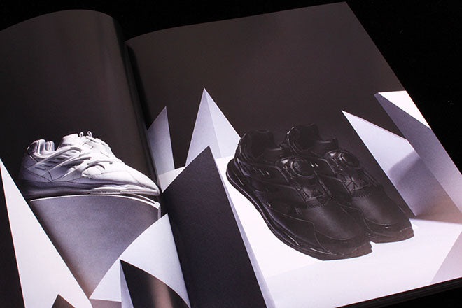


The first ‘Sneaker’ half is filled with shoots by various creative studios (above), and ‘Collecting’ meticulously records every trainer belonging to various designers (below).

Some of the magazine’s content, especially in the ‘Collecting’ section, feels a little catalogue-y - my favourite parts are rather when it embraces itself as a magazine and focuses on interviews, in-depth profiles and features. A particular stand-out is a charming interview with Steve van Doren reflecting on 50 years of Vans, written by Port’s David Hellqvist (below). The soft photography and black pages soften the mood and chime pleasingly with the iconic, chequerboard Van aesthetic.

In general, the whole magazine’s design is a miss-match: spreads tend to derive colour, type and layout from the shoes that are being featured on the page. So pale, soft photography and a muted background frames a piece on Adidas originals (below), boxy and colorful graphics accompany a piece on Nike Air Max (below), and a multi-coloured array of pull quotes seems especially apt for a piece on the Converse Weapon (below).


Even though I like trainers - although not as a new religion - I never thought I’d find a whole magazine about them so enticing. I thought Crepe City might only really be for true trainer fanatics, so the fact that it’s so accessible really sneaked up on me.