


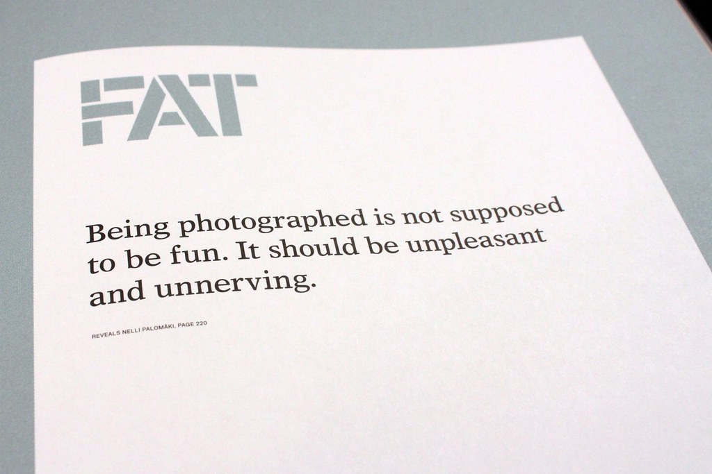
Magazine of the week: FAT
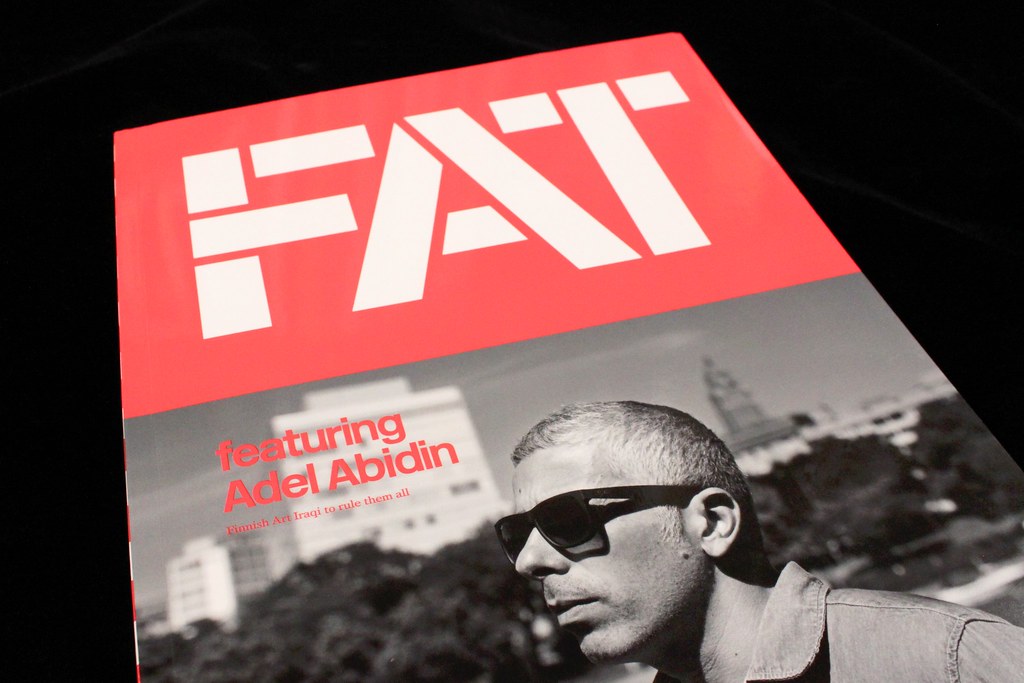
As a long-time follower of Helsinki’s Kasino Creative Studio it's a pleasure to highlight their latest publication, FAT. That's both Finnish Art Today and Famous Art tomorrow, typically light hearted linguistic touches that sum up this exciting new magazine. The name also reflects the physical presence of the new project. Compared to their first project, the sadly missed Kasino A4, it is indeed fat.

Whenever I photograph a magazine of the week I try to present its whole character in a few shots, yet on reviewing these pictures I realise hardly any art is present. And FAT is a magazine about art.

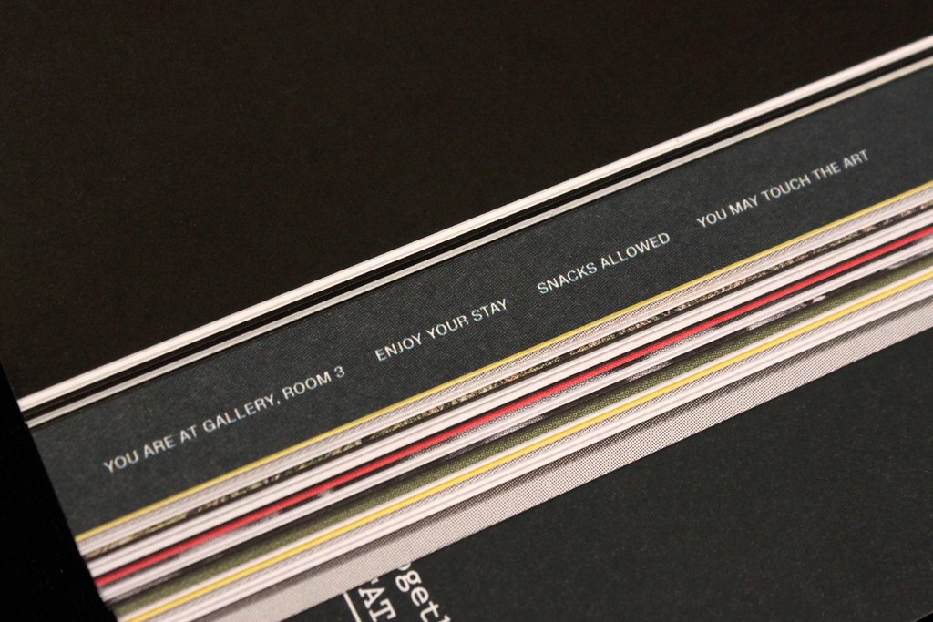
This might be an subconscious oversight on my part, one that shows how much of the magazine is an artistic statement in its own right. There is plenty of art among the pages, with three sections set aside as gallery spaces (above). Spread among the busy intervening pages the art stands out for its simple, clean presentation. The clutter and throwaway nature of much of the content provides the perfect context for the art. These pages also provide space for the Kasino team, led as ever by Pekka Toivenen (‘art dictator’) and Jonathan Mander (‘text designer’) to play with the magazine as form.

From the opening page, with its, ’Oh you’re here already. Just a sec, I'll make myself presentable,’ welcome, the reader knows they're in for a different type of magazine experience. The introduction letter (above) takes this chatty attitude further and promises the magazine and team are ’aiming for your heart’, while small notes at the start of each of the gallery sections (below) subvert the regular etiquette of galleries, advising that ’Snacks are allowed’ and ’You may touch the art.’

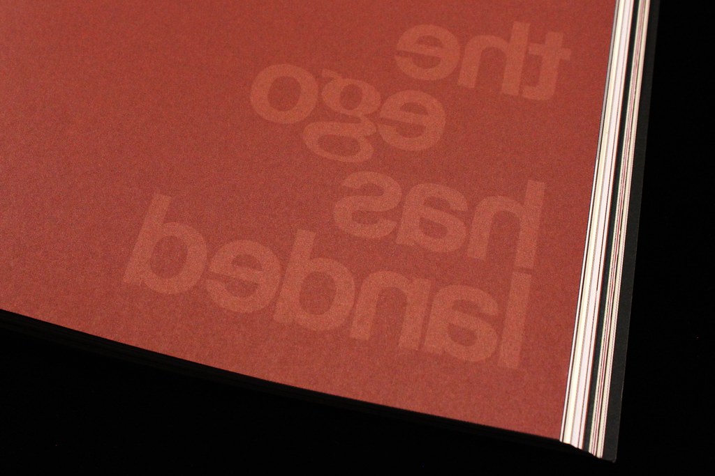
The issue features some bold typographic touches, such as this book ending of a feature with an inverted repeat of the headline (below).
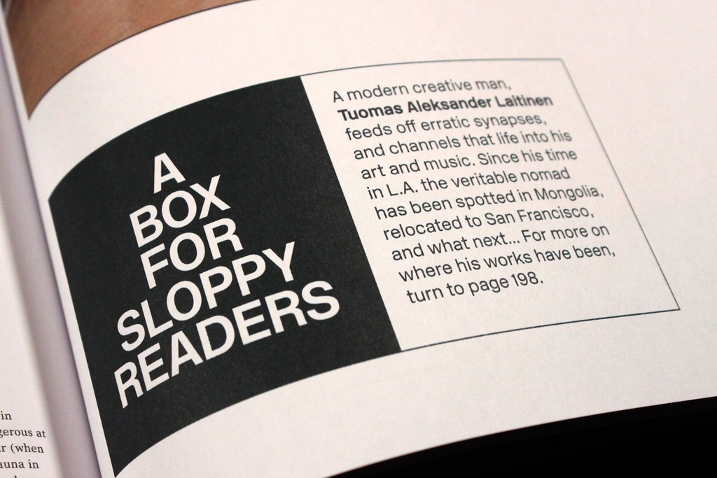
But it’s the linguistic tone, and its application on the page, that wins you over. Tinkering with magazine conventions can easily become overbearing and irritating but in these hands it’s done with such charm that it becomes both clever and enjoyable. Take the explanatory boxes (one below) that appear alongside many of the texts. Such editorial devices are common today, but the title and use of ‘Sloppy’ gives a knowing nod to the convention and to the editorial process that brings about such devices.
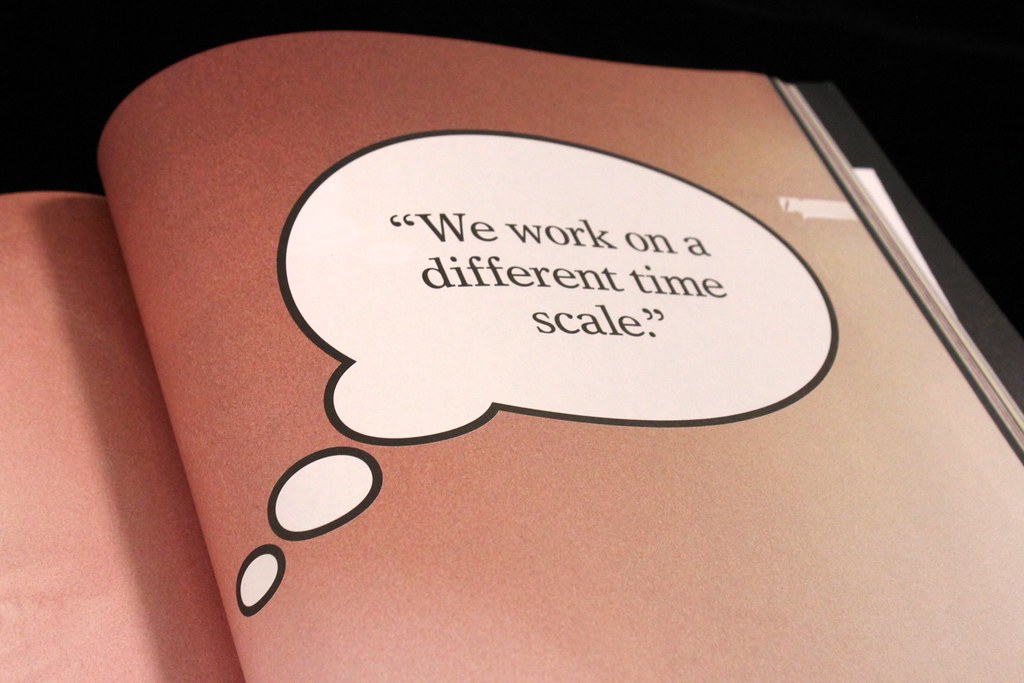
The same can be said for the double-page punctuations in the form of pull quotes from other parts of the issue (above)…
…and the use of comic book devices to lighten the design.
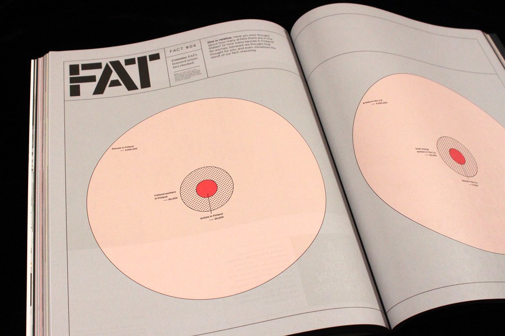
No magazine is complete without some infographics or data visualisation today, so we get some absurdist information using these techniques. Here we learn about the different ratios of saunas to artists in Finland and the USA. Who knew?
And yes there is art and analysis of art too! The publication is in part a catalogue for a show earlier this year at Helsinki’s Design Museum. Congratulations to them for supporting a publication that does its job while also examining how a magazine works, to the point of almost being an artwork in its own right.
I’m still digesting the whole issue – like all great magazines it takes some time to complete – but it’s refreshing to find this unique team of magazine makers back at their best, balancing the serious and humorous to create a really diverting publication. Melancholy is back! Sadly it’s only due on an annual basis.
Steve’s made a video of the issue, on the Stack blog now.