


Magazine of the Week: Mid Century
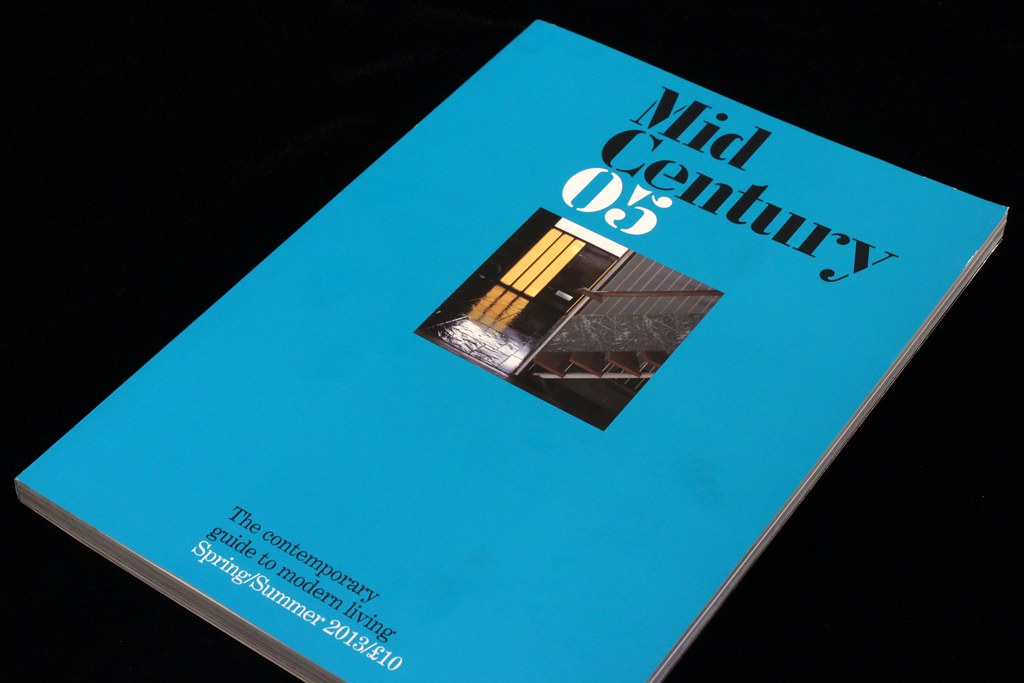
The difference design can make! When I reviewed Mid Century last year the gist of the post was great content, shame about the design (sadly that review is one of the victims of the hack earlier this year). Now issue five is here sporting a brand new look from Esterson Associates, and the layout and art direction have been properly resolved.

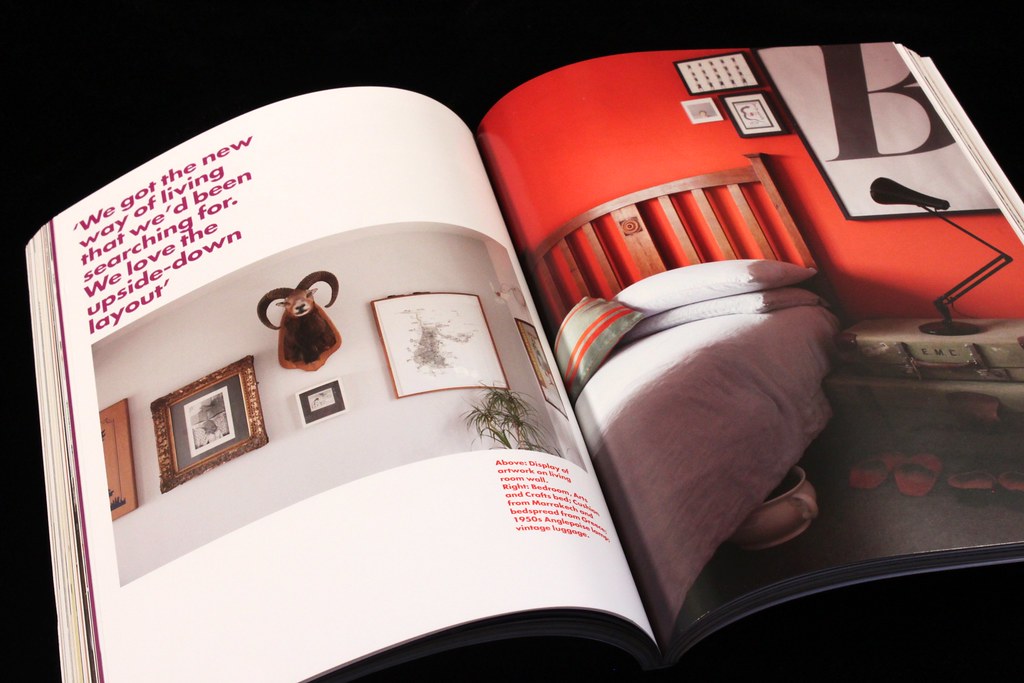
Simon Esterson and Holly Catford have provided a modernist design that is a perfect foil for the content. Features open with Futura headlines on fields of colour taken from the subsequent room shots (above, below).
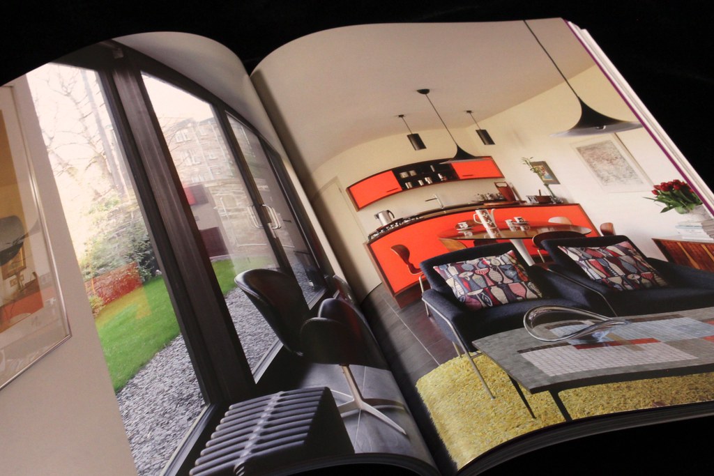
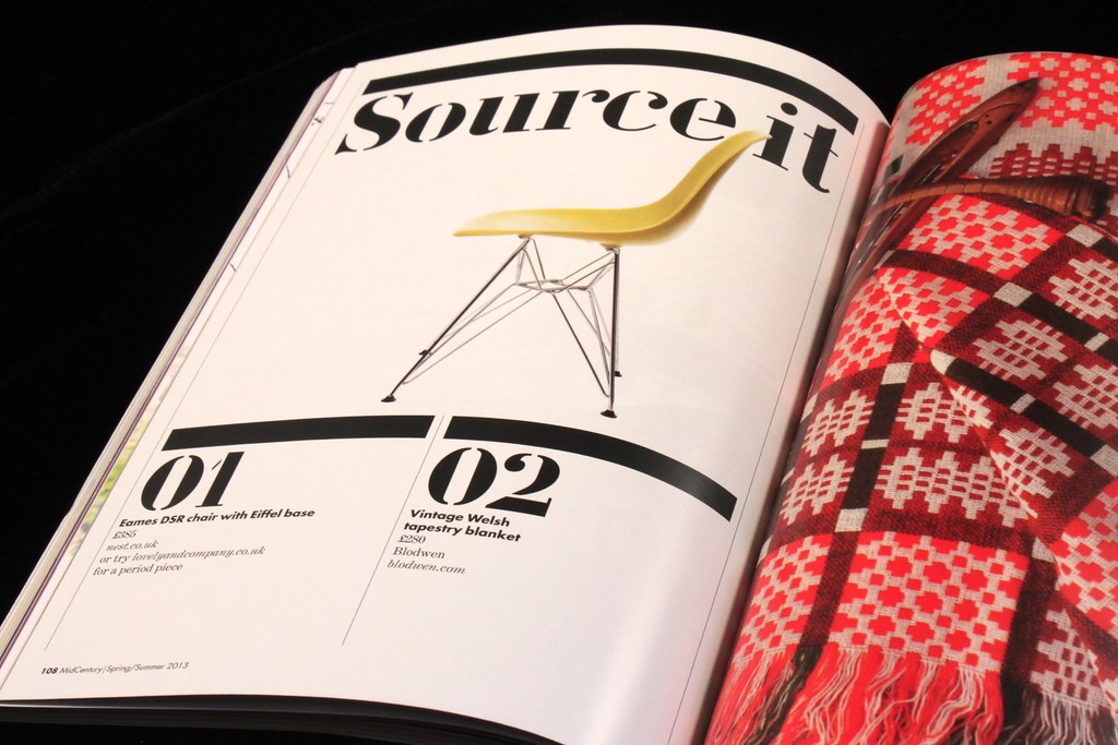
This allows the photography to be take up whole spreads without interruption, particularly important in the tight 170 x 240mm format. Like the headlines spreads, pull-quotes take their colour cue from the images, while the lengthy picture captions stick to a dark cyan.
 .
.
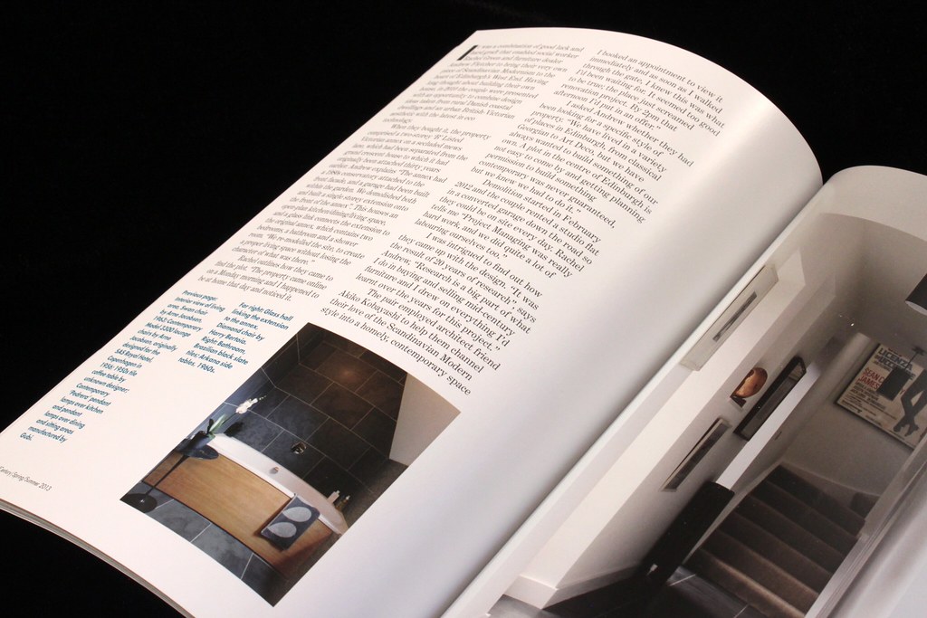
These typographic elements all work efficiently in the service of the photography, which is rightly given the visual lead. Anyone used to Esterson’s work on Eye (not to mention countless other publications) will recognise the deceptive ease of the design. Every page works to a tight grid with text and image carefully proportioned and neatly fitted. It is far harder to achieve than it looks, as is demonstrated by the shift in quality between the previous iteration and this one.
The back section adds the stencil font used for the masthead on the front cover, and in this issue features a wonderful set of samples from the recently discovered archive of British designer Sheila Bownas (below).

Stephen at Fonts In Use has posted a roundup of the fonts used in the redesign here.