

Magtastic 5: Books for magazine people

Andrew Losowsky surveys recent magazine-related design books
In my day job, I'm currently the Books Editor at The Huffington Post, and I even have a book of my own about to come out, ‘Fully Booked’ (Gestalten), about how print book design has reacted to the rise of digital media. So it seems appropriate that I take a look at a few books that have come out in the last 12 months or so, which might interest the discerning magCulture reader.

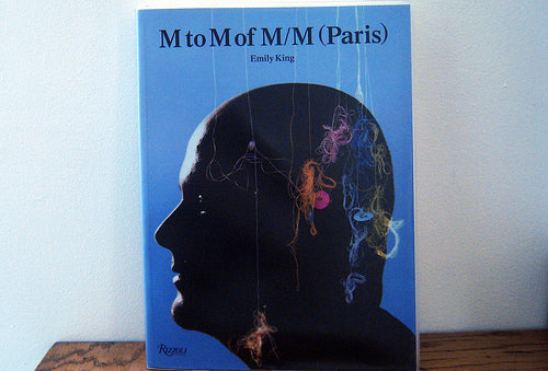
‘M to M of M/M (Paris)’ (Thames & Hudson) is a monograph of work by the French design duo Mathias Augustyniak and Michael Amzalag. In the magazine world, they're known for their work on Purple Fashion, Arena Homme +, French Vogue and five turbulent months following Fabien Baron on Interview, though they're perhaps more broadly prominent for their collaborations with Björk, their posters, their bizarre typography and their distinctive hand-drawn illustration.

This large-format, softcover book was designed by the Graphic Thought Facility, and it opens with some design trickery. There are no copyright pages or contents, merely an interview with one of the pair. And then you realise that this is page 311, and that the successive content runs alphabetically from M-Z, following which the book actually begins, a little under halfway through.

The title provides the hint to this puzzle. This is an alphabetical survey, divided into two like a deck of cards cut at the letter M, a typically witty response to their highly mannered work. Love or loathe it - and personally I find myself vacillating between both poles depending on the piece - this is an important survey of a highly influential contemporary design pair. The book also contains interviews with frequent collaborators, as well as M and M themselves, who stare at each other on the front and back covers of the book.

‘The Art of Making Magazines’ (Columbia University Press) is a natural fit for readers of this humble blog. This isn't a how-to guide, but rather a compilation of lectures delivered at the Columbia School of Journalism by some of the leading figures from the past 20 years. Some feel aimed more directly at undergraduates than others, but Ruth Reichl's recollections, and an explanation of factchecking at The New Yorker are worth the price alone. Some in this book are nostalgia pieces, others bang up to date, but pretty much all are worth reading if you're interested in the personalities behind the mastheads.


‘Page 1: Great Expectations’ (GraphicDesign&) set 70 graphic designers the same typographic challenge: design the first page of Dickens's Great Expectations any way you choose. Participants included Wallpaper*'s Tony Chambers, Winterhouse, Luke Hayman at Pentagram, Erik Spiekermann and Spin, and though some are along very similar lines, there's plenty of variety in the selection. An opening spread to each details the thinking and font choices behind every design. I love these kinds of design challenges, and the results are sometimes more revealing about their thinking than the designers might have intended.


‘Graphic Design Before Graphic Designers’ is a fascinating survey of printing technology and trends between 1700 and 1914. There are two paper stocks in this book: a matt, colored paper holds essays about physical, technological advances, while the silkier white finish is reserved for the immaculate reproductions of these often-amazing pieces of print ephemera. These are designs that would never emerge from anything Adobe, perhaps the strongest reason to spend quality time examining each spread.


‘Petrochemical America’ (Aperture) is a curious collaboration between the photographer Richard Misrach and architectural designer Kate Orff, focused on a 150-mile stretch of the Mississippi known locally as 'Cancer Alley' due to the ecological effects of the area's petrochemical exploitation. The book is divided in two; Misrach's haunting photographs open the piece, showing an area choking and dying even as the industrial complex increases its output. Orff's drawings and maps then powerfully give context to what you've seen. Though some of the data can get a bit overwhelming, and a few of the photo collages are a little misleading, overall this is a persuasive and shocking piece of graphic journalism for an area that bore the brunt of both Hurricane Katrina and Deepwater Horizon - but remains most severely affected by the effects of continual environmental degradation by heavy industry. It rewards close reading, as depressing as it is, to understand the various graphical methods used.
Also worthy of note: ‘Violentology’ (Umbrage), a remarkable book of photos about Columbia's internal conflicts that was printed on newsprint at the rotary press of a prominent Columbian newspaper bombed by Pablo Escobar - its production became part of the story; Laurence King has created a mini new edition of Rick Poynor's excellent 2003 survey of post-modern design, ‘No More Rules: Graphic Design and Postmodernism’; ‘Journalism’ by Joe Sacco (Metropolitan) is worthwhile not only for being a survey of Sacco's unique graphic journalism, but also for the stories of the commissioning magazine and newspaper editors behind each piece; ‘New York Nights’ (Gingko) is a nighttime look at independent stores and diners across the five boroughs of the city that never sleeps, while interviews and research add depth to James and Karla Murray's deceptively straightforward images; ‘Pulp! The Classics’ is one designer's fantastic repackaging of stories in the public domain; Chris Ware's ‘Building Stories’ (Pantheon) is quite simply terrific, as Jeremy already described. ‘LX60’ is a beautiful book about Lisbon in the 1960s designed by AdWeek art director Nick Mrozowski - it's all in Portuguese but you can see some pages here. ‘Curiosity and Method’ is a stunning anthology of strangeness from Cabinet magazine