

New York Times Magazine, 4 May 2020
The extent to which a magazine is free adapt its masthead to suit a particular cover story is an ongoing debate. How much is a magazine brand an exact masthead rather than an attitude?

During last week’s Instagram Live conversation, Simon Esterson shared for us some of David King’s suberbly flexible City Limits covers. Although that magazine’s name was always presented in the same stacked lock-up, it moved across the page, appearing in different sizes and often in repeat patterns. The identity of that magazine was more than its masthead: it was the playful exuberence of raw CMYK colours, coarse halftones and bold rules and star dingbats. I remember spotting it on newsagents shelves for its colour and vivacity rather than masthead.
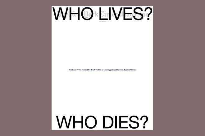
I was reminded of this by the cover of yesterday’s New York Times Magazine. Not literally – the cover (below) is a stark monochrome design consisting largely of clear white space – but because of the freedom the creative team are allowed to favour a poster-like idea above simple masthead recognition.

The graphic power of this cover is two-fold; the headline is dramatically pulled apart to emphasise the divide between the two groups being discussed, and the resulting space hints at social distancing rules. But the key element that makes this cover special, is how the first question has been pushed so far up the page that it obliterates the masthead. It conveys extremity.
Design director Gail Bichler told me, ‘The two questions being on opposite ends of the cover makes a point. But I’m not against running lines over the masthead as a way to add tension to the cover or make an unexpected design. Those things have less to do with content, but they’re important too.’

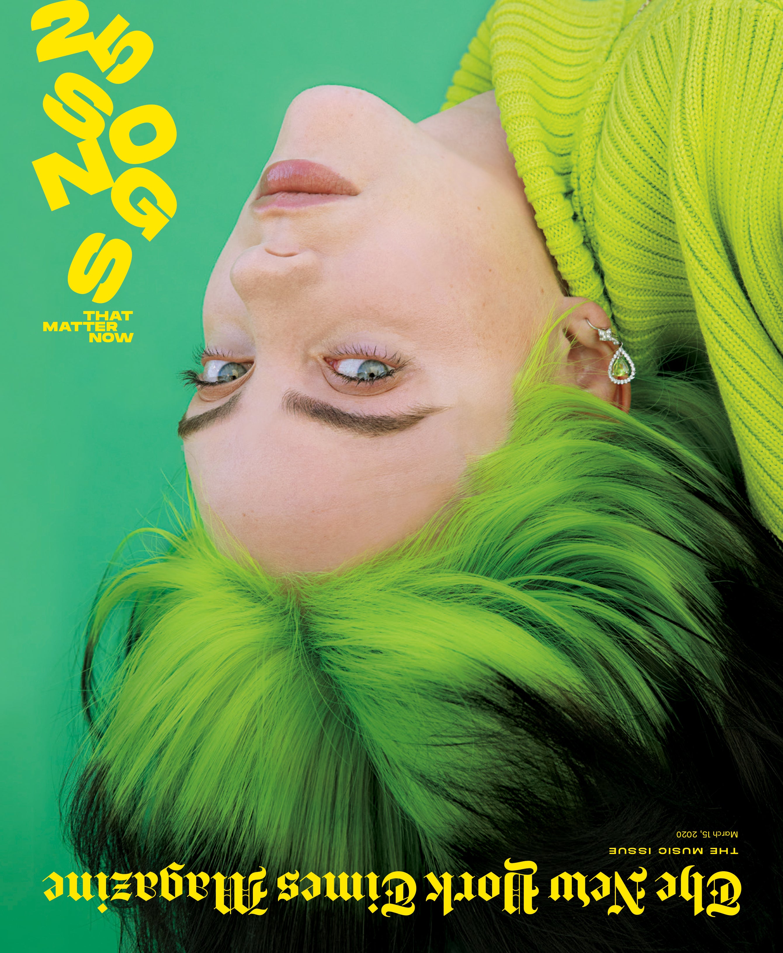
The magazine has a track record of using it’s own masthead like this. Gail took a look back through the archives for us and identified the first instance back in 2013, ‘But we really started to use it as a consistent part of our visual vocabulary in 2017.’ She shared the above cover as a favourite early example, from July 2016.

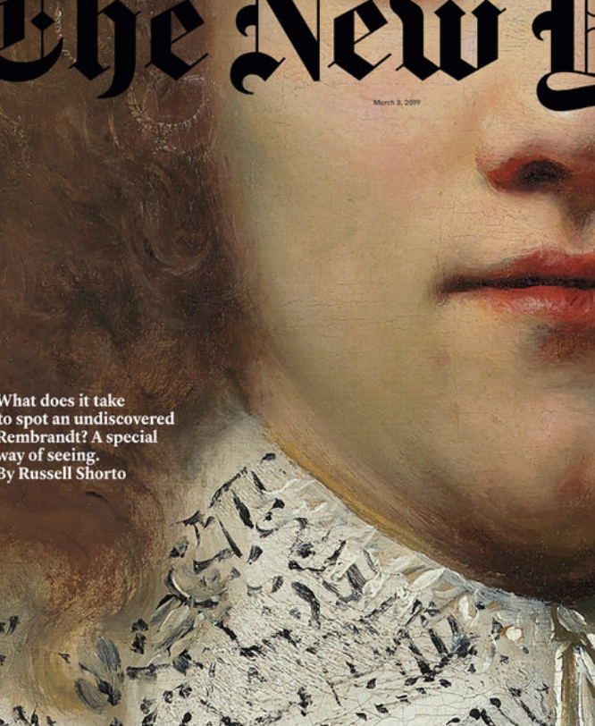
‘In recent years we’ve played with our logo more and often used it as an element to further the design. At points we’ve moved it to a different location on the cover, changed it’s scale or orientation, zoomed in on it super close, broken it up, pushed it partially off the page, made it transparent, almost covered it entirely, and—as you point out—run headlines over it.’

Most New York Times Magazine covers retain the standard masthead in a common position, but the option to bring it into play remains, and not only for news investigations. ‘It’s not reserved necessarily for particular stories or angles,’ Gail explains, ‘We usually do these things in service to a message. There aren’t rules about what we do to it, but we try to be purposeful in the ways that we use it.’
Being able to use a masthead in this manner is as much as anything a matter of confidence. Other magazines that could claim major brand status have toyed with their mastheads – cover stars interacting with the letters of Vogue or Elle for example.
But unlike The New York Times Magazine, which is distributed with the newspaper, these titles have to sell on the newsstand. Gail ackowledges this but points out, ‘We still need our readers to understand what they’re looking at when they pick up the magazine. The logo is a necessary piece of branding, but it can exist in a subtle way and still be effective.’ Which takes me back to my original point: a magazine’s identity is more than the typography of its masthead.
‘We’re very lucky in that we’ve never gotten any pushback from our editor or anyone else at the Times,’ Gail adds, ‘There’s an understanding that our publication is very design forward. And our editor, Jake Silverstein, is willing to take risks to make something compelling.’
That willingness pays off as magazines rely more and more on social media to promote themeselves. Wrapping up image, masthead and text into one poster-like shot of energy works well online, allowing the cover to become a story in its own right.
The New York Times Magazine team even share a weekly ‘Behind the Cover’ video opening up the process of creating the cover and sharing steps along the way to the final design. These give fascinating insight into how tightly linked journalism and design are at the magazine.
Watch Behind the Scenes of the Who Lives? Who Dies? cover.
Design director: Gail Bichler
Art director: Ben Grandgenett