

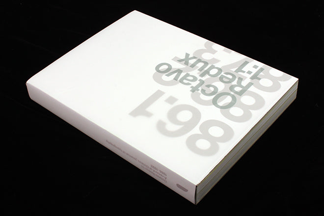
Octavo Redux 1:1
A recent visit to the ever-growing Hyman Archive last week (it’s reached 160,000 magazines now) reminded me of the unique role magazines have in recording our visual culture. Every issue of a magazine is a unique reflection of its time, and it’s not just the ‘classic’ spreads that end up on repeat online and in design book overviews that count. Seeing every page of the magazine gives you the full picture, the highs and lows.
This beautiful new book from Unit Editions delves even deeper as it looks back at the complete eight-issue run of 1980’s/90’s design mag Octavo.

Funded via Kickstarter at the end of last year, copies began to land on desks a few weeks ago. The 384 pages are sized to perfectly contain 100% scale reproductions of the original magazines, and bound in a hard-back volume with full mirror chrome finish and tracing wraparound. A typically flambouyant Unit Editions book, but for this time level of finish reflects exactly the work presented inside.
Octavo was a design magazine produced by radical graphics studio 8vo between 1986 and 1992. Looking at the designs today, ‘radical’ may seem innappropriate, so familiar are we with contemporary iterations of Swiss modernism. Yet when it first appeared, the magazine (along with the studio’s other output) was quite different to other graphic design of the time.
This was the era of post-modernism and the design/style explosion that grew from The Face and Blitz into the yuppie eighties; I was still rebelling against my LCP typography tutors, for whom Swiss modernism was the benchmark. The record sleeves of Peter Saville and Vaughan Oliver (subject of another upcoming Unit book) were our generation’s benchmark. The relative austerity of Swiss modernism, along with their disdain for the nascent commercial graphics world, seperated the three 8vo principals – Mark Holt, Simon Johnston and Hamish Muir – from students and professionals alike. An absurd appearance on a BBC2 arts show cemented their outsider status, as did their concurrent redesign of the American Express charge card bills.
So, as I switched from studying to working, Octavo should have been quite irrelevant to me. Instead, as one of the only magazines at that time doing something different, it was a rare indulgence. I would pick up copies from Ian Shipley Books on Charing Cross Road and covet the extraordinary quality of paper, print and finish. The designs and content sat well alongside the concurrent issues of Emigré I had begun collecting, although that title couldn’t compete in tactile terms and concerned the new world of what was then called desktop publishing.
As the new book demonstrates in deepest detail, Octavo’s level of design detailing was achieved using pre-Apple technology.

It opens with a lengthy interview with the founders, in which they discuss their passion for Swiss design, before the main meat of the project: the spread-by-spread reproduction of every page of each issue of Octavo. The blurb for the book promises ‘it’s now possible to ‘own’ all eight issues and to enjoy them at actual size,’ which is exactly what this section delivers (book shown alongside original magazines, above and below).

The 8vo team shot each magazine page-by-page. Working with photographer György Kyrossy, they shot 300MB files at 575dpi to achieve the highest detail possible. ‘We did several test shoots and took them through to wet proofs on the correct stock on the final production presses,’ Hamish Muir told me.
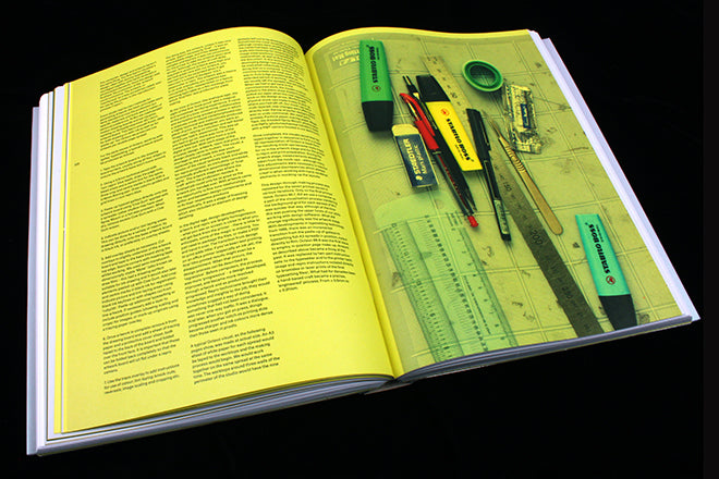
‘We didn’t know whether to scan or photograph at the start – György had some experience of the former and advised against it.’ They shot press sheets from the original magazines (Mark had them safely stored in flat files), and after minimal post-production printed the book at Swedish printer Göteborgs Tryckeriet using a hybrid print system, ‘It’s printed offset in 4 colours but with RGB full-spectrum cold UV inks and stochastic screening,’ explained Muir, ‘plus a soft neon yellow special (above) for the uncoated section and gold on the coated sections.’
This section ends with a full series of screen reproductions from the eighth issue of Octavo, originally published in the then exciting new CD-Rom format. No longer viewable in electronic form, these images turn out to be the lowest-resolution ones in the book (above).
One curiosity is that the seven print issues are reproduced in full with the exception of the actual front covers that originally lay beneath tracing paper dust jackets. ‘We couldn’t see a way of doing it without resorting to fold outs or inserts, or playing mind bending games with the pagination,’ explains Muir, ‘In the end there was some cold logic brought to bear which said it’s only about reproducing each view – you can’t interact with the materials, it’s not a facsimile but a representation.’

Book and page from original magazine


The second half of the book shows how the magazines were made. The original layout mark-ups and printer’s mock-ups are treated to the same level of reproduction (above), along with corrected proofs littered with red instructions, ‘ENSURE SAME LINE BREAKS THROUGHOUT!!!’, ‘MOVE NUMBERS TO RIGHT 0.15mm AND UP x 0.2mm.’
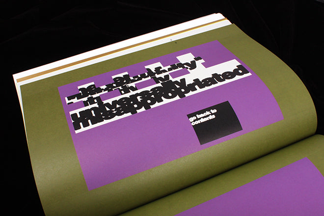
The fanatical completist will be satisfied to find complete sets of promo postcards, subscription cards and design press ads. Everything to do with Octavo is included — they were exacting archivists — and is sympathetically presented on pages designed by the 8vo veterans.
Anyone who knew the magazine first time round will appreciate this book. And if you didn’t know it, you can enjoy a deep journey into a very specific world of design and production that reflects not only lost production methods but also the extraordinary passion that making your own magazine can invoke.
The book shown at the top of the post is the Kickstarter edition; further copies are available from a few shops, including magCulture, featuring a green cover.