

Out now: Conveyor #6
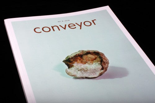
 Conveyor has been around for a few years, a magazine produced by print studio Conveyor Arts, whose aim is to re-imagine the possibilities of contemporary photography publications. As a press that makes zines and beautiful books, the magazine team naturally have a fine eye for print and the materiality of an object, and Conveyor is crafted by hand. For this issue – the Alchemy issue – art directors Elana Schlenker (the mind behind Gratuitous Type) and Christina Labey decided to print, bind, foil-stamp and smyth-sew the publication themselves, and when you hold the magazine, you can tell it’s something special.

The alchemy theme is a metaphor for analogue photography and the process of transforming chemicals into an image. The magazine therefore similarly relies on the idea of transformation and the aura of materials, experimenting with these ideas in the publication’s design and content. A custom typeface slowly transforms from a sketched and skeletal shape (above) into a rounded and complete form (below) as you progress from the beginning of the magazine to its end. The typography, called Conveyor Favorit, was invented by Johannes Breyer and Fabian Harb of studio Dinamo. The chapter headings of each section progress over the pages into their completed form – so as the magazine’s concept and content crystallises in your mind – so do the letters on the page.


A spread at the back highlights the thought process behind the typography (above), and the accompanying text explains the concept further: ‘The type seen here evolves throughout the issue in a process inspired by the four stages of the magnum opus, an alchemical process for producing the Philosopher’s Stone.’
 Conveyor doesn’t leave any stone unturned – I eventually realise that the page numbers have also been subtly undergoing the typographic transformation as well (above, below), and if you flip through them like an old photographic flip-book, you can see the change take place like a magic trick. This invitation for playful experimentation with the magazine-as-object celebrates the thing-ness of the publication.


An article at Conveyor’s beginning entitled ‘Document and Metaphor’ takes the alchemy metaphor even further, and is almost an essay-shaped manifesto for photography today (above). In a world of selfie-sticks and devices constantly recording, capturing and captioning, Jeremy Haik calls for more uncertainty, mystery and fluidity – more ambiguous, shape-shifting alchemy – in photography. Instead of images that record reality, the piece insists that photography should create its own ambiguous reality.

A feature with a futuristic twist on the classical elements of earth, water, fire and air has pixelated icons decorating the page (above). These allude to the digital but also evoke the earthy and mystical, graphically folding together two of the magazine’s threading themes.
Whilst the idea of championing the haptic quality of a printed publication is often evoked in independent magazines, Conveyor re-interprets this idea in a way that isn’t obvious, and it stretches the concept to curious and unusual new lengths. The design enjoys experimentation, and the publication transforms the meaning of ‘alchemy’ into something of contemporary relevance. Conveyor relishes the tangibility of objects, and it emphasises the importance of the intangible in photography.
Editors: Dominica Paige, Jeremy Haik, and Liz Sales
Review by Madeleine Morley