

Perrin Drumm, writer and editor
Last month we launched ‘Issues’, our new Friday feature where we take a look through the magazine stacks and shelves of various magaholics. We’ll be speaking with readers from all areas of the creative industry, asking them about their favourite magazines and getting them to select three publications to share with us on the journal: a new one, an old one, and a detail that they particularly admire.
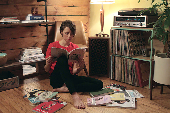
To start the New Year, we’re in NYC’s Brooklyn visiting Perrin Drumm, the editorial director at AIGA who launched the Eye on Design blog just last year.

When we contacted Perrin about the feature, it was perfect timing as she’d just gone magazine shopping as she explained in this quick note: ‘I was just at Berlin’s do you read me?! for hours having a real kid-in-a-candy-store moment, so I’m in prime condition to tackle this column. My levels are all topped up.’
 What I’m reading now: The Idler, no. 47
While I was there I perused all the fan favorites that I’m sure are so familiar to magCulture devotees they’re not even worth listing (just see the nominations for The Stack Awards), plus all those lovely, zany numbers you only discover in magazine shops that go real deep. Those were fun flings, but I recently discovered a new love that’s quickly become a steady bedside companion. It’s The Idler. You guys are British so probably this is snooze news for you, but chances are high that my fellow Americans won’t know it because I don’t think it’s sold anywhere over here. And really, it’s so effing British I can see why.
If you’re on the look out for bright covers, cheeky editorial, and bizarro seamless-and-still-life art direction, you’ll completely miss The Idler, a real book of a magazine that’s maybe best described as the gentleman’s guide to loafing respectably. Fitzgerald would’ve had a field day with it. The latest issue is a hefty, pricey, dark green clothbound, hardcover book with a title set in gold Bembo; it’s all black-and-white and there are hardly any pictures.

But it scratches a real itch for me. At a time when independent magazines seem to skew more niche each month, The Idler is broad as hell and unabashedly devoted to the longform. Yet it’s not dull or super-serious, even though the first hunk of pages are laid out like a dictionary and the rest like a novel, a choice as intentional as lines in the editor’s letter like: “One of the problems with the idle life is that holidays tend to go by the wayside.”
The same editor goes on to describe how he filled his “middle-class” vacation by reading Boccacio’s ‘Decameron’ by the pool, playing backgammon, and taking naps—all of which I find utterly hilarious. This is followed by essays on Alan Watts, Nietszche, Orwell, and weird and nerdy topics like the hours one really ought to work and new modes of self defense (in this case, an Edwardian martial art that’s equal parts jiu jitsu, sword-fighting, and boxing). In short, everything you could want in a paper-bound companion meant to last you the next six months, or whenever they get around to publishing the next issue.
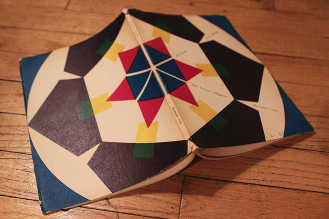 An old magazine I keep around: The Yale Literary Magazine, December 1958
This was a gift from my grandparents when I was knee deep in lit mags back in school during my days as an intern at The Paris Review, and it’s pretty much everything a young writing student with a penchant for design could hope for. The bold, graphic cover is by a little-known designer named Herman Reller, whose work holds up to contemporaries of his like like Ladislav Sutnar and Paul Rand, even if it’s largely overshadowed by them. This issue is all about Ezra Pound, and I was probably taking Intro to Poetry at the time, so seeing “Canto C” in print the year Pound was declared incurably insane was nearly as good as it got for me. There are some amazing writers in this issue as well as a unique “calligraphic drawing,” but I’m not ashamed to say it’s the cover that secures its prime shelf status after all these years.
 Best spread: The Outpost, issue 06
No doubt you have the latest copy of Beirut’s self-described “magazine of possibilities” on your coffee table right now, and for good reason. The quality and originality of The Outpost has been lauded from magCulture to Stack and well beyond. Yet if someone had come to me and said, “We’re going to do an issue dedicated to various organs in the human body, and for the cover we’ll run a black-and-white picture of an old statue,” I would’ve wished them luck and counted down the days to their demise. Luckily, I love being proven wrong, and founder Ibrahim Nehme has done so in spades.

Admittedly, I might be partial to salmon-pink paper covered with red type, but mostly I love what art director Hicham Faraj did for the section openers. When I flipped this issue open on the subway into work one morning and saw how the various bodily systems (circulatory, respiratory, immune, skeletal, et al) had been photographed using household objects—an inflatable pool tube (above), an extension cord, a feather duster, a jump rope, a plant—I broke out in the giddiest grin. Another art director might have gone the fashion-y photography route, or perhaps turned to illustration (all fine choices), but I like to think Faraj was given one afternoon and $25 to figure it out, and what he did is really just so clever and unexpected, and it ties the issues together in a way most magazine section openers don’t seem to feel they need to.