

Robert Newman, creative director
This week we take a peek at the magazine collection of a long-time friend of magCulture. Bob Newman has been a key figure in the New York publishing world for several decades, designing a broad range of magazines including Village Voice, New York, Details, Vibe and Entertainment Weekly. He has been president of the SPD and continues to help judge their annual awards, and his various Newmanology channels on social media are a must-follow far anybody interested in magazine publishing. He is currently creative director at This Old House.

As usual, we asked Bob to select an old issue, a new issue and something special from his archive.
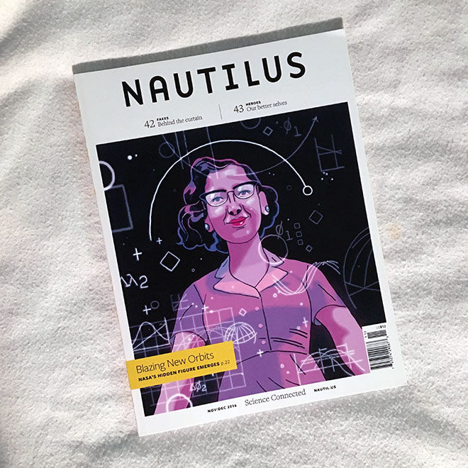
A new issue: Nautilus #17 (November/December 2016).
Apparently the publication of the new issue of Nautilus has been delayed for one reason or another, but that’s OK because it gives me more time to luxuriate with this one. Nautilus, along with Delayed Gratification, is my favorite indie mag to actually sit with and read. And reading this science-based magazine in the age of Trump feels almost like an act of resistance. Art director Len Small has made Nautilus one of the absolute best venues for rich and dynamic illustration. Like a quarterly version of The New Yorker (with much better printing), Nautilus features a brilliant and wide array of illustrators, both known and unknown (to me at least). In addition to the striking cover by Richie Pope, this issue features work by Brian Rea, Rebekka Dunlap, Dadu Shin, Nicole Xu, Harry Campbell, Julia Breckenreid, and Andy Friedman, as well as extended graphic pieces (really, mini-graphic novels, except that they’re fact-based) by Sydney Padua and Anders Nilsen. Each issue of Nautilus is a mini-illustration annual, displaying what is simply a state-of-the-art collection of imagery.
The design is crisp and modern and the typography and imagery works seamlessly with the content to create a print user experience (print UX?) that is a total treat. Len Small has a powerful graphic vision, and his genius lies in no small part with his ability to collect such a broad and diverse set of illustrators and still maintain a cohesive visual aesthetic. Reading and looking through Nautilus is a consistent joy, and I eagerly await each issue. It has become my go-to destination to find the best editorial illustration.
Additional shout-outs go to Fast Company and Smithsonian, both of which are relentless visual delights and the homes for a delightful mix of old and new illustrators.

An old issue: Homemaker, February 1963
I came across this vintage UK home DIY magazine when I started working at This Old House and was looking for some back-in-the-day inspiration. Homemaker is packed with diagrams, how-to stories, tools, and floor plans. There’s a masterful use of typography and restrained white space, but best of all are the hundreds of ads, many of them ¼ page or less, promoting everything from Damp Proof Floor Covering to the New DuraFlex Flip Flop Automatic Door Bottom Draught Excluder. At least half of Homemaker is filled with those exquisitely-designed, packed-to-the-brim, back-of-the-book ads that make a magazine junkie like me misty-eyed with nostalgia. I’m just glad I never had to produce any of those ads myself.
Oh, and I love the Gill Sans Homemaker logo!
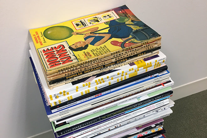
Just as inspirational has been the stack of late 80s magazines I stumbled upon a few weeks ago on a quiet street on Manhattan’s Upper East Side. Someone had been cleaning house, and discarded piles of vintage mags on the sidewalk, many still in their original plastic mailing wrappers and unopened. I grabbed many gems, but best of all was the premier issue of Conde Nast’s Traveler, from September 1987, complete with fold-out illustrated maps, multiple paper stocks and ridiculous amounts of lush illustration and photography, all masterminded by design director Lloyd Ziff.
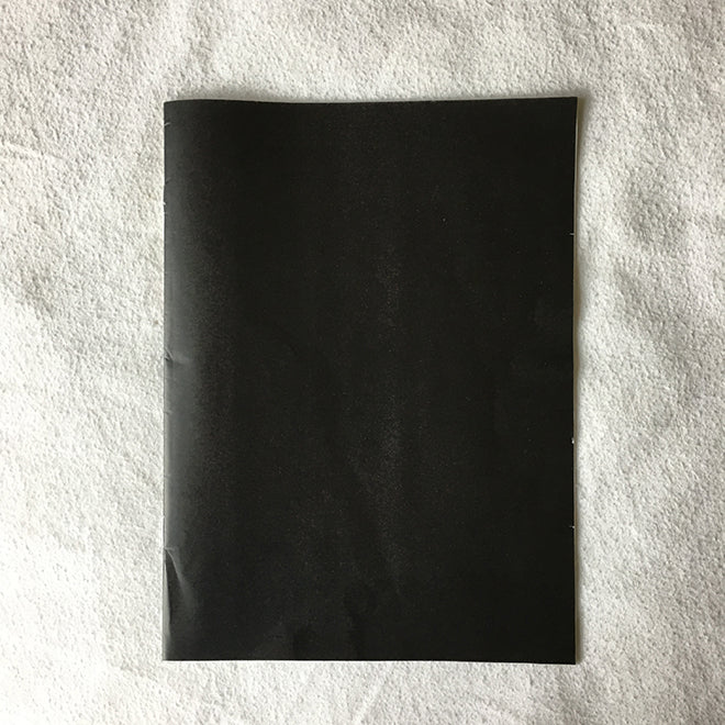
And another thing: ZEITmagazin, issue #3, 2017
ZEITmagazin did the cover I always dreamed of creating: all black, with no type or other identifying characteristics. ZEITmagazin is known for their double covers; the outside cover is complimented by another inside cover, which often creates a powerful graphic one-two punch. In this case, though, the front cover is perfect, and the inside cover merely an afterthought. Of course in my hyper-politicized mindset, I assumed this all-black cover was a commentary on the United States political scene. It’s actually a perfectly apt illustration for a story which my high school German tells me is about sleep problems. A brilliant cover for the ages created for a relatively mundane story… that’s great art direction!