

Spike #50
I love Spike magazine. The quarterly art magazine has been published since 2004 by artist Rita Vitorelli, and has just reached its 50th issue. It follows an idiosyncratic editorial direction – part of its strength is its refusal to follow the crowd, and the art mag shelf is a crammed one. It’s not easy to stand out, but Spike’s mix of written and visual essays brings a more curatorial than ediorial approach. And the main reason it stands out is its design.
For the last few years its design has been overseen by Mirko Borsche. The prolific Munich-based designer and his team are best known here for their creative direction of ZEITmagazin, and you can see touches of that magaizne in Spike. The magazine’s grid and typography has elements of ZEITmagazin’s restraint, particularly in the simple, clear way it separates the German and English text (the magazine is bilingual) using two and three columns respectively.
Elsewhere, though, the magazine acts as a bolder canvas for Borsche’s editorial design archeology. He has the ability to take graphic elements from other eras – in this case bold vertical column rules, seventies typefaces and clumsy changes of headline scale – and make them feel instantly contemporary. Other quirks come from the Mike Mieré school of clashing design: gradients fade behind text, images crash into text boxes.
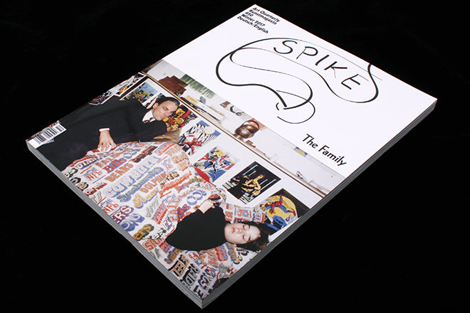
Such elements can be linked back to other magazines, but recent issues of Spike have featured variations on a hand-drawn logo that’s compeltely unlike anything else around at present.
All these things together make every issue of Spike a visual treat before you even consider the art. It’s refreshing to find a magazine of visual art that lets its designer off the leash, always a risk when dealing with the precious world of contemporary art.