

The California Sunday Magazine, April 2 issue
The California Sunday Magazine is a unique project. Produced in San Francisco by the small team behind Pop Up Magazine, it’s distributed monthly with local Sunday newspapers Los Angeles Times and San Francisco Chronicle — a clever model that provides a base distribution and allows them also to offer print subscriptions as well as a strong web version.

The magazine is editorially free of its host newspapers, and the editors take full advantage to publish big, bold photographically-led stories presented with a delightfully subtle touch by creative director Leo Jung. We’ve just caught up with the latest issue of the magazine, and share some of these design touches as we highlight it here as our Magazine of the Week.
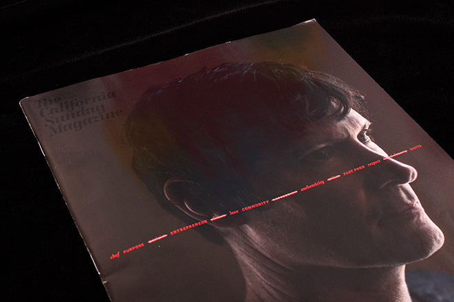
The cover portrait by Sasha Arutyunova of chef Daniel Patterson is slashed by a rare set of coverlines — the covers often only have a word or two but here the bright red words, some crossed out, describe Patterson without giving his name. The magazine logo, always a gentle presence, sits in black on the deep brown background (above).
Inside the cover there’s a tiny 60x30mm insert selling subscriptions (above), a fresh take on the common US hard-sell subs insert. In the proceeding Shorts section, headlines stick at about 20pt, sitting in open space with subtle colour effects (below). The layout of the whole magazine uses white space carefully without ever feeling empty, the elements of every page locking together in different combinations like a jigsaw. There’s a load of design thought thrashing away beneath these calm pages.


Even main features will use a similar size of headline (above); this story, about the missing children of the Argentinian disappeared families, splits the headline across the spread to introduce a simple thematic design highlighting the central idea of the feature. On the left, ‘The Living’ sits below the intro text; on the right ‘Disappeared’ sits below a set of pale blue strokes that echo the shape and position of the intro text on the left. The text itself has ‘disappeared (close up, below).


The same device continues sparingly thoughout the 14-page story.

Later in the issue, the headline for a piece about a flooded canyon echoes the opening photograph (above), and again the idea follows through the article (below). It’s subtle but very effective, and ehanced by the otherwise simple, spacious design of the pages.


That simplicity extends to the occasional diagram, like this map (below), which sits unboxed in open space with a satisfyingly pared-back graphic style.

All this graphic hush means that a louder approach really stands out when needed. A piece about golden eagles (below) suddenly shouts at the reader, but even here there’s a subtle undertow. Look closely at those big bold headlines to find tiny words carrying credits and the intro nestled like birds on a tree.


The issue finishes with the other end of the subs insert and a gentle thank you message (below).

I’ve wanted to highlight The California Sunday Magazine here for some time and it’s a pleasure to finally do so. The magazine regularly wins design awards, and I hope this brief set of pages gives a clue why. It’s refreshing to find a large project like this created by a small publisher with the confidence to be so calm and distinct in its approach to storytelling.
Read our At Work With interview with Leo Jung