


magCulture Live, London 2019, part two
Our report of the second half of magCulture Live, London, 2019, which took place at Conway Hall on 7 November.

Over lunch our longstanding friend and collaborator Cath Caldwell invited our audience to join her magazine-handling session, with a collection of titles matching the days theme (above). This has become a popular and vital part of magCulture Live. Being able to flick through some of the magazines our speakers show on the screen is a positive reminder of the essential, tactile nature of the real thing.

The first afternoon session saw French art director Serge Ricco present his redesign of the long-established L’Obs. Previously known as Le Nouvel Observateur, the 2010 redesign pulled the news weekly into the modern age with an abbreviated name and a complete editorial and creative reinvention.

Serge’s work is rooted in the history of editorial design and he shared plenty of work that had inspired him, opening with his early collaboration with British designer Nicholas Thirkell on French TV listings magazine Telerama. Other references included early New York magazine, The Saturday Evening Post and Ms magazine.
He also included some great video material that fleshed out his story of combining these broader influences while digging into Le Nouvel Observatuer’s archive. An excerpt from John Oliver’s US TV show (above) was an amusing reminder of the struggle that traditional news journalism faces to maintain resources and standards, and footage of L’Obs being printed added a useful reminder of the process at the end of our edit and design workflow.

A couple of conceptual highlights included the definition of digital as ‘mono’ and print as ‘stereo’, and a grouping of readers into types of fish: the Shark as subscriber, spotting every fault and telling you about it; the Goldfish, who only wants blue skies and leaves if things become grey; and the Dolphin. This is the reader everyone wants. Clever, curious and likes surprises.

Serge’s talk was an inspirational yet realistic call to arms from an experienced editorial creative working in a country we don’t hear enough from. And anybody who can stand up and speak successfully in their second language deserves complete respect.

From France we moved to the US and one of Serge’s sources of inspiration. Jody Quon is perhaps the lesser-known of the three principals (alongside editor Adam Moss and creative director Luke Hayman) behind the 2004 redesign of New York magazine. She spoke at our 2019 NY conference and it was a delight to welcome her to London to reprise that talk. Anybody that heard it will have little doubt about here role in reinvigorating New York magazine.

From big, bold cover concepts to the more day-to-day details inside the magazine, Jody explained the role of photography director at the magazine. The work itself spoke volumes for her talent, but hearing her talk quietly yet authoritatively through her slides inspired further. One segment examined the role of Instagram as a research tool for the contemporary photo editor.

It was fascinating to hear of the internal struggles to get her Barbara Kruger commission for the iconic Donald Trump ‘Loser’ cover (above) into print, as well her championing of the Cosby Women cover story (below) that so nearly failed to make it onto the cover.

The internal discussions between photo director, editor and others will be familiar to anyone in publishing, and added a reality check to anyone who might have thought such heroic cover stories atuomatically proceed smoothly. Despite her quiet, gentle delivery it was clear Jody is a force to reckon with. Such editorial brilliance doesn’t just happen.


At the other end of the scale, Jody highlighted the importance of captioning with a detailed look at a special issue of the mag about marriage. She showed a series of portraits of couples and called out the single-sentence descriptions of each pair, explaining how the subtle use of words can add so much meaning to images (above).

After the break we heard from Charlie Brinkhurst-Cuff, head of content at gal-dem. Launched in 2015, gal-dem is an archetypal modern media company, encompassing a strong web presence with daily content, an annual print magazine and regular events and collaborations.
Where it departs from the archetype is in its campaigning role on behalf of women and non-binary people of colour. Charlie talked us through its development – ‘We’re a young publication, but our cultural impact is huge,’ – focusing on the growing team’s desire to change the make up of the media industry to better reflect society.
Highlighting the dominence of white male journalists, her presentation pulled no punches. Describing the website’s content, she highlighted Monday’s news digest, which sought to ‘Make the news bearable for our audience,’ and ended with an appeal to go away and work to help change things.

The risk with a project like gal-dem is that it appeals only to its core audience. Charlie highlighted a couple of collaborations that looked to reach further: their event at the Victoria & Albert Museum and 2018’s collaborative take-over of the Guardian Weekend magazine (above).
The magCulture Live crowd is pretty much 50-50 in gender but racially reflects our creative industries – there are never many people of colour present. It was great to have Charlie challenge that status quo; we hope plenty of those present took her message away and are considering how they can help changes things.
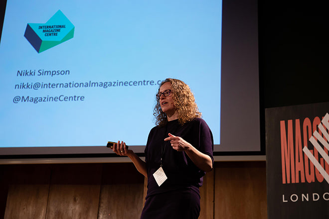
Next up was our second mini-talk, with Nikki Simpson introducing her ambitious plans for an International Magazine Centre. A fantastic advocate for magazines, she helped set up PPA Scotland’s annual MagFest day in Edinburgh, and having established the case for the IMC is now raising support and funds for a permanent magazine event space in the city. Check the website for full details.

The final speaker of the day was Matt Willey. A brilliant designer but often a reluctant speaker, we were thrilled to have him join us for magCulture Live. His departure from the New York Times Magazine to become a partner at Pentagram had not yet been announced, but this was his opportunity to sum up his career to date. He did not disappoint, opening with his personal journey towards graphics (via illustration and photography) and describing how he overcame his profound hearing problems. His humble approach to the personal made the work he showed all the more powerful.

Indie literary mag Zembla set him on course for a career in editorial in 2003; since that project, ‘there hasn’t been a single moment where I wasn’t working on a magazine project of one sort or another. Often several magazines at the same time.’ Plastique, Elephant, You Can Now, RIBA Journal… the work flowed by as Matt explained his approach.
‘I gravitated towards magazines because they offered proximity to other worlds; to writers and editors, to art and photography and film, and illustration, and music… Working on magazines allowed a certain amount of proximity to people and subjects that I knew I was interested in.’

This slide of a year’s covers of the weekly New York Times Magazine demonstrated the variety of design approach used
His recent work (2014-19) for the New York Times Magazine is a major part of one of the most extraordinary bodies of editorial design of recent times. The publication is a unique proposition, with a wide-ranging news/culture agenda that promises truth as it celebrates the best and challenges the worst. From week to week it jumps between these two poles, allowing its design team to respond in kind to the various editorial thrusts.
‘What we do is entirely in service to journalism - to great writing and reporting. To important stories.’

One of the last covers of NYTimes Magazine designed by Matt Willey, including his bespoke type design
The team he was part of – Matt was Art director, working with Design director Gail Bichler, Director of photograpy Kathy Ryan, Editor-in-chief Jake Silverstein and a host of other designers, editors and specialists – have advanced the magazine’s already creatively-led identity to build a unique playground for editorial innovation.
‘I’d spent a decade on small magazines, a lot of which had been start-ups, where the teams were just a handful of people. So this was/is about as different from everything I’d been used to as you could imagine.’
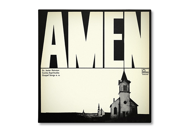
Brilliant though the work we saw was, the most revealing parts of Matt’s talk were where he discussed influences, such as this LP sleeve (above). ‘This is a record I own, I don’t know the name of the designer. It’s one of a thousand different examples I could have picked of type being great, but technically wrong…’
He went on to describe his joy at the flaws – the heavy strokes of the ‘N’ and ‘M’, arguing, ‘if you made this type technically more correct, it wouldn’t be as good.’ Seen in the context of his award-winning identity for the TV show ‘Killing Eve’ (below) this comment is all the more relevant.


Matt ended with a look at ‘The 1619 Project’, a unique series of publications, events and podcasts re-examining the foundations of the United States of America (sample spread from the magazine part of the project, above). I’ll quote directly his explanation for the project:
‘This had multiple parts to it and, on the day it became available, the first episode of a 5-part 1619 podcast series went straight to the top of the charts, becoming the No. 1 podcast in America. Two weeks after publication, when it was announced that 2,000 free copies would be given out at the Midtown headquarters of The New York Times, hundreds of people lined up on 40th Street at 9 a.m. to get a copy.
The project was celebrated online by Oprah Winfrey, Elizabeth Warren, Kamala Harris, and many others (and lambasted by Newt Gingrich). Beto O’Rourke mentioned it in the third Democratic debate. Chuck Schumer read aloud from it in Congress.
And then there are the schools. The motivation behind the project was chiefly educational, so the magazine arranged to convert it into free curricula for high school and college students, in partnership with the Pulitzer Center. In six days, the Pulitzer Center reported more downloads from its website of The 1619 Project lesson plans than of all other lesson plans in the previous year.
Today, just a little over two months after the issue was published, that curriculam is being taught in more than 500 school districts across every single U.S. state, including every single high school in Chicago. In Houston, educators are creating an official for-credit course based on the project that they plan to propose for statewide implementation.’
This was the perfect demonstration of our theme of the day, Making a Difference.
Save the date:
magCulture Live, London 2020, takes place on 5 November. Subscribe to the magCulture Weekly newsletter to be the first to hear of details.
Read our report of the first part of magCulture Live, London 2019, here.
Photography from the day by Dunja Opalko
We’re grateful to our partners for their support:


Thank you also to our media partners:
