

The Magazine of the Decade
I generally resist list-making of the ‘Top 10 of the year’ variety, but as we enter the new decade I’ve been wondering which single magazine might sum up the one we’re leaving.
As we always remind people, we love magazines here at magCulture, and that love crosses the useful but often arbitary boundary between indie and mainstream sectors. Which perhaps makes selecting one magazine an even crazier pursuit than compiling a Top 10; but the more I thought the more it became clear there was one magazine that really did sum up the 2010s.
That magazine is Bloomberg Businessweek.
There are several reasons why I’ve selected BBW, but first and foremost among them is because it made a mockery of the definitions of indie and mainstream. It took design cues from everywhere: part serious business title, with clean typography adopting modernist norms, and part anarchic mixing pot of internet meme references. Like the best indies, it reinvented its genre both editorially and visually as editor-in-chief Josh Tyrangiel and creative director Richard Turley forged a unique partnership.

For anyone thinking its crazy to sum up a decade with one magazine, I’ll double down and highlight the above single page as the page of the decade. It sums up BBW: a clean, functional piece of contemporary graphic design made brilliant by a deliberately awkward image crop and toilet wall graffiti writing. It is typical of the front section of the early 2010’s version of the magazine and of the project as a whole.
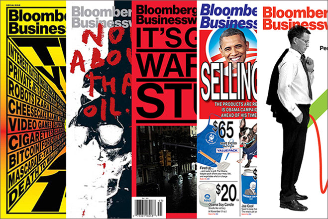
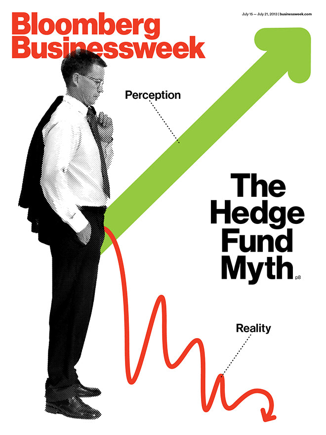
For the first half of the 2010’s, BBW ruled magazine design, each week’s cover spreading virally across social media (setting a new norm for attention) before winning every design award it was entered to. It was a magazine that shook out the industry, challenging norms while working with the best typographers, illustrators, infographic artists and photographers to ensure superb levels of execution. It turned up as a reference point in interviews with all types of magazine makers here on the Journal: from Christoph Amend to Gail Bichler via illustrator Cynthia Kittler.
A magazine of its time, then, something that I (and plenty of others) noted regularly. Reviewing its 2017 redesign, I wrote, ‘The crazy Tyrangiel–Turley days of the magazine happened at a time when the relative calm and order in the Western world was beginning to break down. This was a time of the big crash, and the powerful deserved puncturing with knowing winks at the problems in the system. In so far as a weekly business magazine could rebel, it did. But now we face the craziness of today’s world of Trump, Brexit et al. In a sense, our governments have unleashed the sarcasm and having-it-both-ways of the Tyrangiel–Turley era as mainstream devices.’

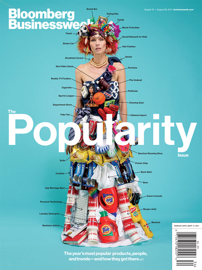
The annual Review of the Year issues (2010, above), along with special one-offs like The Popularity Issue (August 2011, below) and the Steve Jobs obituary issue (October 2011) were extraordinary pieces of editorial invention. Brilliantly planned and skillfully executed, they set a remarkable benchmark to match: urgent and spontaneous, yet expertly finished.
All of which, as I say, was noted at the time. Looking back the magazines remain surprisingly fresh, and point the way to Turley’s current work: in a frenetic post-BBW end to the decade he designed what turned out to be the final issue of indie fave Mushpit, was behind the launch of Civilization as well as the design of both Good Trouble and the relaunched Interview.

Turley is now at ad agency Weiden+Kennedy, somehow fitting in the editorial work around a full time job . As ambitious as ever, he told me how his need to keep testing himself saw him leave BBW to join MTV before moving to W+K. Yet even while working on longer-term advertising projects, he enjoys returning to editorial design.

‘I’m an editorial hobbyist. It’s a hobby that feeds my day job. It takes time to sustain so many projects, but it’s fun. Working at an agency I’m learning and absorbing so much but editorial design is like slipping into a comfy pair of pyjamas – it’s something I intuitively understand and and it’s been really fun going back to it.’

He’s also realistic about magazine work, ‘The deadlines demand spontaneity and risk-taking, but that’s a double-edged sword. You do something amazing one day and the next it’s chip paper.’ There’s always the possibility of failure. ‘If you put every single piece of work I've ever done in a long line you'd see a lot of of crap quite frankly, but the fact is that there’s so much of it that you can cherry pick the good things.’
One final reason why the magazine deserves recognition is highlighted by an end-of-decade post from Fast Company. It lists six design trends that ruled the 2010s, four of which can be found in the pages of BBW at the start of the 2010’s: ‘Bad’ design by good people; Gradients; Hand-lettering; and Default minimalism.

All of which is to say, don’t look at BBW and copy it; it’s Magazine of the Decade for its boldness of character and ambition rather than the design specifics, the new clichés it helped establish.
Instead, use those broader attributes as inspiration for the next generation of magazine design that might come to represent the start of the 2020’s in the same way.
Happy new decade!
Read our 2013 interviews with Richard Turley and infographics designer Jennifer Daniel. And see more BBW covers here.
Editor-in-chief: Josh Tyrangiel
Creative director: Richard Turley
One last thing…
The failure of the decade: the Apple iPad and magazine apps first appeared in April 2010, but never reached the imagined success in monetising digital content.