Cynthia Kittler, illustrator
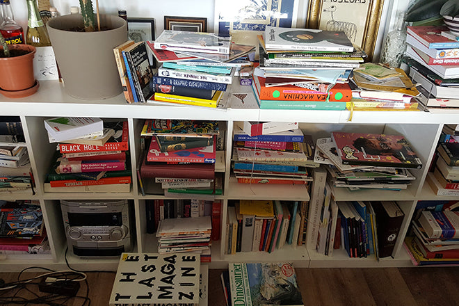
This morning we're in Offenbach browsing through the tumbling collection of magazines stacked up on illustrator Cynthia Kittler’s bookshelves. As her work regularly appears in magCulture favourites like The New York Times Magazine, Zeit Magazine, Bloomberg Business Week and Buffalo Zine, Cynthia is well-versed in all-things print.
We asked her to select three magazines for us: an old issue, a new issue, and an illustration detail that she finds particularly intriguing.
An old issue: Rolling Stone, Germany, 1996
I bought it on a flea market some years ago - just because of the Alanis Morisette cover, as I was and still am a huge fan of her. She was a newcomer back then, and I love the article about how Alanis and her band came together and created the album Jagged Little Pill. The interviewer travelled with them in the tour bus and caught a bad flu from the drummer.
The magazine also had another treasure of an article about the downfall (yes!) of Apple, and how they'll never be able to manage to recover as a company. Pretty funny. I like how really old magazines are a bit of a time machine.
The layout of the article about Apple is a over the top (above) but generally I really fancy the bold use of type in the 90s. And look at this other fantastic double spread of Nicholas Cage (also above). I think it's fantastic.
A new issue: Missy Magazine #03, 2016
I received a copy a few weeks ago because I made a little illustration for it about Sapiosexuality.
Missy is a feminist pop culture magazine. They started about eight years ago and I remember buying the first issue when I started studying graphic design. Since then, it offers great articles about a wide spectrum of issues including music, sex, politics… I really like the article about Alicia Keys’s new album and her no make-up portrait (above), as well as the series by photographer Jen Osborne about the New Orleans ‘Bounce’ dance style (also above). I love most of their covers and enjoy watching how the design of the magazine continually changes in nuances.
And another thing...: Playboy, Germany 1978
So this one again is one from the flea market. I couldn’t help but buy this a few years ago. I think I’ve had it now about seven years in my little collection.
Although I have threw a lot of magazines away about a year ago, I had to keep this one because, apart from the fact that it's a relic of the past, it's always funny to compare it with now-a-days. I find it interesting because amongst the sexiness from a man's perspective, the cars, advertising, and opinions, it's filled with illustrations! Which I find interesting but also surprising.
I counted 37 drawings, cartoons, technical illustrations and illustrations in this one issue! Some are pretty gross - haha - and others weird in cool way. Interesting to see the style of the majority of illustrations. I feel like some of the illustrators (I haven’t been aware of any of their names) could have been influenced by Push Pin Studios.
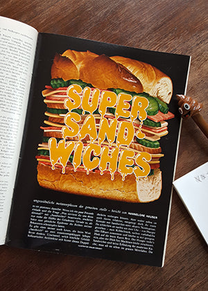
One illustration in particular is credited with "Wurlitzer Studios“ (above). The one about The Sexual Behaviour of Germans is illustrated by Marlene Neckermann (also above), and illustration number 19 is about Super Sandwiches and illustrated by Eraldo Carugat (below), who happened to do covers for the band Kiss. But Google doesn’t make it easy to research much more about these artists. Last but not least, some of them feel kind of contemporary, don’t they?


