

Coverage – July 2015
Another month passes, another pile of magazines weighs down the desk. Here’s what we’ve enjoyed but didn’t get on to the Journal over July.
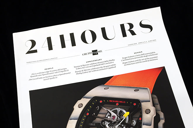
24 Hours #1
Every publisher wants to do a watch mag – there’s money in those ads! – but not everyone has Francesco Franchi available as art director. This one-off magazine is classically smart, with excellent photography and a nice use of Kris Sowersby’s Domaine Sanserif. Not as exciting as Franchi’s work for IL but still well crafted.

Variety – Special Report
This rather slipped under the radar: a one-off special about the US Supreme Court’s ruling on gay marriage. As the bible of the movie industry, Variety rightly steps up to look at the entertainment industry’s role in opening the way for the decision. It’s a well-researched and neatly designed publication with multiple opinions and views from directors, stars and a rundown on international progress in gay rights.
variety.com

Arc #19
The Royal College of Art’s student-led magazine Arc returns with a Contagion-themed edition designed by Summer Studio. As usual the design challenges the norm, delivering on a promised alternative to Massimo Vignelli’s idea of design as a cure for the visual disease of everyday life with busy pages of curious fonts, ink splodges and clip art graphics.
arc.rca.ac.uk

Orlando #1
London-based Orlando takes its name from the Virginia Woolf novel, and it’s a magazine that sets out to tackle and question rigid gender norms. Issue 0 is themed ‘proto’, and inside the loud and colourful pages are a collection of essays that mingle art and design, film, literature, politics and history. The editorial voice is fluid and confident, and although the design can be a bit erratic at times, the project is an impressive, thoughtful undertaking.
weareorlando.co.uk

Protocol
Protocol is a magazine put together by the architecture department of Berlin’s UdK (University of the Arts), and the university’s graphic design students work on the layout. For this year’s issue, they’ve chosen four different pastel colours for the cover (we got the soft yellow one), and the inside is printed on glossy paper to offset the textured paper stock of the front. The coordinates of the architecture being discussed are peppered along the margins – an elegant, thoughtful touch.

Betty Annual 2015
Previously a quarterly, this woman’s magazine has dropped its print element down to a single bumper-sized annual edition. The resulting relaxed pace and volume of content justifies the decision; a colourful alternative to the mainstream press.
bettymagazine.co.uk

Foreign Policy
This magazine was established post-Vietnam to provide a critical discourse on US foreign policy. It’s current iteration is surprisingly smart, courtesy of creative director Josef Reyes. Recent front covers have been satisfyingly inventive and there’s good use of photography and infographics.
foreignpolicy.com

Szum
Polish art magazine Szum is messy, lo-fi and bold, with lots of underlined titles and imagery that looks like it’s been lifted from an old Animal Collective sleeve. The contents are all written in Polish so I can’t find out what’s inside, but I like the grungy, grainy texture of the cover and the thickness of the pages. The art magazine is a best seller in the Polish magazine shop Super Salon (who we interviewed for Source a few months ago) – and it’s one of many local, Polish language magazines that have cropped up in recent years.
magazynszum.pl

Elsewhere #1
Place is a very popular topic at the moment, and a great, extensive theme for magazines. Berlin-based Elsewhere is the newest ‘Journal of Place’ to be released, and it’s full of thoughtful stories and articles inspired by roads, cities and open fields. The writing is evocative, but the design could perhaps take a bit more from the shape and movement of the stories. It’s a subtle and promising magazine, and I’m looking forward to following it on its journey.
elsewhere-journal.com

Twin #12
Issue 12 of the sophisticated art and fashion magazine is themed ‘Attitude’. London-based-independent-magazine-it-band Skinny Girl Diet makes an appearance (I’ve spied them in six magazines this month!), and an interview with Miranda July is beautifully honest and open. Also inside: behind-the-scenes of Nathalie du Pasquier’s Milan studio, personal recollections of the 70s punk scene from Roberta Bayley, and 74-pages of glossy, summer fashion.
twinfactory.co.uk
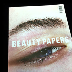
Beauty Papers #0
Bi-annual Beauty Papers has an intriguing concept, I just wish they’d take their idea a bit further and make their content a bit stranger or out of the ordinary. The publication sets out to explore beauty and to break down notions that there is an ideal way that someone should look, and their issue zero is themed ‘Foundation’. I find that many of the spreads feel like they’ve been lifted from the beauty section of a high-fashion magazine, but the photography and styling is powerful and well executed nonetheless.
beautypapers.com

Rabona #4
The ever-increasing number of independent football magazines doesn’t surprise – football and mags is a combination that certainly appeals to me – and Rabona is one of the most accomplished. Great to see strong use of photography – live action and portraiture – without tabloid headlines.
rabonamag.com

No Substance #1
The new, self-style ‘lo-fi’ fashion magazine No Substance has a suitably and curiously scrappy cover. The spreads are choppy and laid-back, the photos are grungy and Nan Goldin-inspired, and the clothing is a mixture of the thrift-shop and the glamorous. I like the way the back of the magazine is inundated with stick-on price tags.
nosubstance.co.uk