October 2016
Our monthly overview of magazines received covers wine, literature, philosophy and the year 2003.
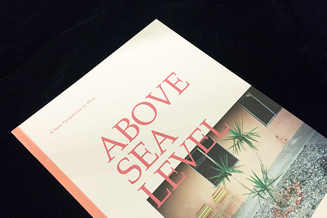
Above Sea Level #1 California
Wine journalism seems so ripe for reinvention I’m surprised that so far we’ve only seen Noble Rot from the indie sector. But now there’s Above Sea Level, the name a reference to the vital altitude measurements that dictate grape characteristics and thus wine flavour. It’s an impressive debut, covering wine-related art, label design and architecture as well as more directly linked subjects like barrels. Next up: wine country of the moment, Portugal.
above-sea-level.co
Benji Knewman #5
Issue by issue Benji is dropping its original identity as the record of an imaginary character’s journey from Latvia. That doesn’t mean it’s lost its curious mix of the personal and general, and the new issue typifies that mix. There on the cover is interview subject Christoph Amend of ZEITmagazin, while the bilingual texts inside cover everything from sadness to a tour of Riga’s Guild Hall. I don’t always understand its twists and turns, but by linking east and west Benji is doing something nobody else is doing.
benjiknewman.com
Structo #16
Issue 16 of the independent literary title features photography by Minoru Karamatsu and an interview with novelist Minae Mizumura. It’s little, pocket-sized format and penchant for translation makes it stand out from other journals of a similar ilk; we look forward to seeing how the bi-annual continues to visually develop over the next year.
structomagazine.co.uk
A Year Magazine #2, 2003
2003 is the second publication from A Year Magazine. It’s clear from the name: each issue takes a year as its theme, so issue 1 (sub-themed ‘The Boys Issue’) looked at 1991. With Mushpit-meets-Fruitlands humour and fashion-sensibility but translated to a US context, issue 2 includes art and photo contributions centring on all things 2003—so there’s the blackout of August 23, Winona Ryder and Dolly the Sheep. It’s one to keep an eye on.
ayearmagazine.com
Freize #183
The contemporary art mag continues in its own way, always looking smart but ultimately winning or losing on the subjective matter of the artists covered in each issue. I really liked this cover, from a performance piece by Anne Imhof. It’ll be interesting to see what new art director David Lane (creative director of The Gourmand) does with his upcoming redesign.
frieze.com
Pollen #2
Philosophy-centric Pollen is back with the theme of ‘Creaturely Life’, which basically means it looks at the relationship between humans and animals, at the notion of humanization, flesh and embodiment. Its art direction therefore suitably takes on bloody and bodily aesthetic - its filled with fleshy close-ups and organic textures that make the hairs on the back of your neck stand alert. Pollen doesn’t come out very often; it’s supposedly annual but actually it takes its time.The wait is worth it though – the title is entirely of its own camp, and in a time of multiple niche mags in the same category (pet mags being the obvious example), it’s refreshing to come across something that has no obvious comparison.
pollenmagazine.com
Little Atoms #2
The second edition of the podcast spin-off starts where the debut issue ended: more transcribed podcasts (inclduing DJ Taylor), some strong essays from the likes of Iona Craig and new art from Molly Crabapple. One essential development is the larger point size that means the texts are readable without a microscope. Love the colourful cover too.
littleatoms.com
Printed Pages #12
The latest best-of It’s Nice That mag looks as smart as ever, it ticks the right boxes and features strong work from young creatives and new graduates. I wish they’d be a little braver with their feature-length pieces. Jean Julien and Milton Glaser are important figures but both have been well covered recently.
itsnicethat.com
The Smart View #2
This 160-page bookish mag is devoted to mobile photography. There’s a good international mix of images, and they demonstrate clearly the remarkable quality of today’s smartphone cameras. Editor Rosa Roth has a good overview of her subject, with some nice interviews and more general pieces about the form. But this is one for the specialist, the medium alone perhaps not providing enough of a connecting theme to the images.
thesmartview.de


