

Science of the Secondary
A series of 40+ page publications about everyday items such as apples, cups and clocks might not seem to be a promising basis for a creative publishing project, but the Singapore-based HOKO team manage to prove otherwise with their Science of the Secondary publications.
 As noted last week by Madeleine in her review of new magazine Andròmina, using objects to tell stories is a popular device in contemporary publishing. What’s special about Science of the Secondary is its ambiguity: is it a serious examination of our physical and mental relationship with these objects, or a subtle parody of the same?

The answer is this is a serious project that uses humour. Published from Singapore by Alvin Ho and Clara Koh, aka HOKO, the publications are part of their desire to investigate the everyday and rediscover our curiousity about things and practices so familiar we overlook them as secondary to more exciting parts of our lives.
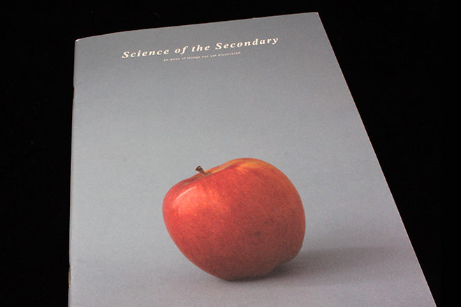
 The publications are presented in a very matter-of-fact manner, almost in a textbook style. Plain, monochrome typography sits alongside neat pictorial taxonimies. The written language is similarly plain and unadorned. The first issue opens by asking why we use Apple to represent the letter A of the alphabet – why not Ant?
 The text goes on to explain how apples are perfectly-sized for the human hand, noting that we tend not to eat the stem and how this designates that part of the fruit the ‘handle’. Diagrams examine how to take the first bite, before noting the relative simplicity of eating a banana – its ‘narrow shaft-like form fits well in the mouth.’

Issue two examines the humble cup, noting that the rim gets marked as we drink from the vessel and also how we tend to return to that same spot for the next sip. This detail is the key; we know these patterns but overlook them. It’s strange to see such hidden knowledge present so matter-of-factly.
 A set of images of mouth positions for different drinks (or beverages as the editors like to say) notes the unsightly nature of some, laconically expressing thanks that most cups are opaque.
 Science of the Secondary is a subtle blend of many things; there is dry humour even as it digs seriously into its detail, and while the design is low key it has its expressive moments – the third issue, Clock, opens and closes with abstract images of dawn and dusk skies (above).

Clock is perhaps the most actively useful edition too; diagrams for positioning clocks are accompanied by ‘wrong’ examples (an alarm clock on the wall, below). The issue also reproduces tiny images of analogue and digital clocks that clearly demonstrate how the anlogue is more useful as a quick visual tool.
 It’s a rare magazine that makes so much from so little; I love that Science of the Secondary is almost as easily overlooked as the items it highlights. A perfect match of concept and design.