

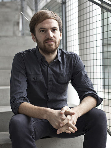
At Work With: Patrick Waterhouse, Colors
Recent issues of COLORS has seen the 22-year old magazine become essential reading again. So as we start the new week it’s a pleasure to catch up with editor-in-chief Patrick Waterhouse as planning begins on their next edition.
Where are you today?
I’m in the COLORS studio in Fabrica, which is in the north of Italy.
What can you see from your window?
I can see some train tracks. On a clear day, I can see the Dolomites. And I can now see a house which has been built from the ground up over the past year and a half.
What is your favorite magazine this morning?
To be honest, I don’t look at magazines a lot. I draw more inspiration from books. But I have just bought an issue of McSweeney's with a section on Australian aboriginal fiction. As an object, this one isn't their best, but I usually enjoy their playful approach. Apart from that, I’ve had a look at the redesign of Aperture photography magazine. I haven’t looked at it in depth, but it seems like a massive improvement.
How many emails are waiting in your inbox?
106.
How do you decide the themes for COLORS?
I have a long list and we discuss and debate different ideas as a team. Selecting the next theme is about finding an idea that is relevant to what is happening in the world at the moment and has a certain universality. The Transport issue, for example, was an oblique way of thinking about ‘peak oil’ and the fact that oil is a finite resource. Our themes are often ideas that are already in the public conscious, already part of the public debate. The treatment is conceptually-driven but it's also about taking information and insights which are often written about, and trying to make them into a story that works visually.
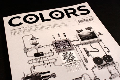
The latest issue, #86 (above) takes a more photographic approach, using visuals together with some nice magazine-y features, die-cuts etc. Is this a new direction or a one-off?
Each issue is different, but since the beginning I wanted to make sure it was a consistent body of work which also evolves.

So, for Making the News, the ‘reveal’ element that the inserts allowed us to do seemed appropriate for discussing a different prospective with in the same story. The magazine format itself and looking for ways to give stories more tactility is always important, but how that comes out depends on what fits the issue, the story, or concept.
How was your move from creative director to editor-in-chief?
In someways I don't see COLORS as a magazine. It's more like making a book, its about doing an in-depth study and thinking of each issue as a coherent whole. It's a practice that forces you to build something new out of a pre-existing field of knowledge. It's one of the things that makes COLORS unique. So I initially called myself the creative director, which was what the previous guy in charge of COLORS had done. But when I was talking about COLORS with other people, they were confused by the fact that there was no editor-in-chief. Because COLORS is a magazine, after all.

What was the last thing your art director said to you?
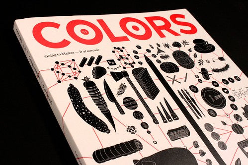
The last conversation I had with our art director, Ramon Pezzarini, was about paper. And binding. He loves binding. We were discussing the Yellow Pages, which is an element of the magazine that now always has its own separate identity. In the last issue, Making the News, the Yellow Pages were a little tabloid-style newspaper insert (above) that gave advice to would-be journalists. In the previous issue, Going to Market, the Yellow Pages section was a mini-guide to different and unusual marketplaces in the world, a more playful element that complemented the stories running in the issue itself. Over the last couple of issues, things have really clicked into place with good, mutual understanding of the right aesthetic and approach to COLORS design with Ramon and Tim Wan, our associate art director. Working has become quicker and better because we're on the same page, which makes the magazine stronger.
We are going to make a rough mockup of the next issue today, to see how the work holds together. The last two issues have had an underlying sequential structure, for example, the Going to Market issue reads as a continuous narrative to reflect what a market is, a network that allows trade. With the News issue, linking the stories echoed the practice and problems of contemporary news-making, in which stories pass from one medium to another, are retold and recast.
What are you looking forward to this week?
Working on the magazine.
What are you least looking forward to this week?
Working on the magazine.
What are you doing after this chat?
I’m going to lunch. Then I'm going to go through a rough edit of the magazine with Cosimo, executive editor, and Caitlin, our editor. This afternoon we will look at research about a conservationist or restorer of contemporary art, someone who has to deal with materials and conceptual installations, for the next issue #87 Art.

COLORS #86 Making the News is currently available from the magCulture shop.