


At Work With: Nicholas Cary, Alquimie
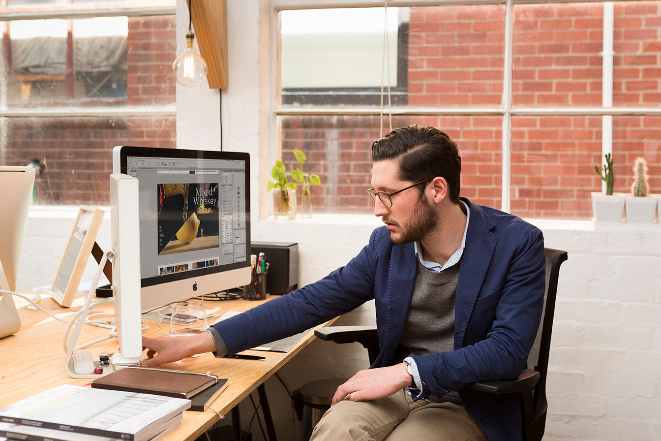
Nicholas Cary is co-founder and creative director of Melbourne-based magazine Alquimie, a quarterly about all types of drink. Before Alquimie he co-founded, edited and art directed Process Journal, producing eight issues of the the award-winning design title before leaving in 2012 to start his own design practice ThoughtAssembly. He looks ahead at his week as issue three of Alquimie arrives with subscribers.

Where are you today?
I am at my desk, trying to keep warm in the depths of Melbourne winter. Our studio is a couple of minutes outside the CBD in an old textiles warehouse, so while the original timber floors and high ceilings are beautiful, the early mornings can be quite brisk!
What can you see from the window?
We’re situated on the first floor next to a laneway, so my view consists of the red bricks of the building opposite, a makeshift vegetable garden set up on a rickety balcony by the people that live there and but a glimpse of the dark morning sky.
Are you a morning or evening person?
I am definitely a morning person. I wake up around 6am each day and head in to work pretty much right away. Getting into things this early gives me a few hours with no phone calls and this time is definitely my most productive. I generally work until at least 7pm and if I don’t consciously force myself to leave around then—or if my girlfriend doesn’t step in—I tend to accidentally work until 9 or 10. Cooking dinner is an important daily ritual for me, it helps me sway my mind from work-mode to home-mode, so I try to get home at a reasonable hour so I can cook and unwind.


What’s your favourite magazine this morning?
An almost complete set of the Ulm Journal (published in the late 1950s by the Ulm School of Design). I actually don’t own the set, I have it open in a background tab on my computer and am trying to convince myself to buy it... In saying that, the latest issue of Printed Pages looks great.
And your favourite drink?
Right now? A piccolo latte: I am just finishing one as I write this. Another important routine of mine involves coffee—two in the morning and one or two in the afternoon, depending on meetings and how severe my 3 p.m. crash is. Outside of that, I am currently very partial to Beaujolais, particularly those from Morgon.
You’ve designed a few magazines. How’s the magazine scene in Australia generally?
I co-founded Process Journal a few years ago and was responsible for the design of the first eight editions, however I stepped aside and left the publication at the end of 2012. That experience was my introduction to self-publishing and the independent magazine scene in Australia, which is currently blossoming. We are truly spoilt for choice here: from the established titles like Frankie and Smith Journal to the smaller entities, such as Dumbo Feather, Offscreen, Head Full of Snakes and Paper Sea... the list goes on. I think one of the most exciting things to come out of the Australian industry recently is The Saturday Paper, which takes a lot of cues from the world of independent magazines. The idea that the print industry and the art of long-form journalism are dissolving is, from what I can see, almost outdated. I think it’s probably more accurate to say that the industry is going through a healthy transformation. I am generally a cynic but in regards to the magazine medium—in all its forms—I am surprisingly optimistic.

The design of Alquimie reflects the minimal approach seen in other magazines you’ve designed, but has a softer, more rounded side too. Where did you look for inspiration?
Alquimie utilises a much more versatile grid and typographic style than my previous work and this is simply due to the subject matter. Process—a magazine about graphic design—required the design itself to fall into the background, allowing the featured work to be the hero. As a magazine centred on wine, beer, whisky, coffee and food, Alquimie calls for an injection of personality: the pages can take on a life of their own as the aim of the magazine is to tell a story rather than simply catalogue. In terms of design inspiration, I can’t help but look to the Swiss and German designers from the ’50s for what I think are obvious reasons! In the current age, Matt Willey’s approach to type and image is brilliant and studios such as Bibliothèque and Hofstede have great attention to typographic detail and rhythm.

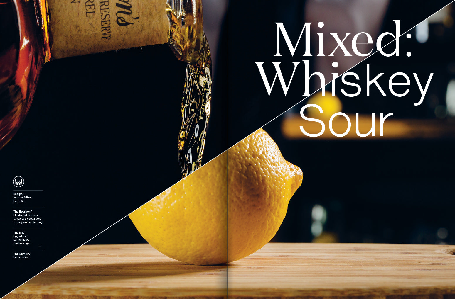
From what I’ve seen online of the upcoming third issue of Alquimie, the design is becoming bolder. How do you see the look of the magazine developing?
When we were establishing the initial design, I wanted to create a framework that allowed for evolution and change but still held everything together. I love the concept of minor breaks in the traditional rules i.e. a change in pagination style to define a section. However, for this to work there needs to be many other elements in play: to form consistency and define the title. I also work very closely with our photographer (and cofounder) James Morgan, on the art direction of all the shoots. His talent behind the lens creates a very strong visual feel and allows us to really create a dynamic rapport between the photography, the layout and the typography.
Very early on, we also knew that we wanted Alquimie to be kept and collected; that is where we see the world of print heading. Josh Elias—the editor-in-chief and fellow cofounder—ensures the content is not trend-based or too “timely” and I am consciously steering clear of any design trends—especially any random squiggly lines! We wanted to create something that subtly evolved in front of our reader’s eyes. Additionally, I think it’s really important to create something you yourself would want to buy. If you’re not producing something that engages your own tastes, interests and ideals, then you’re doing something wrong. Allowing space for aesthetic evolution is the only way we could really stay true to that idea.

Do you live the life featured in the magazine – the fine food, the rare wines?
Ha! I have always indulged and perhaps lived above my means ... however, operating my own small design studio and self-publishing on top of that, does not make my “means” very high. In saying that, the subject matter of Alquimie has obvious perks!

What are you most looking forward to this week?
Our subscribers receiving the third edition of Alquimie!

What are you least looking forward to this week?
The possibility of copies going missing in the black hole of the postal system…
What will you be doing after this chat?
Designing some materials for our edition three launch, which is taking place next Thursday night (August 7) at a café in Melbourne called Plenty: all are welcome! Copies need to be dispatched to specialty retailers, the website needs a few updates and then after that, I’m taking part in a dessert tasting built to replicate and also match a big red wine for our next edition … what was I saying about the perks behind Alquimie?
alquimie.com.au
thoughtassembly.com.au