Boys Don’t Cry
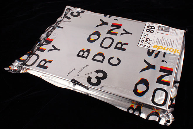
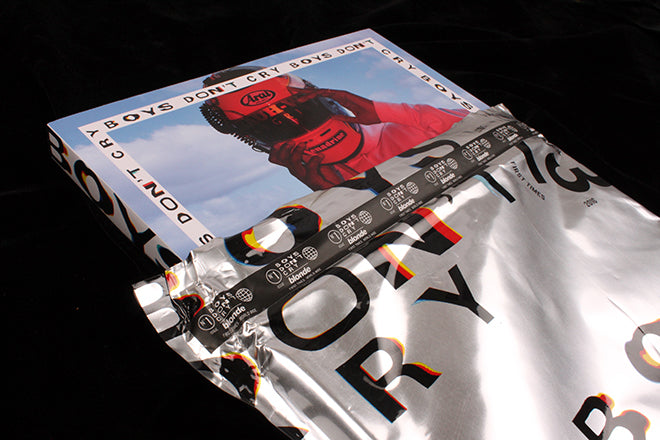
I finally got my hands on a copy of Frank Ocean’s magazine Boys Don’t Cry this week. Published alongside his recent album ‘Blonde’, the publication had been rumoured to be due for several months before suddenly arriving announced in late August. LCC journalism student Eve Cross managed to pick up a copy, and lent it to us for an unboxing session.
The hype around the project has subsided since the balmy days of August, and on cutting open the heavy foil packaging I was ready for possible disappointment. I needn’t have worried. The project is astonishing, a massive publication in format, extent and ambition, and a highly deserved Magazine of the Week.
We’re used to the worlds of fashion, art and culture finding common ground in magazine projects, and often musicians are co-opted in as the front person for a fashion biannual or special issue. What’s remarkable about Boys Don’t Cry is that the musician behind it is completely in charge. Ocean’s musical talent has translated perfectly to magazine making and the result is a heavyweight beast that is surprisingly personal (interviews with his mum and other relatives, screengrabs of his browser history, a first screenplay) yet is brazenly obsessed with fashion and cars. And more cars – this is almost a magazine about cars, from the cover image onwards. With a particular focus on Porsches.
If this makes the mag sound like an absurd, self-obsessed urban music cliché, think again. Perhaps partly through the vast and impressive list of contributors and people thanked (a spread of credits covers everyone from Anna Wintour to Lewis Hamilton via Jony Ive), Ocean has concocted a visual treat that is impressively produced at every level.
The foil wrap teases like Madonna’s book ‘Sex’ from the 90s, and once revealed the quality of the print and production inside is super-high. The printing is great, the paper is a subtle mix of matt and high gloss, and the overall effect is of an oversized zine. The art direction and design is underplayed and subtle, contrasting the high production values with a spontaneous feel throughout.
A CD of the album sits in the centre of the magazine, among a series of die-cut pages that allow the reader to see the disc for several spreads before you reach a the confirmation of the title of the album. The accompanying photograph of a blonde woman repeats for spread after spread, getting yellower (blonder?) as you get closer to the CD. Some stories last for pages, others – a tribute to David Bowie – are just a single full-page image.
My favourite shoot involves a young girl and her toy car. She unpacks the car from its box and we cut to a recreation of the car and box to full real-life scale, and see a human driver getting out of the car. The whole story is shot by Ocean.
Magazines that assault you with stream-of-consciousness imagery are common today and often allude to the visual chaos of tumblrs and instagram feeds. It may appear simple to make such publications, and sometimes it is. But this hits a high level throughout.
The typography is consistent but understated, with strong, regular titling and a typewriter font for text that matches the tone of the visuals.
Boys Don’t Cry manages to pull together some spectacular imagery. It is not a vanity project, it is a genuine and succesful attempt to make a visual treat to accompany Ocean’s music. You can feel the fun (and effort) involved in making it. Now I just want my own copy.
Editor-in-chief: Frank Ocean
Creative direction: Frank Ocean and Thomas MastorakosArt direction: Simmonds Ltd
Huge thanks to Eve Cross for loaning the magazine.


