‘David King’ by Rick Poynor
Earlier this year I was offered the chance to read a near-final PDF of this new book about David King, in order to contribute a quote in support of it. Many of my generation of designers have waited so long for a book about King, it was with some anxiety that I clicked open the document. Would it match expectations?
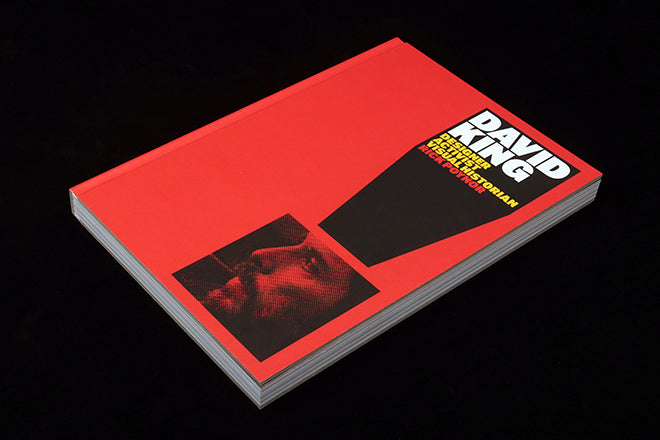
I needn’t have worried; first, the PDF was littered with detailed corrections and detailing from its designer Simon Esterson, ensuring the quality of reproduction and finish would be perfect. And second, aside from one minor flaw I’ll come to, author Rick Poynor neatly ties together Kings journey from designer to activist to archivist while sharing plenty of his work. It’s a unique and remarkable story, and its physical appearance in terms of design and production is the perfect homage to King (coarse halftone portrait, below).


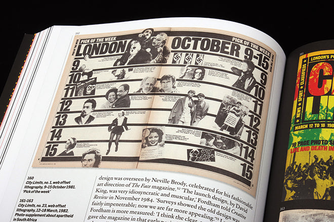
I first became aware of King as a student, via his Rock Against Racism and Anti Nazi League campaign posters (above). These coalesce in my memory with the record sleeves and magazines of the late seventies/early eighties as key reference points. A little later a new magazine was added to those references, London listings weekly City Limits, and the link to RAR and ANL was manifest in its typography, especially its brilliant front covers.

I later worked in the City Limits studio, and although he was no longer involved, it was with relish that I worked with King’s typographic rules (above). It was only later I discovered he had also designed the weekly Sunday Times Magazine I had grown up with.


The new book is packed with examples of King’s work, which stands up well all this time later. We see a few pieces of early commercial work for The Who and Jaeger (below) but it’s the Sunday Times Magazine (above) and left wing campaigning work that stand out.
All have been carefully sourced (largely from King’s own archive) and photographed as real items, adding a curatorial feel to the project. For the production nostalgist, several pieces of analogue artwork showing colour mark-ups are included.

The jumping exclamation marks in this early fashion catalogue reappear in many of King’s campaign posters, as the example at the top of this post shows
Following the story of a designer’s career is often the least interesting part of such a book; here it’s the key. Poynor’s text is a rich blend of personal detail (‘The collision fractured his skull and he was unconscious for four days’), technical information (‘The posters had to be designed quickly and printed cheaply on low-grade paper by printers such as Feb Edge Litho’) and contributions from King’s friends and colleagues (Crafts editor Margetts ‘recalls that King was often very opinionated about what was going into the magazine’).
Chatty yet authorative, Poynor takes us through three chapters: Visual Journalist, Visual Activist and Visual Archivist. The design work draws you in, but it’s the sense of self-development at the heart of the project that hooks you. A common thread of self-belief and focus runs through each part – as a person, King appears to have been just as sharp as the photographic storytelling he employed at the Times, as defiant as his campaigning graphics, and as commited as his curation of Soviet history.
Such is the overall strength of vision on display it’s simpler to highlight two minor low points than note the many highs.

First, a layout from Crafts magazine is, to my eye, just weird, almost a poor parody of his other work (above). These spreads seem to demonstrate King struggled to work outside his self-defined interest in politics. Perhaps that justifies its inclusion.

And second, that flaw I mentioned earlier: the disappointment that his series of 48 City Limits front covers is represented by just five examples (four above, including the first issue, left). If ever there was a time to share the complete set this was it. Not just for the personal reasons mentioned above, but because they demonstrate what can be done with simple technology and scant resources. The epitome of the magazine cover as poster, the dazzling series took a simple typographic logo and using colour, scale and position created a flexible identity that would be the envy of many contemporary designers.
These minor points aside, this is a must-have book for anybody interested in the interaction between content and design. We’re so used to the idea of the designer as author today; here, perhaps, is the first designer to not just be that, but really live that.
‘David King: Designer, Activist, Visual Historian’ by Rick Poynor, designed by Simon Esterson, published by Yale University Press, ISBN: 9780300250107
Additonal updates will be posted on a dedicated webiste: davidkingdesigner.com


