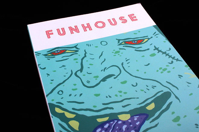
Funhouse #1
Few contemporary literary magazines include comics, and few comic journals have literature alongside full-pages of illustrated strips – Funhouse sets out to feature both. The best example of this combination I’ve come across is the website Hazlitt – the writing is crisp, the stories are surprising, and comic-masterminds like Michael DeForge and Eleanor Davis make frequent contributions. With graphic novels sat happily next to contemporary short-story collections on staff recommendation shelves in Foyles, I’m often surprised that there isn’t more of a cross-over between the two mediums in journals and literary magazines – someone who loves Chris Ware’s Building Stories will often also love the short stories of Lydia Davis.
 Hackney-based, small book-sized Funhouse seeks to further heal this rift. The bumpy, purple tongue and oozing green face on the cover sets the tone for an issue exploring the body with ‘transformations, disappearances, castrations, pinched faces and rabies’. A flesh-colour fittingly strings the text pages together and constantly evokes the theme (above).
 Surreal, darkly humorous stories by Christopher Linforth, Brandi Wells and Patty Cottrell are evocative, and the magazine’s deliberately grotesque illustrations contain narratives of their own. The text and drawings are kept separate so that one doesn’t illustrate the other. Stylistically, the words and visuals are bold and loose - like Guy Field’s mint-green drawings of people getting punched in the head (above).
 The slightly bumpy, goose-pimple quality of the drawings continues in a strip by the trembling yet confident hand of Felix Decombat (above). There’s also work by German illustrator Sebastian Schwamm, whose editorial work can sometimes be spotted in Zeit (below).
 Funhouse has a very deliberate and specific aesthetic, and I enjoy the way that in seamlessly evokes this tone visually and through its words. It’ll be interesting to see whether they’ll continue to be so choppy and loose when the theme changes though; I wonder whether they’ve gone for this look to evoke the flabby flesh and stray body parts that they’re focussing on.
Editor: Oliver Zarandi
Design: Fran Marchesi


