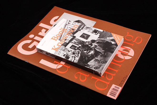
Girls Like Us #9, Benji Knewman #6
Two popular indies have published their latest issues in distinctive new formats, one larger, one smaller.
Fourth wave feminist mag Girls Like Us has increased its page size for this ninth issue, almost doubling it, as they set out on a new course working with a collaborative guest editor. New York-based artist Emma Hedditch is their first guest in charge, focusing on dance culture in her adopted city, and looking back over her time there.
While the design remains familiar – a limited two-colour palette, gradient fields and fluid grid structures (above) – the large pages offer more variation, particularly for Mary Manning’s series of snapshot-style images, thrown across the page to emphasise their spontaneous nature (below).
Elsewhere, the more crowded poster-like pages take the reader to the steamy, packed dance studios where people met over common ground and formed fierce bonds. It distills an artist’s view of NY in the 80s and 90s with a romantic, peach palette and a set of contrasting fonts that echo the era.
Meanwhile the latest issue of Benji Knewman has shrunk its pages to a surprisingly satisfying bookish format. The theme remains the same: Benji is an imaginary character looking at his ancestral home of Latvia from the perspective of an outsider.
For founder Agnese Kleina, the new size initially came from a need to reduce costs, but also from a desire to reflect the history of Latvian publishing. ‘We researched Latvian magazines and books circa 1960-90. We looked into typefaces, colors (usually black and white and one color of choice) and papers.’ Thus the issue uses little full-colour photography, and one feature colour throughout its pages - coincidentally a similar peach pink (above) to that used in the issue of Girls Like Us. The texts appear in a pair of classic 20th century typefaces — English texts use Futura, Latvian appears in Times New Roman (below).
The disarming photography, still streets and ghostly figures in the little book format, transport the reader. (‘If a country had a face national art would be it’s wrinkles,’ p186) They have married the past and the present, mixing in remnants of the soviet era in pieces like ‘From October to December’ and ‘Plastic bag, you need?’ (below).
A lighter paper stock makes the small pages beautifully flickable – a key part of the new format’s appeal – but with an extra 80 pages needed to fit the content, the print/production cost remained the same. The finished magazine weighs less than before, though, and the complexity of magazine economics is demonstrated by the resulting 37% saving on international postage.
Both magazines have dramatically overhauled their formats, travelling in opposite directions but reminding us how the physical shape and feel of every magazine is key to its identity.


