Hengam
I’ve been keen to expand our horizons here on the Journal, to reach a little further then the obvious sources of magazines and hear from publishers beyond Europe, Australia and the US. Singapore has recently provided a steady supply of interesting magazine projects, but this still feels like an exception. So the arrival of a package from Iran recently was at first intriguing, and then highly exciting.
 Hengam is a magazine published in the southern city of Shiraz. It covers contemporary art and literature, and is distributed across the whole country. ‘Tehran still has the most powerful scene in art ansd most other fields like politics, industry, etc,’ explains creative director Ali Asali, ‘but Shiraz is well-known for its ancient history and famous poets like Hafiz and Saadi. The city is still a pioneer in literature.’
 Asali’s Studio Metaphor design the bimonthly A4 magazine. He explained to me that most editorial design in Iran is influenced by US design, ‘Avant-garde designers are mostly attracted to poster design, and editorial design gets overlooked. One of my intentions in designing Hengam was to fill this gap, and surprise the readers with visuals and new typographies.’ To this end he designed his own headline typeface for the magazine.
 Iran has been in the headlines recently as it attempts to come in from the cold after the 1979 Islamic revolution. According to Ali, the political temperature has shifted in the few years since the last election. ‘Rouhani – the current president – is far more open to new insights than his predecessor AhmadiNejad.’ Hengam is only in its second year of publication, benefitting from this relative openness. ‘The media suffers less and can catch a breath for a while,’ he explains.
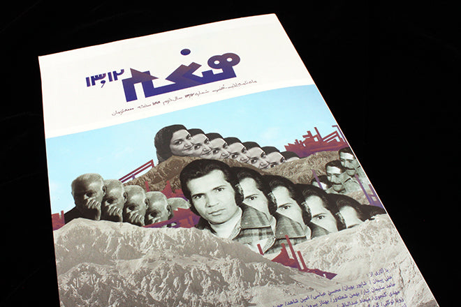
 Language problems mean even a loose understanding of the magazine and its content is impossible for me. The basic structure follows expectations, apart from reversing our back and front and reading right to left (contents page, above).
 The scope of the magazine is unclear, but I spotted this reproduction of the front cover of a Gregory Corso book (above) and in an earlier issue a picture of Duchamp’s urinal readymade; both suggest Hengam is as free to publish as Ali suggests.
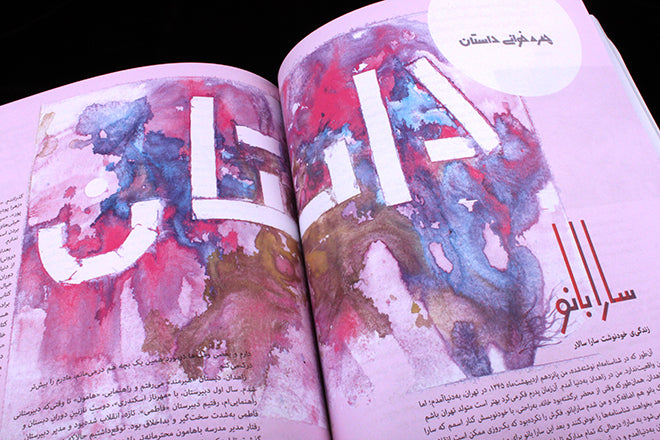
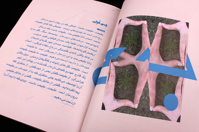
 What really grabbed my attention, though, is the composition and design of the pages. The custom font is one thing, sometimes slick and sometimes rough, but the use of colours, shapes and curious effects (below) is very visually exciting. There is a degree of creativity and finish to the detailing that lifts this above a curiousity; this is a really exciting find.
 I’ll finish with a few more images from this recent issue of the magazine, and ask the question, how fully can we appreciate a magazine without being able to read the written words? Something we’ll return to again very shortly.