Journal tagged by Typography

Cover story
Port handwritten covers
We’ve seen magazines experiment with their logo from issue to issue, but Port’s new approach to the typography of its name is unique. Each issue features up to eight different cover stars, and each person handwrites the magazine’s name. We spoke to art director Matt Curtis about how the covers are working.
Read more

Lars Harmsen, Slanted
Graphic design magazine Slanted has grown to be a vital part of the design ecosystem, publishing regular editions featuring contemporary work from single cities and countries. Co-founder Lars Harmsen considers the state of graphics today as he reflects on how his mag has developed over the years.

Nic Carter, Sociotype Journal
Launching a magazine to showcase your typefaces may sound like an excuse for some easy content and over-exhuberent design, but London type foundry Sociotype have managed to produce a serious publication that intelligently displays their type work. Creative director Nic Carter explain more in this week’s interview.
Read more

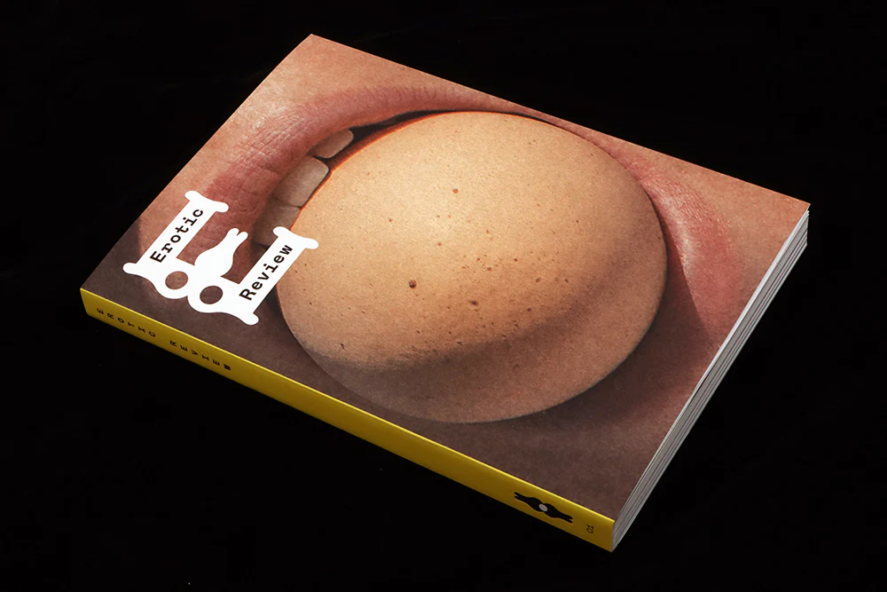
Erotic Review #1
Erotic Review has just been relaunched by editor Lucy Roeder as a journal exploring desire. The new magazine has a unique and subtle typographic identity by Studio Frith, helping it look forward rather than back. We spoke to Frith Kerr about the development of the identity and the language of desire.

Whitney Mallett, The Whitney Review of New Writing
One of our favourite new magazines of 2023 was The Whitney Review of New Writing, a large format mag from NY covering literature and other forms of writing—the recent second issue includes a review of the script of ‘Poor Things’. Founder Whitney Mallett explains more about the roots of her bold magazine.
Read more

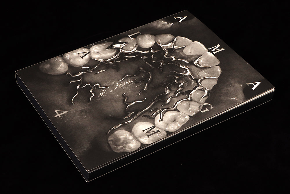
Amalgam #4
The latest issue of US magazine Analgam is another brilliantly radical look at the intersection of typography, language and power. Themed ‘Collapse’, it again presents challenging content in challenging but beautiful layouts, making the most of its simple but effective black and white typography.
Read more


