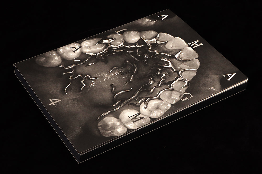
Amalgam #4
The fourth issue of Amalgam is, again, a brilliant example of how design and content can resolve themselves on the page to enhance rather than compete with each other.
That may sound like the very essence of editorial design, and indeed it is, but few magazines manage it with such clarity of vision.

Each issue, editor-designer Pouya Ahmadi, an Iranian-American based at Rhode Island School of Design, brings together an impressive selection of new and archive writing along a design-orientated theme, itself based around the intersection of typography, langauge and power. Issue four takes the timely theme of collapse, and addresses the collapse of language syntax, semantics, barriers between langauges and language itself.
It’s all presented in the usual black and white, a smooth dense black combining with a warm off-white paper to show how the simplest effect—a decent bit of deep black printing—can be compelling. The only grey appears in the image halftones. I wrote here about issue three back in 2021, and said many of the same things, but they’re worth repeating as a key part of Amalgam’s strength is its stark monochrome appearance, and is further enhanced this time by the black page edges (printed page edges are having a bit of a moment—see recent issues of Beauty Papers and Cabana).
This bold monochrome base is the foundation on which Ahmadi’s designs are built. There is no superfluous decoration here, just type and image locking together in a apparently simple, but actually super-complex, jigsaw of parts. At one level, this is typographic pattern-making, with headlines and other elements sprayed across the page and often filling every corner. But there is logic in play, a system of headline, standfirst and test styles that become familair as the reader travels through the pages. The designs are not layered, but use large word spacings on headlines and sometimes complex combinations of text alignments. Again, though, once the reader grasps the patterns, the parts make sense.

A story in the issue that stood out for me is J. Dakota Brown’s piece about the automation of typography (above). Presenting a history of the development of typographic reproduction, Dakota Brown ignores the usual gloried story of invention and craft in favour of a more realistic analysis of the industrialisation of typography and its effect on its practitioners, highlighting the social dislocations caused by 20th century mechanisation of production.

It’s a timely reminder that while the traditional typographer and printer might once have been auto didacts using their presses to share radical views, the new, automated technologies were funded and imposed by capitalists who inevitably sought to control those very views. And today, as graphic designers relish the control of their craft that huge corporations such as Apple and Adobe offer, with their hardware and software replicating earlier generations of automation (above), we face the irony that the same control is accesible to the non-designer. Typography is now presented as a set of options in InDesign. Given to someone like Ahmadi, the result can be spectacular, but elsewhere we can find plenty of the merely adequate.

The issue opens with a poem about stuttering by JJJJJerome Ellis (above), an ideal introduction to the subject of language collapse. Elsewhere, Mimi Onuoha outlines her project ‘Library of Missing Datasets’, Maia Ruth Lee writes about the failure of language to express the meaning of emotion, and in a conversation with artist Sophie Seita, poet and critic Klara du Plessis discusses writing in multiple languages. The design of this piece is particularly strong (below), the two threads of words set in different fonts and surrounded by the two participant’s names in spaced capitals.

The issue arrived at the magCulture Shop shortly after I read a social post complaining that all the radical magazines had closed. Amalgam is proof that isn’t the case. Each issue contains radical ideas presented in radical layouts. Which makes it a perfect Magazine of the Month.


