Letter to Jane: the future of iPad apps

The fourth issue of Tim Moore’s Letter to Jane iPad app was released late last year. Although some early development work was included in my book The Modern Magazine, I missed the chance to give it a more thorough review here on the blog at the time it appeared. This week Bob Newman posted a review on his Newmanology site – a review I wholeheartedly agreed with, for its positive response to this particular app as much as the general observations about magazine apps. Bob has kindly given me permission to republish his post.
I’ve been pessimistic lately about the state of iPad magazine apps. There are certainly some ably-designed apps based on existing magazines, but increasingly they feel like static replicas that are being churned out from an assembly line. A lot of this is due to various publishing strategies, rules, and budgets (or the lack of budgets). There’s no doubt that many of the magazine apps being produced look smart and sharp on the iPad, especially the graphics. And while I’m increasingly drawn to those that work on phones (a result of the many hours I’m still spending traveling to and fro from physical therapy to doctor appointments), I’m not finding myself particularly interested in reading or looking at magazine apps on the iPad. And to be honest, I can’t find many art directors or other magazine makers who read tablet apps on a regular basis (I’d love to be proven wrong on this!).
Remember when we all thought there was going to be an outpouring of brilliant magazine apps, filled with rich textures, exciting content, videos, sparkling images, all packaged in a format that would be part of an entirely new and unique way of presenting information and engaging readers? Well I’m happy to say that there’s one app that is living up to this bright promise. To paraphrase the famous quote about Bruce Springsteen (it’s corny, but it still works!): I’ve seen the future of magazine apps, and it’s called Letter to Jane.

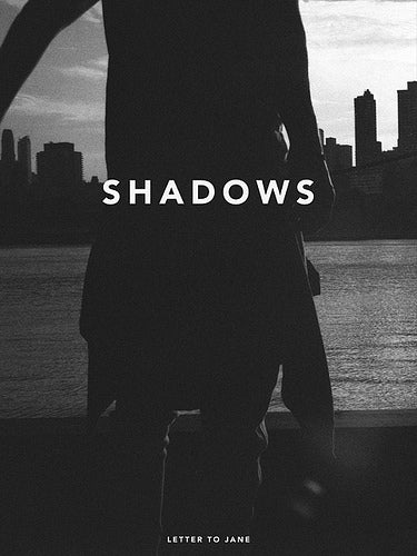
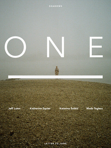
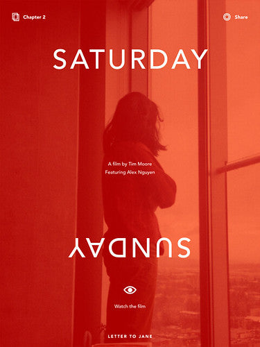
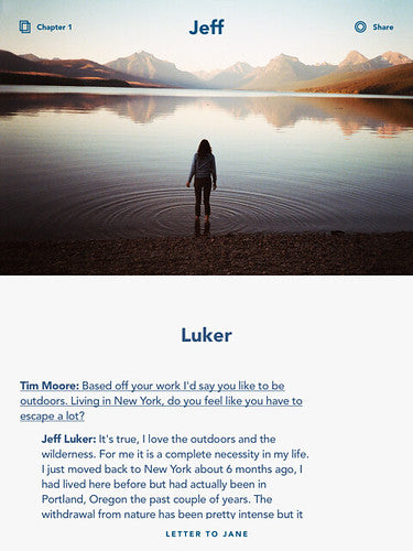
The latest issue of Letter to Jane (number 4, titled “Shadows”) has been out since October, and I’m remiss for just getting around to it now. (I also should mention that I’m more than a little biased towards the magazine’s success….I was a supporter of the Kickstarter campaign to gather financing for the issue.) Letter to Jane was created by Tim Moore, who has a day job as creative director at 29th Street Publishing. Tim has been busily creating a wide array of commercial magazine apps for 29th Street, and his experience shows on the new Letter to Jane. The “Shadows” issue is beautifully and elegantly designed. And the interface is simple, clean, and very easy to navigate. I love the structure of the magazine, too. There’s no traditional front, back, and feature well. Rather, Letter to Jane is broken into three distinct sections, with additional multi-media features used to add texture and surprise.

In earlier issues of Letter to Jane, the design was cool but very plain and almost naive. Moore was heavily influenced by the title sequences of his beloved French New Wave films. In this latest issue, the design is still spare, but is much more sophisticated and state-of-the-art. And while there is still a certain cinematic flavor throughout, both to the graphics and the imagery, there’s also a solid sense of typographic refinement and graphic attention to detail that was sometimes missing in earlier issues.

Although the app’s title is a reference to the moody black and white 1959 movie Shadows by director John Cassavetes, the photographs in Letter to Jane are actually a lot more bright and colorful than previous issues. Moore readily acknowledges Cassavetes as a powerful influence on his creative work (which is yet another reason I love this app so much!). But I’d argue that the Cassavetes film that this issue best relates to is Husbands, not Shadows. That was the movie where it seemed to me that Cassavetes first fused his artful creativity with an attempt at mass commercialism, and was a big stepping stone to his later masterpiece A Woman Under the Influence.

About the content: There’s a rich selection of interviews here, most notably with film directors Wim Wenders and Whit Stillman and actress Miranda July. I think Moore hasn’t gotten enough credit for his editorial content, and there’s much of interest, skillfully edited and compiled. If there’s a weakness it’s the over-reliance on interviews with young photographers, who to my mind just aren’t interesting enough to carry a dominating portion of the magazine. The third section, featuring interviews with Wenders, Stillman, July, and others, is remarkable. I’d like to see Moore raise up the rest of Letter to Jane to that level of quality.

Overall, however, this is a highly-imaginative and boldly creative project. Letter to Jane is by turns surprising, delightful, sensual, engaging, and very smart. It creates a whole new magazine format, one totally unrelated to anything having to do with “print,” while also serving as a vehicle for Tim Moore’s graphic cinematic sensibilities. Like the best indie movies (and like Moore’s idols Cassavetes and the French New Wave), Letter to Jane works to stretch the boundaries of its genre. It’s exciting to see someone being creative and having fun, and also articulating a completely original and very personal graphic and editorial vision. Letter to Jane is what I always imagined the best magazine apps would be like. It’s both a pure treat to read and view and a major source of inspiration. Anyone who is working in app creation should rush out and buy a copy immediately!
Download Letter to Jane, “Shadows” from iTunes.
Read more of Bob Newman’s posts on Newmanology
If you haven’t already bought your copy of My Favo(u)rite Magazine, published in support og Bob, it’s still available in our online shop.


