


Magtastic 5: April 2013
Andrew Losowsky in New York returns from the corner kiosk with some recent US magazines. ‘An overdue update from these shores, so it seems appropriate that I open with Apology.’

So what are you thinking of when I say “A new magazine from the former Editor-in-Chief of Vice”?
It's probably not Apology magazine, an elegant, pretty much gonzo-free publication that's indulgent in all the right ways. In his editor’s note (perversely placed at the end of the magazine), Jesse Person says that the magazine is named “as a reference to the classical idea of apologetics (pl.n. reasoned arguments defending a theory or doctrine).” He also describes it as “my apologia against what I see as the problematic state of magazines today, both big and small.”
This particular magazine, whose format is small, and 256 pages long with few ads, is apparently especially inspired by New American Review, a paperback-sized journal published between 1967 and 1977.

Apology is hard to categorize. It kind of feels as if many of my favorite magazines (including the slightly pretentious ones) all melted together in the night. Obscure like Cabinet but without some of its pretensions (and a little more millennial pathos), Apology is varied without ever becoming dull.

I read it cover to cover, in part because the threads connecting one article to another are so subtle that identifying the Exquisite Corpse-esque connections becomes part of the pleasure of reading. There are some fairly big names - Ryan McGinley, John Ashbery - providing entertainingly spurious content, supported by a design that contains wit and variety without ever straying too far from what feels appropriate for its paperback format.

Apology is almost exaggeratedly indulgent at times - hence a 20,102 word interview with comedians Tim and Eric, a look at the china shoe collection of a famous poet, and a huge, sprawling 28-page section dedicated to the semicolon. At its best, the imaginative commissions and sprawling spreads of artwork never feel like they overstay their welcome (a frequent complaint of mine with these kinds of magazines.)
It is pretty obtuse, and not for everyone. But if you give it some time, and your brain is shaped like mine, you'll find your reaction to reading Apology shifts pretty quickly from cynicism to grudging admiration to, by about two-thirds of the way through, sheer delight. One to buy, and read slowly.

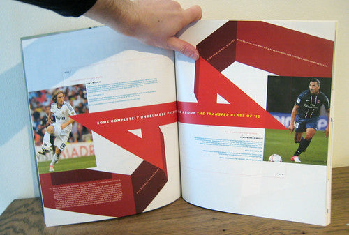
It is often said that most Americans don't get football. They don't even get its name right, for Don Revie's sake. As true as that may be, Howler proves that at least they get how to make a great soccer magazine. In fact, a great magazine period (as they like to say over here).
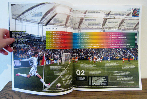
While recent British indie footie mags seem to have taken the Apartamento / Granta route (The Blizzard, Green Socccer Journal - both fine publications worthy of your pennies), Howler is a whole other proposition, using vibrant, imaginative design to accompany the smart, passionate journalism on its theme.

Its geographical distance from the European game gives Howler license to provide more context and depth to discussions of, say, Manchester United vs Arsenal, racism in English football or the history of Inter Milan in ways that a British publication simply couldn't achieve, and it's a stronger read for it.
Infographics, cartoons, timelines, great photography and a cut-out-and-make player on the inside back page of each issue all are thrown into the energetic mix.

The format is large, and the lively design by Priest + Grace makes fantastic use of the page real estate in a way that few large-format magazines do. Never has the beautiful game looked more beautiful. Chase it down.
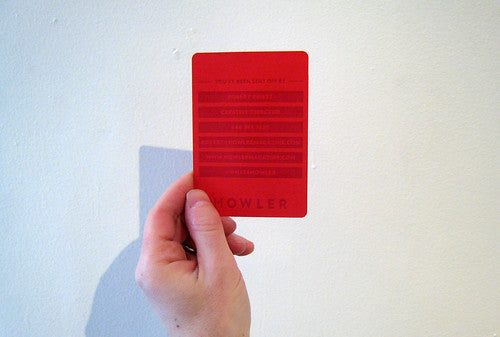
Bonus: my copies arrived from the creative director, Robert Priest, whose business card is a red card that reads "You've been sent off by..." I imagine he has enormous fun pulling them from his back pocket and presenting them to people at parties.

Everything is Fucked/Everything is OK is a zine created by editor James Aviaz and designer Andrew Guirguis. Contributors were free to submit whatever they wanted as long as it had a vague connection to the title, so the pieces are unsurprisingly mostly first person, and somewhat self-obsessed. However, the brevity of the pieces, the mix of contributors, and a clean design mean that it doesn't outstay its welcome.

Aviaz also created a special edition (above) containing just one story, about his experiences in helping during the clean up after Hurricane Sandy. This feels like a true piece of self publishing for the best reasons - an exploration of what he saw, simply to try and make some kind of sense of it all.

I don't know it would work as a glossier, more substantial project - but then it doesn't need to. Definitely worth a look.

Aperture is a classic photography magazine that's long been in need of a redesign. Published by a New York-based photography foundation that aims to connect the photo community with new work and ideas, the magazine has been going since the 1950s. The cover of the relaunch issue is a slightly obscure in-joke, nodding to Daido Moriyama's 1972 publication ‘Bye Bye, Photography’.

The first thing to say about the redesign is that the page size is much bigger that before - which means, obviously, bigger photos, though not as many as you might think. It's also fatter - 50% more pages than before are promised. An ambitious gamble, then.

The redesign, overseen by A2/SW/HK, divides the magazine into Words (ideas, interviews, debate - pages 1 through 72 in this issue, accompanied by often frustratingly small images) and Pictures (projects, images, plus a surprising amount of articles as well, including interviews - pages 72-153). Each section has its own paper stock: a thick matt for Words, a heavy gloss for Pictures. The typography varies between the sections, too: a serif for Words and a thick sans for Pictures, while headlines in Words are eschewed for longer ledes that act as titles.

Though everyone is a photographer these days, this magazine is clearly about photography for arts’ sake, and the content is fairly esoteric, aimed at a particular audience in the know rather than laypeople who love powerful images. There also seems to be a reluctance to ask the reader to rotate the page, which means that landscape images are often printed unnecessarily small.

As a general, non-art historian, there are some ideas in this magazine that intrigued me, and certainly some striking images, but too few of either for my taste. This is an insider's conversation, so I can't speak too much to whether or not the redesign succeeds, except to say that though it was definitely necessary (the old format looked very dated), it doesn't contain anything remarkable enough to make it an essential purchase for general-interest magazine fans.

Finally a double-bill of special editions from McSweeney's: The Believer 10th Anniversary edition and Lucky Peach’s Apocalypse issue.
One of the remarkable things about The Believer is that it has stuck to the same cover artist every issue for the past ten years (can only Harrison Fisher for Cosmopolitan claim a longer continuous stretch?) and so for its tenth anniversary, it has ditched the distinctive outlines of Charles Burns for a selection of amusingly terrible fold-out stock photos.
Typical for The Believer, the anniversary is nodded to in a variety of esoteric ways, without any overt self-congratulation. Its obscure, vaguely literary content remains as engaging as ever, somehow fresh without trying to be current.
This issue has some particularly strong features, including Jonathan Goldstein interviewing an overlooked radio hero, Justin Wadland on a remarkable tale of local newspaper anarchism from 1901 and Ed Park on the hidden messages in children's picture books. If you never really got the point of The Believer, this anniversary issue won't convert you. It's consciously non-mainstream, aimed at those of us who enjoy a particular kind of well-written esoteria, and long may it continue.
Early issues of McSweeney's food magazine Lucky Peach were deservedly hailed for their graphic design, but I found the egocentric feeling of much of the content, most prominently that which focused on the life and culinary loves of Momofuku owner David Chang and friends, grating (no pun intended). However, Chang's imposing personality has been reduced from the content, and this special themed issue, Before and After The Apocalypse, reminds me of the some of the best moments from a personal favorite in the archives: Eat magazine, a bilingual Japanese food mag from the early 2000s, which seems to have left almost no online footprint.
The latest issue of Lucky Peach is divided into two halves. The first part is about preparing for doomsday: the art of canning, how to hoard seeds and prepare an emergency larder according to 1950s government leaflets, as well as articles explaining why the end times might come courtesy of our own carelessness around food (food-bourne illnesses, soil degradation, etc). This section is a bit of a mix, with some very strong pieces mixed in with others that seem a little over-long and not quite on topic.
Following from a wordless, cartoon apocalypse, the After section, however, is a triumph, containing some great conceptual commissions. One piece takes the signature dishes from some of New York's finest restaurants, and leaves them to rot, analyzing the emerging moulds. Another piece sent unknowledgeable amateurs into local forests to forage what they think might be edible, and had an expert label their findings (‘Silver Nightshade. DO NOT EAT!’) With recipes on how to cook brains (in case it's a zombie apocalypse) and how to make butter from raw cow's milk, as well as how to find wild honey, this is locavoring with a dark twist. A feast in so many ways.