Mel Nichols, editorial consultant
Mel Nichols was editorial director at Haymarket Consumer Media for 22 years until 2009, overseeing the growth of the company’s car, tech and B2B magazines during the boom years. He now applies his experience of magazine making to a series of teaching roles at UK universities and on international courses, passing on his knowledge to a new generation of aspiring journalists.
We asked him to check through his magazine collection and select an old issue, a new issue and one other thing. Here’s what he pulled out.
An old issue
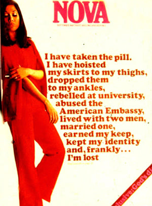
Picking up a copy of Nova is a reminder of the riveting power of its journalism, photography and graphic design, and the influence it had.
But few people expect specialist titles such as Motor Cycle News Sport (MCN Sport) to be at the leading edge of compelling magazine-making. The creativity and variety of its page treatments was textbook. I use a sequence from a 2004 issue, including these two spreads, in my Magazinecraft course to demonstrate visual variety across consecutive stories.
A new issue
The New Yorker’s daily newsletter is a must-read when it hits my phone (subscription required). It’s fantastic to be able to read such impeccable journalism every day.
Meanwhile, the weekly’s covers – like the Trump-thumpers on February 13 and August 28 2017 – are often devastatingly incisive. New York is blessed to have three such remarkable magazines as The New Yorker, New York and The New York Times Magazine.
There’s a new celebration of long-form journalism of a different kind in The Classic Motoring Review, a quarterly that Mark Williams launched late in 2017. Outstanding automotive journalism drew me to magazines in the first place so it’s a treat to have this collection from evocative writers. Mark curates it as an antidote to ‘creeping blandness and predictability’.
And another thing
I love showing magazine editors, art directors and students the covers that editor Harold Hayes and art director George Lois produced for Esquire between 1962 and 1972. I don’t think they’ve been bettered. Lois was brilliant at distilling a story into an image but was never afraid to use type when that was the right thing to do.


